Sliced Episode 3: Superstore profits
Summary:
Background: In episode 3 of the 2021 series of Sliced, the competitors were given two hours in which to analyse a set of data on superstore sales. The aim was to predict the profit on a sale.
My approach: This is a good example of a problem for which we have knowledge about the structure of the data. In particular, we know the relation between sales, cost, discount and profit. Using this knowledge, I converted all sales and profits to what they would have been without a discount and I modelled the simplified data. Undiscounted profit is best described as a percentage of the undiscounted sales price, so the problem reduces to estimating that percentage. On log scales the model reduces to a series of lines with a known slope of 1 and intercepts related to the percent profit.
Result: A simple linear model of logged data with known slope in which the intercept depends on the type of item produces a RMSE that is much better than the top submission on the leaderboard.
Conclusion: When we have knowledge about the data structure, this must be incorporated into the model. A standard machine learning algorithm that ignores known structure is almost guaranteed to perform badly.
Introduction
The third of the Sliced tasks is to predict the profits on items sold by a unnamed superstore (think Amazon or a similar company) and as usual the evaluation metric is RMSE. The data can be downloaded from https://www.kaggle.com/c/sliced-s01e03-DcSXes.
At first sight, this looks like a rather boring example. There is nothing unusual about the data and the response is a straightforward continuous measure; it looks like a bog-standard regression problem, and yet!
There is a class of problems that standard machine machine learning algorithms find difficult to handle; I’m thinking of those problems where we have external knowledge about the structure of the data. The classic example is a physics dataset where we know that the measurements must obey the natural laws of physics, so models need to incorporate those laws. In a much simpler way, we know the relationship between product cost, sales price, discount and profit and we need to use that information.
What we know
When there is a known structure, it is vital that the analyst finds out exactly what each variable means so that structure is described accurately. For instance, we are told the sales price, but when multiple items are sold together, is this the total sales price, or the sales price per item? When we talk of profit, does this allow for shipping costs?
Since we cannot go to the management of the store and ask them, we will have to make best guesses, and later, check the data to see if those guesses look reasonable.
Let’s set up some notation so that we can express what we know about the cost and profit on a single item.
C = cost of the item (what the store pays for it)
S0 = sales price when there is no discount
P0 = profit when there is no discount
d = discount on the item (a proportion)
Sd = sales price when the discount is d
Pd = profit when the discount is d
The first thing that we know is that profit is the difference between sales price and cost
Pd = Sd - C
and in particular
P0 = S0 - C
so
C = S0 - P0
and
Pd = Sd - (S0 - P0)
Next we can relate the discounted price to the full (undiscounted) price
Sd = (1-d) * S0
So we have our first key equation for calculating the undiscounted sales price.,
Equation A: … S0 = Sd / (1 - d)
and we can deduce that
Pd = Sd - ( Sd / (1 - d) - P0 )
or
Pd = - Sd * d / (1 - d) + P0
This give the second key equation for the undiscounted profit,
Equation B: … P0 = Pd + Sd * d / (1 - d)
In the training data, we are given d, Sd and Pd, so we can use (A) and (B) to deduce S0 and P0, i.e. we can remove the impact of the discount and calculate the profit that would have been made had there been no discount.
In this way, we can build a model to predict profit without discount. Then in the test data we can predict the profit without a discount and back-calculate the actual profit. Hopefully, this will remove a large component of the variability in the data.
Reading the data
It is my practice to read the data asis and to immediately save it in rds format within a directory called data/rData. For details of the way that I organise my analyses you should read by post called Sliced Methods Overview.
This code reads the rds files
# --- setup: libraries & options ------------------------
library(tidyverse)
library(broom)

theme_set( theme_light())

# --- set home directory -------------------------------
home <- "C:/Projects/kaggle/sliced/s01-e03"

# --- read downloaded data -----------------------------
trainRawDF <- readRDS( file.path(home, "data/rData/train.rds") )

testRawDF  <- readRDS( file.path(home, "data/rData/test.rds") )
Data Exploration
Let’s calculate the undiscounted sales price and profit, I’ll call them baseSales and baseProfit and then summarise everything with skimr.
# --- summarise data with skim ---------------------------
trainRawDF %>%
  mutate( baseSales  = sales / (1 - discount),
          baseProfit = profit + sales * discount / (1 - discount) ) %>%
  skimr::skim()
As usual for these posts, I have hidden the output for skim(); it is important, but long and interferes with the flow. It shows that there is no problem of missing data and, as we would expect, baseProfit is always positive (within rounding error).
The Response
The response used in judging the models is profit after discounting, which I have truncated at -$250 and +$250 for the following histogram.
# --- histogram of the profit after discounting -----------
trainRawDF %>%
  filter( profit >= -250 & profit <= 250 ) %>%
  ggplot( aes(x=profit) ) +
    geom_histogram( bins=100, fill="steelblue") +
    labs( title="Histogram of profit after discounting",
          subtitle="truncated at -$250 and +$250",
          x="Profit")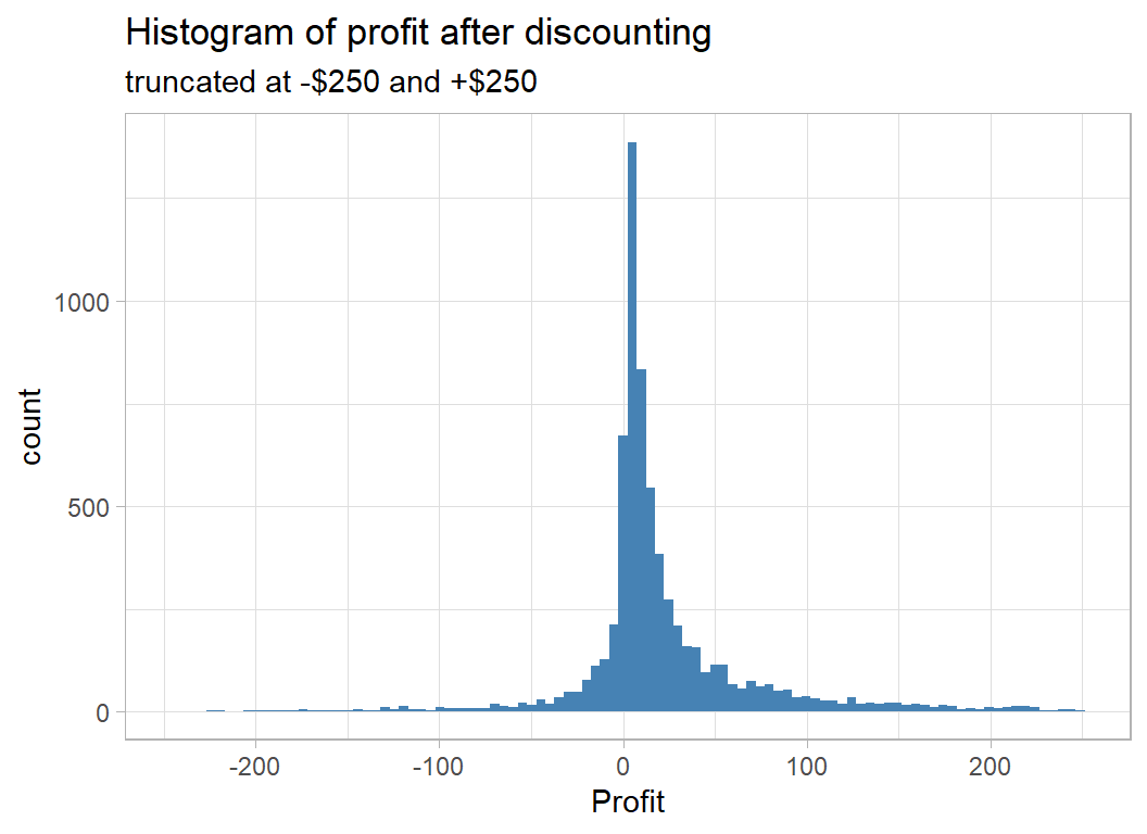
However we will work with the profit before discount, which I call baseProfit.
# --- Histogram of baseProfit = profit before discount ----
trainRawDF %>%
  mutate( baseSales  = sales / (1 - discount),
          baseProfit = profit + sales * discount / (1 - discount) ) %>%
  filter( baseProfit <= 250 ) %>%
  ggplot( aes(x=baseProfit) ) +
    geom_histogram( bins=100, fill="steelblue") +
    labs( title="Histogram of profit before discounting",
          subtitle="truncated at +$250",
          x="Profit")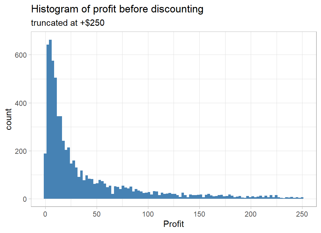
This confirms that there are no negative profits before discounting.
Profit is usually a percentage of the sales price but the discount makes this picture confusing
# --- profit and sales price ------------------------------
trainRawDF %>%
  mutate( discount = factor(discount)) %>%
  ggplot( aes(x=sales, y=profit, colour=discount)) +
  geom_point() +
  labs( title="Discounted profit and sales price")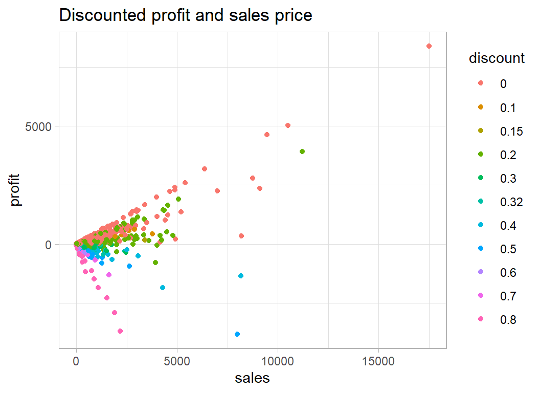
Some items are sold at a loss because of the discount. The undiscounted items all lie on the steepest positive line and most of the 80% discounted items lie on the line with the steepest negative slope.
When we remove the effect of discount the relationship becomes clearer.
# --- baseSales and baseProfit ----------------------------
trainRawDF %>%
  mutate( baseSales  = sales / (1 - discount),
          baseProfit = profit + sales * discount / (1 - discount) ) %>%
  mutate( discount = factor(discount)) %>%
  ggplot( aes(x=baseSales, y=baseProfit, colour=discount)) +
  geom_point() +
  labs( title="Undiscounted profit and  sales price")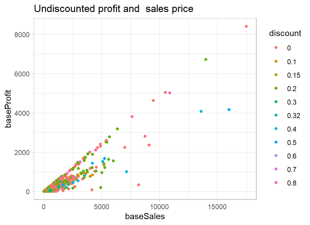
We have removed the effect of the discount and we can see the that items are no longer being priced at less than they cost and that the best base profits are associated with a mix of items, some of which were undiscounted and some of which were actually discounted.
The structure of the plot of undiscounted profit and sales is of a set of straight lines that pass through the origin. This suggests that it might be better to think in terms of the percentage profit per item.
P0 = k S0
where k is the proportion of the price that does to profit, which we would usually think of as a percentage. So, for example, the store might make 30% profit from selling computers, but only 10% profit from selling tables.
In this case
log10( P0 ) = log10(k) + log10( S0)
and if we plot log10( P0 ) against log10( S0) we should see sets of lines at 45o with intercepts equal to log10(k).
One problem with a log scale will be items sold at or very close to cost price; the rounded profit will be 0 and we will not be able to log it. We could either add 50c to those profits or drop them from the logged plot. There will not be many such items, so I have decided to drop them.
# --- baseSales and baseProfit -------------------------------------
trainRawDF %>%
  mutate( baseSales  = sales / (1 - discount),
          baseProfit = profit + sales * discount / (1 - discount) ) %>%
  # --- drop items with under 50c base profit -------------------
  filter( baseProfit > 0.5 ) %>%
  ggplot( aes(x=log10(baseSales), y=log10(baseProfit)) ) +
  geom_point() +
  geom_abline( slope=1, intercept=0) +
  labs( title="Undiscounted profit and  sales price on a log scale")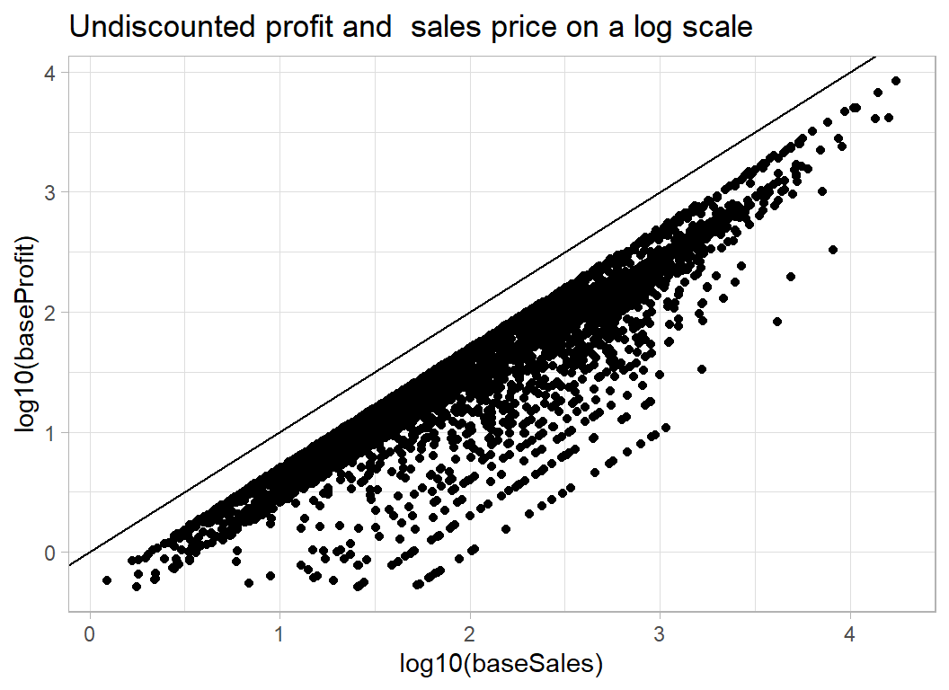
Just the banded appearance that we were expecting. A intercept of -0.5 corresponds to 100*10-0.5=32% profit, an intercept of -1 corresponds to 10% profit and -2 corresponds to 1% profit. So if items were sold at full price the store would usually make between 20% and 30% profit on each item.
Predicting percent profit
The next questions is what influences whether you make 30% profit on the full price or 10% profit on the full price?
One of the variables in the dataset is ship_mode which can be ‘First Class’, ‘Same Day’, ‘Second Class’, ‘Standard Class’. So we know that the superstore is selling over the internet. This suggests that there must be one dollar price for the whole of the USA and (unless shipping costs are included in the profit calculations) regions/States/Cities should not effect the percentage profit.
What should matter is the nature of the item as described in sub_category
# --- bar plot of the sub-categories ------------------------
trainRawDF %>%
  group_by( sub_category) %>%
  count() %>%
  ggplot( aes(y=sub_category, x=n)) +
  geom_bar( stat="identity", fill="steelblue") +
  labs(title="Categories of items sold by the store",
       x = "number of sales", y=NULL)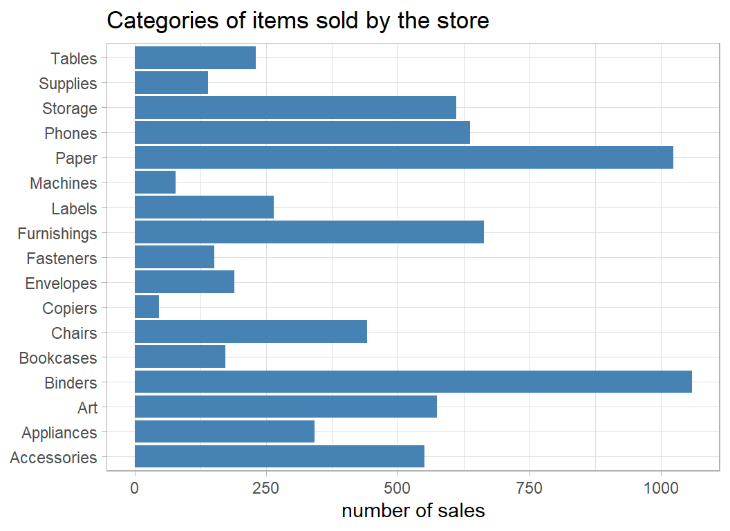
It looks like the store only sells office supplies but even so, these categories are quite broad; there must be several different types of table and many brands of phones. Let’s look at the profit/sales plot for particular subcategories.
Rather arbitrarily, I’ve chosen tables, phones and binders
# --- profit and sales for 3 categories of item -------------
trainRawDF %>%
  mutate( baseSales  = sales / (1 - discount),
          baseProfit = profit + sales * discount / (1 - discount) ) %>%
  mutate( discount = factor(discount)) %>%
  filter( baseProfit > 0.5 ) %>%
  filter( sub_category %in% c("Tables", "Phones", "Binders") ) %>%
  ggplot( aes(x=log10(baseSales), y=log10(baseProfit),
              colour=discount) ) +
  geom_point() +
  geom_abline( slope=1, intercept=0) +
  facet_wrap( ~ sub_category) +
  labs( title="Undiscounted profit and  sales price on a log scale")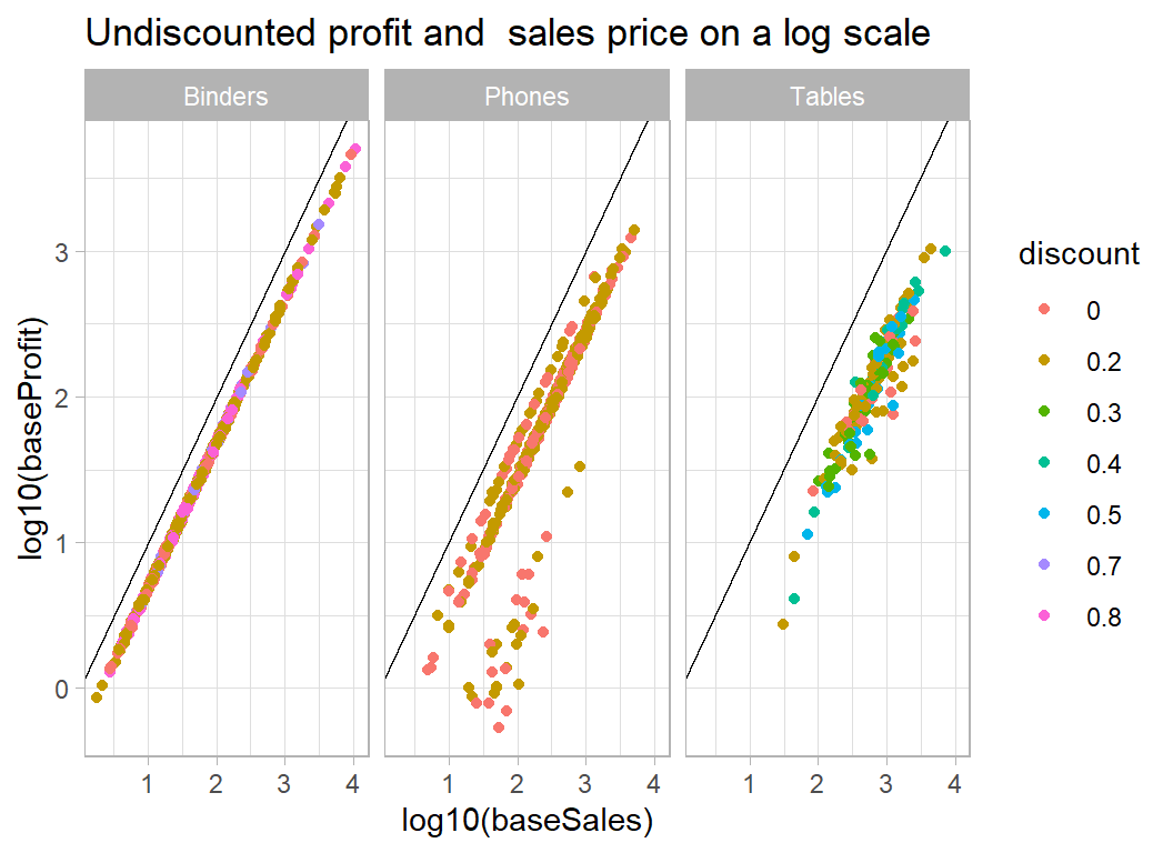
Clearly, there will be no problem predicting the profit on binders, though I find it hard to believe that $1000 was spent on a binder. It makes me suspect that the figures relate to the total amount spent over some fixed period in a given location, rather than individual transactions as I first thought. Phones too are fairly predictable but tables are more variable.
Here are some other products
# --- profit and sales for 3 other categories of item --------
trainRawDF %>%
  mutate( baseSales  = sales / (1 - discount),
          baseProfit = profit + sales * discount / (1 - discount) ) %>%
  mutate( discount = factor(discount)) %>%
  filter( baseProfit > 0.5 ) %>%
  filter( sub_category %in% c("Copiers", "Paper", "Accessories") ) %>%
  ggplot( aes(x=log10(baseSales), y=log10(baseProfit),
              colour=discount) ) +
  geom_point() +
  geom_abline( slope=1, intercept=0) +
  facet_wrap( ~ sub_category) +
  labs( title="Undiscounted profit and  sales price on a log scale")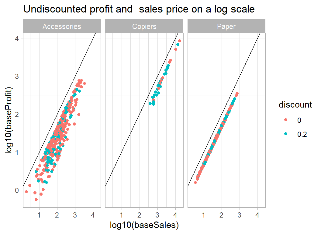
Paper is encouraging in that there is a single line regardless of discount, which suggests that our discount adjustment works well. We would expect accessories to be a variable category so the spread of the intercepts is not surprising.
The next question is, given that accessories is a wide category and we have no way of knowing what accessory was bought, is there anything in the data that will help predict the percentage profit. It could be that some people only buy items from this store if they are competitively priced. It seems far fetched but perhaps when the basic price is good value, people are more likely to opt for first class delivery, or maybe high profit items are more popular in some states than others. Even if there are such effects, my guess is that they will be very small. In practice, at this point I would contact the store and ask for a more detailed breakdown of the products.
Let’s look at accessories against some of the other potential predictors.
# --- accessories coloured by shipping mode -------------------
trainRawDF %>%
  mutate( baseSales  = sales / (1 - discount),
          baseProfit = profit + sales * discount / (1 - discount) ) %>%
  mutate(ship_mode = factor(ship_mode)) %>%
  filter( baseProfit > 0.5 ) %>%
  filter( sub_category == "Accessories")  %>%
  ggplot( aes(x=log10(baseSales), y=log10(baseProfit),
              colour=ship_mode) ) +
  geom_point() +
  geom_abline( slope=1, intercept=0) +
  labs( title="Undiscounted profit and  sales price for Accessories",
        subtitle="by mode of shipping")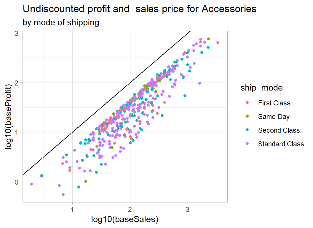
# --- accessories coloured by region --------------------------
trainRawDF %>%
  mutate( baseSales  = sales / (1 - discount),
          baseProfit = profit + sales * discount / (1 - discount) ) %>%
  mutate( region = factor(region)) %>%
  filter( baseProfit > 0.5 ) %>%
  filter( sub_category == "Accessories")  %>%
  ggplot( aes(x=log10(baseSales), y=log10(baseProfit),
              colour=region) ) +
  geom_point() +
  geom_abline( slope=1, intercept=0) +
  labs( title="Undiscounted profit and  sales price for Accessories",
        subtitle="by region")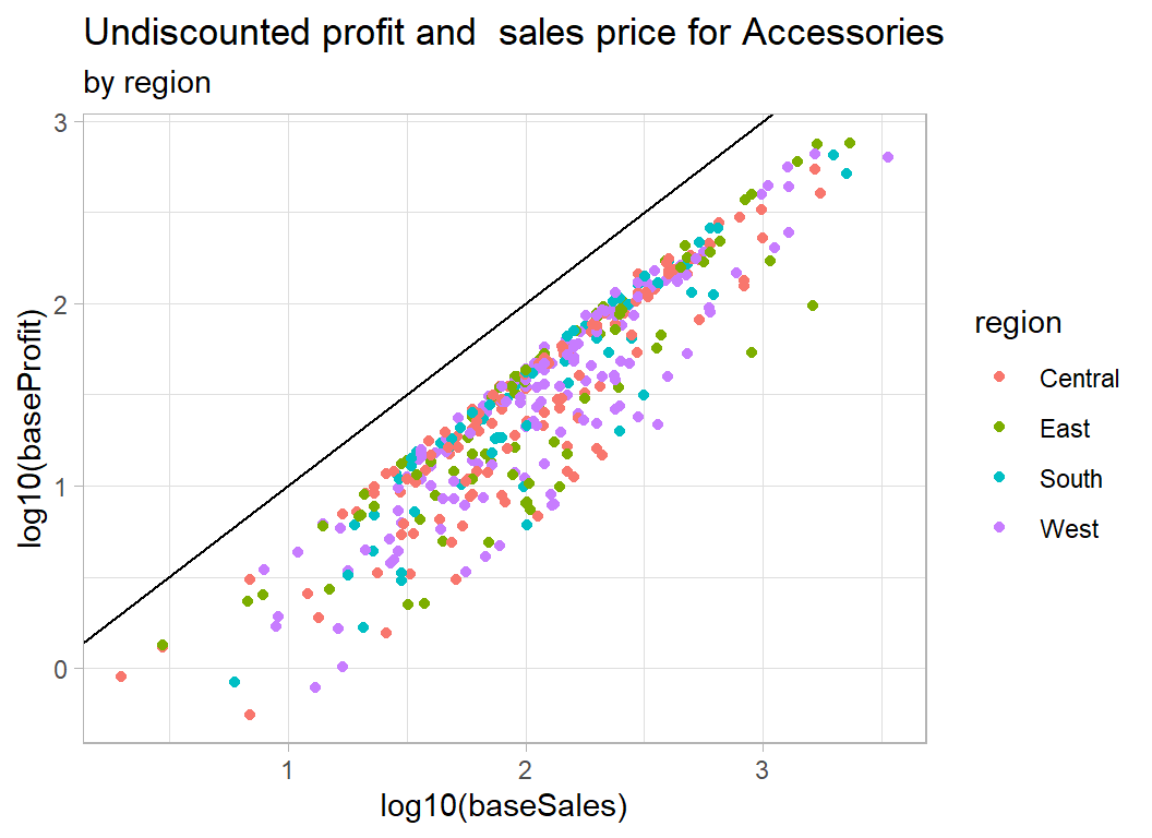
# --- accessories coloured by segment of the market -----------
trainRawDF %>%
  mutate( baseSales  = sales / (1 - discount),
          baseProfit = profit + sales * discount / (1 - discount) ) %>%
  mutate( segment = factor(segment)) %>%
  filter( baseProfit > 0.5 ) %>%
  filter( sub_category == "Accessories")  %>%
  ggplot( aes(x=log10(baseSales), y=log10(baseProfit),
              colour=segment) ) +
  geom_point() +
  geom_abline( slope=1, intercept=0) +
  labs( title="Undiscounted profit and sales price for Accessories",
        subtitle="by segment of market")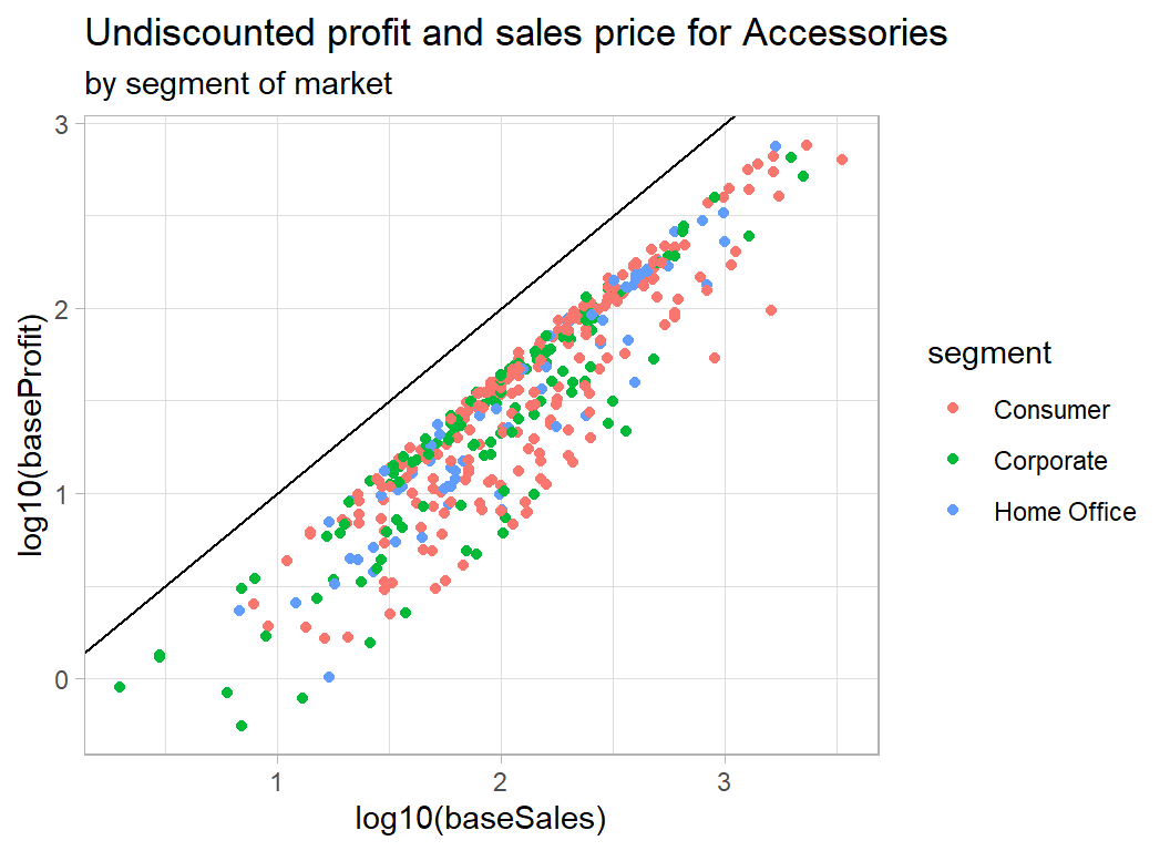
# --- accessories coloured by quantity -------------------
trainRawDF %>%
  mutate( baseSales  = sales / (1 - discount),
          baseProfit = profit + sales * discount / (1 - discount) ) %>%
  mutate(quantity = factor(quantity)) %>%
  filter( baseProfit > 0.5 ) %>%
  filter( sub_category == "Accessories")  %>%
  ggplot( aes(x=log10(baseSales), y=log10(baseProfit),
              colour=quantity) ) +
  geom_point() +
  geom_abline( slope=1, intercept=0) +
  labs( title="Undiscounted profit and sales price for Accessories",
        subtitle="by quantity")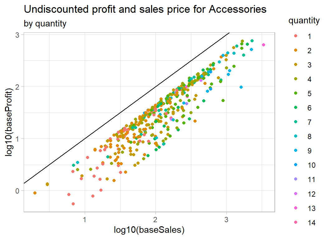
As expected, there is nothing clear cut. In the case of quantity, we appear to have the total sales price and total profit, so although quantity moves the sales price to the right, it is not obviously related to the percentage profit.
Data Cleaning
There are no missing values or unlikely looking values, so all we need to do is to add baseSales and baseProfit to the data frame.
# --- simple data cleaning ------------------------------------
trainRawDF %>%
  mutate( baseSales  = sales / (1 - discount),
          baseProfit = profit + sales * discount / (1 - discount) ) -> trainDF
Some models
First, we will create a model for predicting base profit from base sales and subcategory. We will work on a log10 scale and insist that the relationship with sales takes the form of a 45o line. We can do this by using an offset. An offset describes a term in a model for which the regression coefficient is known and does not need to be estimated; in this case we know that log10(baseSales) will have a coefficient of 1.
# --- base model: coefficients -----------------------------
trainDF %>%
  filter( baseProfit > 0.5 ) %>%
  { lm( log10(baseProfit) ~  sub_category,
              offset=log10(baseSales),
              data=.) } %>%
  tidy() %>%
  select( -statistic)
## # A tibble: 17 x 4
## term estimate std.error p.value
## <chr> <dbl> <dbl> <dbl>
## 1 (Intercept) -0.590 0.00862 0.
## 2 sub_categoryAppliances 0.0535 0.0139 1.23e- 4
## 3 sub_categoryArt 0.0820 0.0121 1.13e- 11
## 4 sub_categoryBinders 0.267 0.0106 3.09e-133
## 5 sub_categoryBookcases -0.157 0.0177 7.12e- 19
## 6 sub_categoryChairs -0.101 0.0129 4.98e- 15
## 7 sub_categoryCopiers 0.231 0.0307 6.55e- 14
## 8 sub_categoryEnvelopes 0.267 0.0170 2.33e- 54
## 9 sub_categoryFasteners 0.172 0.0196 2.22e- 18
## 10 sub_categoryFurnishings 0.0697 0.0117 2.33e- 9
## 11 sub_categoryLabels 0.266 0.0151 7.06e- 68
## 12 sub_categoryMachines 0.156 0.0244 1.87e- 10
## 13 sub_categoryPaper 0.266 0.0107 2.79e-131
## 14 sub_categoryPhones -0.0242 0.0118 4.03e- 2
## 15 sub_categoryStorage -0.304 0.0121 6.46e-134
## 16 sub_categorySupplies -0.184 0.0200 4.09e- 20
## 17 sub_categoryTables -0.138 0.0159 3.87e- 18So Accessories, which is alphabetically first, is the baseline product with an intercept of -0.59, so an average profit of 26%. The margin is better on Binders at (-0.590+0.257=-0.333) or 46% and so on.
We ought to treat the standard errors and p-values with caution because we know the variance is much greater for Accessories than it is for Binders; this violates one of the assumptions of the model. The effect of the violation will invalidate the standard errors but should not have much effect on the estimates or predictions.
The next question is whether any of the other factors add to the predictions. Because the variance differs by product, I’ll look at Accessories in the first instance.
# --- effect of other predictors on accessories -------------
trainDF %>%
  filter( baseProfit > 0.5 ) %>%
  filter( sub_category == "Accessories") %>%
  { lm( log10(baseProfit) ~  ship_mode + region + segment + quantity,
              offset=log10(baseSales),
              data=.) } %>%
  tidy() %>%
  select( -statistic)
## # A tibble: 10 x 4
## term estimate std.error p.value
## <chr> <dbl> <dbl> <dbl>
## 1 (Intercept) -0.572 0.0365 8.61e-46
## 2 ship_modeSame Day -0.0252 0.0557 6.52e- 1
## 3 ship_modeSecond Class -0.0375 0.0340 2.71e- 1
## 4 ship_modeStandard Class -0.0340 0.0289 2.41e- 1
## 5 regionEast -0.00435 0.0294 8.82e- 1
## 6 regionSouth 0.00362 0.0320 9.10e- 1
## 7 regionWest -0.0241 0.0259 3.53e- 1
## 8 segmentCorporate 0.0220 0.0238 3.55e- 1
## 9 segmentHome Office 0.0419 0.0280 1.35e- 1
## 10 quantity 0.00124 0.00452 7.84e- 1None of the p-values is even close to significance.
We could tentatively check over all categories
# --- effect of other predictors on all categories ---------
trainDF %>%
  filter( baseProfit > 0.5 ) %>%
  { lm( log10(baseProfit) ~  sub_category + ship_mode + region + segment
        + quantity,
              offset=log10(baseSales),
              data=.) } %>%
  tidy() %>%
  select( -statistic) %>%
  print(n=26)
## # A tibble: 26 x 4
## term estimate std.error p.value
## <chr> <dbl> <dbl> <dbl>
## 1 (Intercept) -0.592 0.0120 0.
## 2 sub_categoryAppliances 0.0533 0.0139 1.29e- 4
## 3 sub_categoryArt 0.0823 0.0121 1.00e- 11
## 4 sub_categoryBinders 0.266 0.0106 1.00e-132
## 5 sub_categoryBookcases -0.158 0.0177 6.09e- 19
## 6 sub_categoryChairs -0.101 0.0129 5.53e- 15
## 7 sub_categoryCopiers 0.231 0.0307 6.51e- 14
## 8 sub_categoryEnvelopes 0.266 0.0170 4.94e- 54
## 9 sub_categoryFasteners 0.172 0.0196 2.20e- 18
## 10 sub_categoryFurnishings 0.0697 0.0117 2.40e- 9
## 11 sub_categoryLabels 0.266 0.0151 7.51e- 68
## 12 sub_categoryMachines 0.156 0.0245 1.96e- 10
## 13 sub_categoryPaper 0.266 0.0107 5.54e-131
## 14 sub_categoryPhones -0.0245 0.0118 3.79e- 2
## 15 sub_categoryStorage -0.304 0.0121 4.04e-134
## 16 sub_categorySupplies -0.185 0.0200 3.64e- 20
## 17 sub_categoryTables -0.138 0.0159 5.14e- 18
## 18 ship_modeSame Day 0.00158 0.0122 8.97e- 1
## 19 ship_modeSecond Class 0.000948 0.00817 9.08e- 1
## 20 ship_modeStandard Class -0.00268 0.00689 6.98e- 1
## 21 regionEast 0.00927 0.00668 1.65e- 1
## 22 regionSouth 0.000356 0.00787 9.64e- 1
## 23 regionWest -0.00906 0.00609 1.37e- 1
## 24 segmentCorporate 0.00761 0.00550 1.66e- 1
## 25 segmentHome Office 0.000860 0.00663 8.97e- 1
## 26 quantity 0.000482 0.00107 6.53e- 1Nothing. Perhaps we ought to bootstrap the standard errors and maybe look at states or cities, but what is the point? There is such good a priori knowledge that it would be a waste of time.
Accuracy of predictions
Let’s start with the in-sample accuracy. First we will save the model fit
# --- base model -------------------------------
trainDF %>%
  filter( baseProfit > 0.5 ) %>%
  { lm( log10(baseProfit) ~  sub_category,
              offset=log10(baseSales),
              data=.) } -> mod
Here is a residual plot for this model.
# --- residual plot of base model --------------
augment(mod) %>%
  mutate( .resid = `log10(baseProfit)` - .fitted ) %>%
  ggplot( aes(x=.fitted, y=.resid, colour=sub_category)) +
  geom_point() +
  geom_hline(yintercept=0)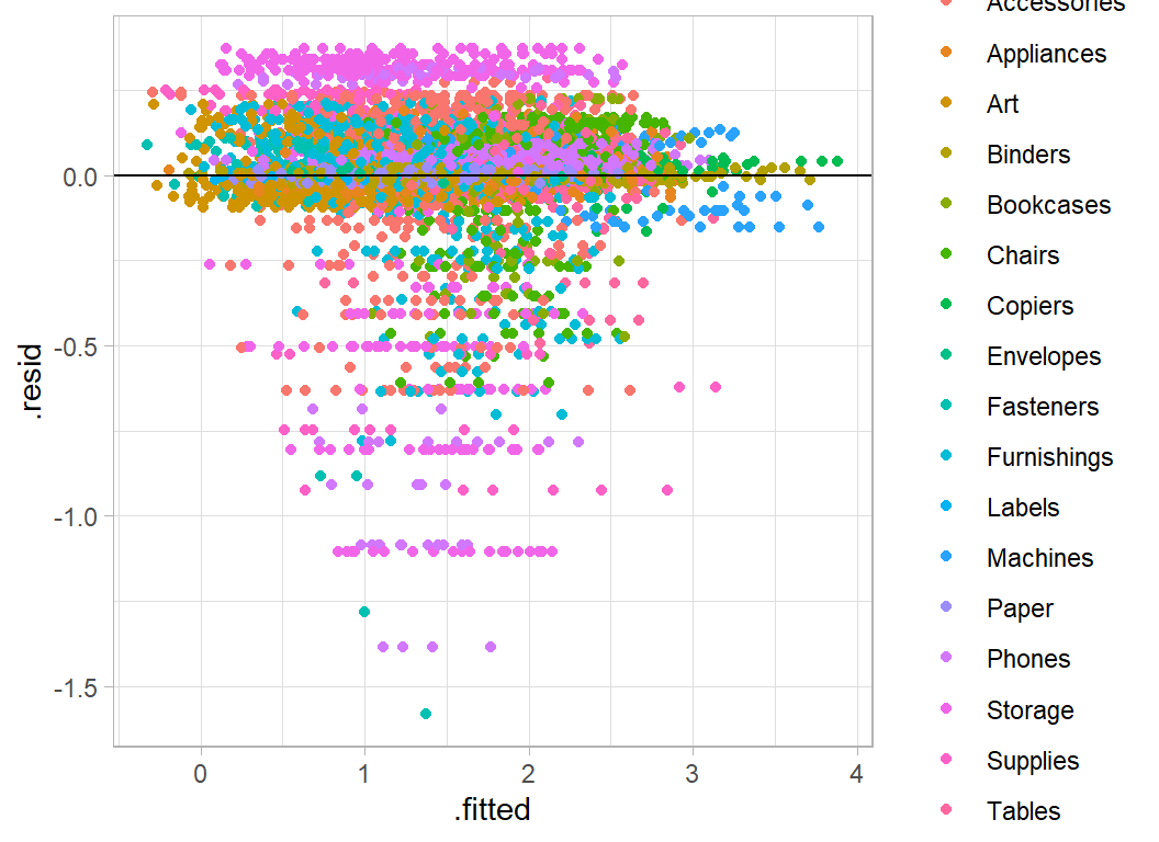
The horizontal bands reflect the different items within each subcategory.
Let’s back-calculate to find the in-sample rmse on the discounted scale.
# --- rmse of discounted data ------------------------------------
trainDF %>%
  # --- .fitted = predicted base profit --------------------------
  mutate( .fitted = 10 ^ predict(mod, newdata=.) ) %>%
  # --- yhat = predicted discounted profit -----------------------
  mutate( yhat = .fitted  - sales * discount / (1 - discount) ) %>%
  summarise( rmse = sqrt( mean( (profit - yhat)^2 ) ) )
## # A tibble: 1 x 1
## rmse
## <dbl>
## 1 53.653.6 is a good score given that the leaderboard rmses range from 116.9 (1st) to 263 (prediction with the average value for all items).
Here is the residual plot on the original (discounted) scale. I have added lines at plus/minus 500 to emphasise the largest prediction errors
# --- residual plot on the discounted scale ---------------------
trainDF %>%
  mutate( .fitted = 10 ^ predict(mod, newdata=.) ) %>%
  mutate( yhat = .fitted  - sales * discount / (1 - discount) ) %>%
  mutate( .resid = profit - yhat) %>%
  ggplot( aes(x=yhat, y=.resid)) +
  geom_point( alpha=0.5) +
  geom_hline(yintercept=0) +
geom_hline(yintercept=c(500, -500), lty=2) 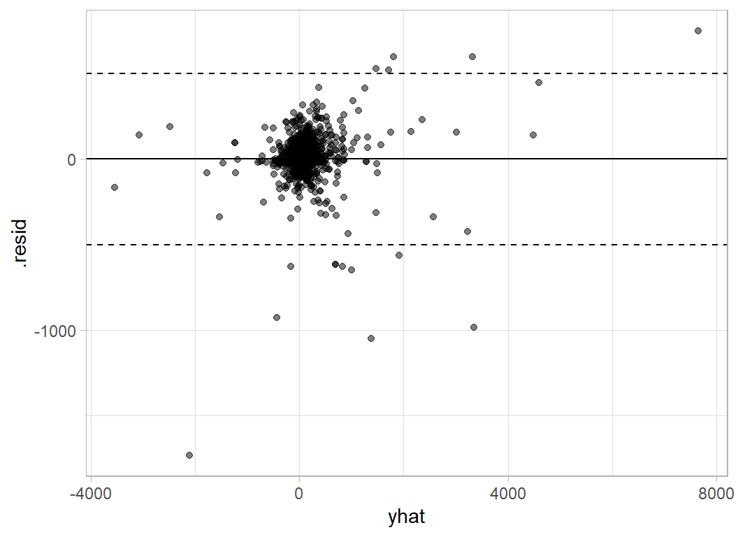
Here are the items with large prediction errors
# --- items poorly predicted ------------------------------------
trainDF %>%
  mutate( baseProfit = pmin(0.5, baseProfit)) %>%
  mutate( .fitted = 10 ^ predict(mod, newdata=.) ) %>%
  mutate( yhat = .fitted  - sales * discount / (1 - discount) ) %>%
  mutate( .resid = profit - yhat) %>%
  filter( abs(.resid) > 500 ) %>%
  select( id, sub_category, sales, profit, yhat, .resid)
## # A tibble: 15 x 6
## id sub_category sales profit yhat .resid
## <dbl> <chr> <dbl> <dbl> <dbl> <dbl>
## 1 5183 Machines 9100. 2366. 3351. -985.
## 2 6128 Machines 3992. 1996. 1470. 526.
## 3 4629 Machines 4644. 2229. 1710. 519.
## 4 9149 Supplies 4913. 197. 826. -630.
## 5 973 Machines 8000. -3840. -2108. -1732.
## 6 3667 Copiers 11200. 3920. 3323. 597.
## 7 6689 Machines 4800. 360. 1010. -650.
## 8 3086 Copiers 17500. 8400. 7653. 747.
## 9 3391 Machines 4900. 2401. 1805. 596.
## 10 1459 Machines 5200. 1352. 1915. -563.
## 11 7218 Machines 8160. -1360. -431. -929.
## 12 5464 Supplies 4164. 83.3 700. -617.
## 13 5253 Supplies 8188. 328. 1377. -1049.
## 14 1994 Supplies 4164. 83.3 700. -617.
## 15 9042 Supplies 3930. -786. -156. -630.Machines, Copiers and Supplies seem to cause the biggest problems. Machines and Copiers are expensive items so perhaps it should not surprise us that they can create large residuals, but why Supplies? Let’s look at the data plots for those items
# --- profit and sales for poorly predicted categories ----------
trainDF %>%
  filter( baseProfit > 0.5 ) %>%
  filter( sub_category %in% c("Machines", "Supplies", "Copiers") ) %>%
  mutate( discount = factor(discount)) %>%
  ggplot( aes(x=log10(baseSales), y=log10(baseProfit),
              colour=discount) ) +
  geom_point() +
  geom_abline( slope=1, intercept=0) +
    facet_wrap( ~ sub_category)  +
  labs( title="Undiscounted profit and  sales price on a log scale")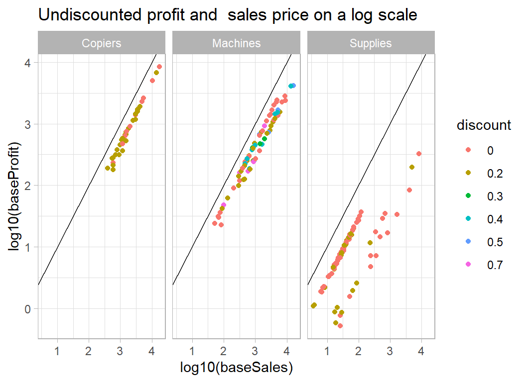
The problem with Supplies is that the majority of items in this category are cheap but have a high percentage profit, while a handful of sales are more expensive but less profitable. The model predicts a better return on the high sales and hence those items have large negative residuals. For machines (and copiers) the problem is that a few of items/sales were very expensive (over $10,000), so that an error in the predicted percentage profit has large consequences.
Not much we can do about it without more detailed information on the items.
Submission
The test data can be processed in exactly the same way.
# --- prepare submission -------------------------------------
testRawDF %>%
  mutate( baseSales  = sales / (1-discount) ) %>%
  mutate( .fitted = 10 ^ predict(mod, newdata=.) ) %>%
  mutate( yhat = .fitted  - sales * discount / (1 - discount) ) %>%
  rename( profit = yhat) %>%
  select( id, profit) %>%
  print() %>%
  write.csv( file.path( home, "temp/submission1.csv"),row.names=FALSE )
## # A tibble: 2,821 x 2
## id profit
## <dbl> <dbl>
## 1 5195 6.11
## 2 6540 -23.9
## 3 3606 -10.7
## 4 8514 3.32
## 5 6893 7.64
## 6 1936 -18.9
## 7 1593 -8.46
## 8 8245 6.84
## 9 4178 -61.4
## 10 3369 6.23
## # ... with 2,811 more rowsWhen I submitted these predictions as a late submission the RMSE was 97.48, far better than the other competition entries, which range from 116.9 (1st) to 263 (prediction with the average).
What this example shows:
It is a common fault that people see everything as evidence that they were right all along, but this example certainly plays into my prejudices about machine learning. In particular, the tendency of data scientists to be over-reliant on automatic algorithms.
When I taught statistical modelling, I tried to emphasise the importance of thinking about the problem; of course, data scientists will say that they think about the problem too, but I don’t see the evidence for that. Too often, machine learning involves data visualisation followed by XGBoost, and rarely do the plots have any impact on the models. It is as if they were two separate processes.
There is a movement within data science called probabilistic programming that is trying to correct these failings, but this is just a rediscovery of statistical modelling under a new name.
Perhaps, my rant is a little harsh, machine learning is a new discipline and so we must give it time to mature. As a statistician, I would not like to see my subject judged by statistical practice as it was 75 years ago.
When you employ a statistician, you get the understanding of the statistician together with the performance of the statistical model. Machine learning uses very similar models, but tries to use them automatically, that is to say, without human understanding. Take as an example a neural network that is designed to recognise images of cats and dogs. We all know that neural networks can be trained to perform incredibly well at this task, but we also know that by tweaking a few pixels, we can fool the network into deciding that a car is a dog. A human would not be confused by these changes, because they have a deeper understanding of what they are doing. Without human understanding, errors are bound to occur and performance levels will suffer.
No doubt, machine learning algorithms will eventually develop to the point where they imitate human understanding; not only will they fit a logistic regression, but they will understand when the model is appropriate and they will understand what the results mean and so they will spot errors. We are not yet at that stage and so human understanding is still needed in the modelling process. At present, it is still true that an analysis is only as good as the analyst that produced it.