Methods: Assessing MCMC Output
Introduction
My last methods post described how Probabilistic Programming Languages (PPLs) such as BUGS, nimble, stan and greta can be used to fit Bayesian models in R. These PPLs all use MCMC simulation, but they return their results in differently structured R objects, so I also gave the code of functions that take these objects and convert them into a standard tibble with one column for each parameter and one row for each iteration. In this post, I will consider how best to use the simulations once they have been converted into that standard form.
There are four distinct questions that need to be asked of any set of MCMC simulations and I will consider each in turn.
- Assessment of convergence: do the simulations correctly represent the posterior of the model?
- Simulation accuracy: assuming convergence, are the results accurate enough for our purposes?
- Model criticism: assuming convergence and accuracy, does the current model adequately capture the patterns in the data?
- Model interpretation: assuming that we happy with the model, how do the simulations help us answer the questions that motivated the analysis?
1. Assessment of Convergence
MCMC algorithms are very powerful, but they can go wrong. Much like an optimisation that settles on a local maximum, so an MCMC algorithm can get stuck exploring a remote region of the posterior and produce simulations that do not represent the true target. The problem for the data analyst is that they do not know what the true distribution looks like, so it is difficult for them to be sure whether or not the algorithm has worked.
One of the standard approaches is to assessing convergence is to run the analysis several times with different random number seeds and different initial values, in order to see if the various chains all arrive at the same posterior. Running at least three chains should be routine practice for any Bayesian analysis.
Within a single chain, we can get some idea of convergence by dividing the chain into sections; for instance, does the posterior described by the first 500 iterations resemble the posterior described by the last 500 iterations?
When an algorithm does not converge, the simulations should be inspected for clues as to why it has failed, so that the algorithm can be improved.
I’ll consider single chain assessment of convergence first, even though multiple chain assessment is the gold standard.
Single chain assessment
Trace plots
A lot of information can be obtained from a simple trace plot (time series plot) of a chain. By eye we can see,
- Whether or not different sections of the chain resemble one another
- Whether the chain is still moving towards the true posterior
- Whether the chain is moving freely across the distribution
There are several packages that will make a trace plot of a single chain, but the task is so straightforward that one might as well code it for oneself using ggplot2. For convenience I have created my own function called trace_plot() that I present in the appendix to this post. I supplement my trace plot with horizontal lines representing the 10%, 50% and 90% quantiles of the simulations and by a smoother that helps the eye detect any trend.
Here is the trace plot for a single OpenBUGS run obtained in the previous post on Bayesian software for the Poisson regression model of alcohol related deaths. MyPackage contains my Bayesian functions, including the trace_plot() function and bugs_to_df, which extracts the simulations and saves them in a data frame.
library(tidyverse)
library(MyPackage)

theme_set(theme_light())

# --- home folder on my computer -------------------------------------
home     <- "C:/Projects/kaggle/sliced/methods/methods_bayes_software"

# --- read single bugs chain & convert to a data frame ---------------
readRDS( file.path( home, "data/dataStore/alcBugs01.rds")) %>%
   bugs_to_df()  -> simBugsDF

# --- trace plot of parameter b1 -------------------------------------
trace_plot(simBugsDF, b1) +
  labs(title="Trace plot for the OpenBUGS analysis of parameter b1")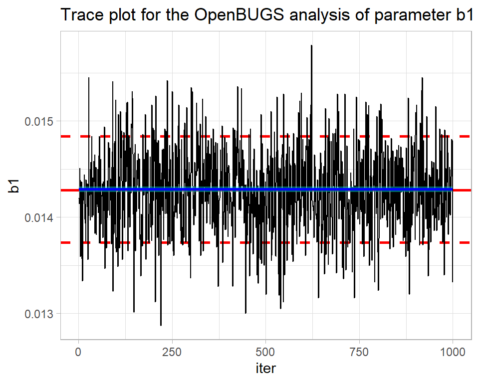
By eye all looks well. The blue smoothed line is reassuringly straight and horizontal. There is no drift up or down of the type that might suggest that the algorithm is still searching for the centre of the posterior distribution. What is more, the simulations move quickly across the distribution suggesting that the algorithm is mixing well, that is to say it is not getting stuck in one part of the posterior.
From the plot, we can see that the parameter b1 has a posterior mean of about 0.0144 and there is a high probability that its true value is somewhere between about 0.0138 and 0.0148.
The package bayesplot has been designed to work with stan, but can be used more generally. It includes its own versions of the standard Bayesian plots. For instance, here is the bayesplot version of the same trace plot.
library(bayesplot)

mcmc_trace(simBugsDF, pars="b1") +
  labs(title="bayesplot's trace of the OpenBUGS chain")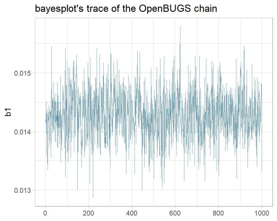
I prefer my own function and when it does not quite do what I want, I am happy to write ggplot2 code from scratch. None the less, bayesplot is widely used and if it suits you, you can read more about it at https://mc-stan.org/bayesplot/.
The nimble analysis of the same problem was less successful as its trace plot shows.
# --- single nimble chain -----------------------------------------
nimbleObject <- readRDS( file.path( home, "data/dataStore/alcNimble01.rds")) %>%
   nimble_to_df() -> simNimbleDF

trace_plot(simNimbleDF, b1) +
  labs(title="Trace plot for the nimble analysis of parameter b1")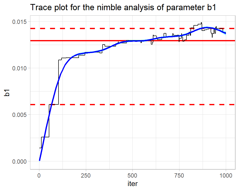
The contrast could hardly be more stark. This chain is struggling to find the posterior (drift) and the smooth is anything but straight and horizontal. The algorithm ends in the right ballpark with a median estimate of b1 is about 0.014, but without the OpenBUGS analysis for comparison, I would not have any confidence in that estimate.
The mixing is also poor. The flat regions within the trace show how the algorithm is getting stuck at the same value. nimble uses a Metropolis-Hastings algorithm, so when a proposal is rejected the algorithm repeats the current value. The flat regions extend over up to 50 iterations indicating the time needed before a proposal is accepted. There are theoretical papers that suggest that for a high-dimensional distribution, the ideal is accept on average every 4th proposal. An even higher acceptance rate might seem preferable, but it would mean that the proposed moves are too similar to the current value and such very short moves will be slow to cover the posterior.
The problem here is mine, not nimble’s; I did not use nimble very intelligently. In my experience, nimble’s defaults are not as good as those of OpenBUGS, so the user needs to work harder to tune the algorithm.
Here is the trace plot for the first stan chain.
# --- three bayes chains -----------------------------------------
stanObject <- readRDS( file.path( home, "data/dataStore/alcStanP01.rds")) %>%
   stan_to_df() -> simStanDF

# --- trace plot of b1 in chain 1 --------------------------------
trace_plot(simStanDF %>% filter(chain == 1), b1) +
  labs(title="Trace plot for the stan analysis of parameter b1")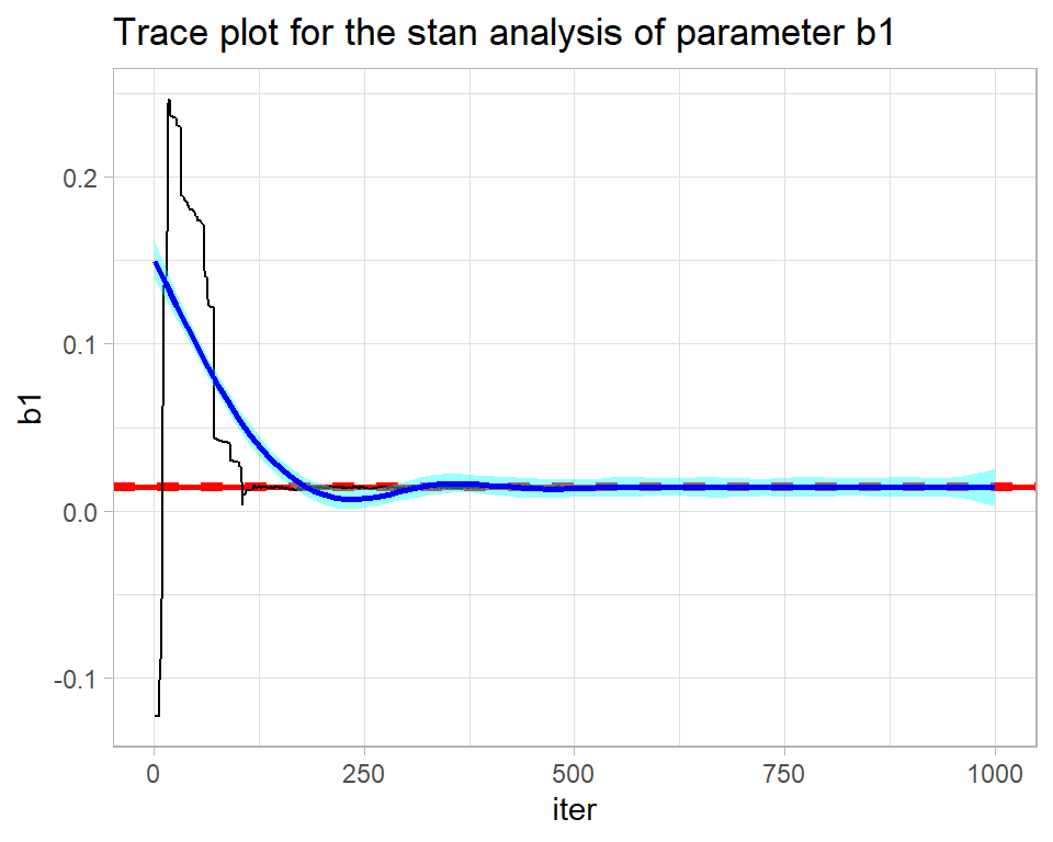
stan returns the full chain including the warmup during which the algorithm is being automatically tuned. The warmup of 500 iterations needs to be discarded before the chain is examined. The result is not perfect, but is not bad for such a short run.
# --- trace plot of b1 in chain 1 --------------------------------
trace_plot(simStanDF %>% filter(chain == 1 & iter > 500), b1) +
  labs(title="Trace plot for the stan analysis of parameter b1 after the warmup")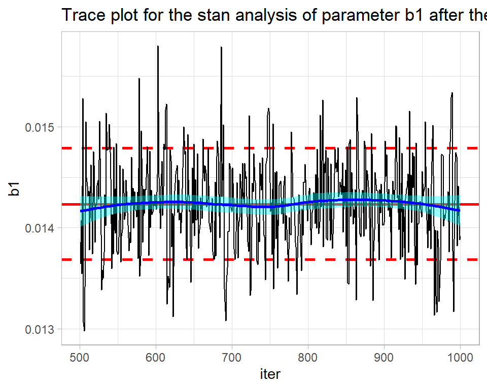
In my greta code, I placed all of the coefficients in a single vector, b, and the element corresponding to b1 is called b_2_1.
Here is the trace plot for the first greta chain.
# --- three greta chains -----------------------------------------
gretaObject <- readRDS( file.path( home, "data/dataStore/alcGretaP01.rds")) %>%
   greta_to_df() -> simGretaDF

# --- trace plot of b_2_1 (b1) in chain 1 ------------------------
trace_plot(simGretaDF %>% filter(chain == 1), b_2_1) +
  labs(title="Trace plot for the geta analysis of parameter b_2_1")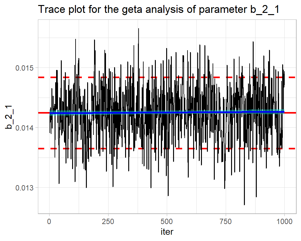
Pretty good. Quite similar to OpenBUGS.
Numerical measures of convergence
Sometimes it is helpful to have numerical measures that summarise the things that can be seen in a trace plot and a good way of obtaining such measures is by using the coda package. Coda requires the simulations in a special format, but it provides a function mcmc that does the conversion. My iter and chain columns need to be dropped before mcmc() is used.
library(coda)

# --- Coda versions of single chains from each program ------------
bugsCoda <- mcmc( simBugsDF %>%
                    select( -chain, -iter))

nimbleCoda <- mcmc( simNimbleDF %>%
                      select( -chain, -iter))

stanCoda <- mcmc( simStanDF %>%
                    filter(chain == 1 & iter > 500) %>%
                    select( -chain, -iter))

gretaCoda <- mcmc( simGretaDF %>%
                     filter(chain == 1) %>%
                    select( -chain, -iter))
Drift
The function. geweke.diag() runs the Geweke test and produces the Z-statistic for testing the mean level of the early part of a single chain against that of the late part of the same chain. If they have the same mean, the Z-statistic should lie in the range -2 to +2.
# ---- Geweke test of the OpenBUGS chain ------------------------
geweke.diag(bugsCoda)
##
## Fraction in 1st window = 0.1
## Fraction in 2nd window = 0.5
##
## b0 b1 b2_2 b2_3 b2_4 b2_5 b2_6 b2_7 b2_8 b2_9
## -0.1998 -1.3644 1.0031 0.2770 0.2470 0.3254 0.5552 0.3952 0.3079 0.1454
## b2_10 b2_11 b2_12 b2_13 b2_14 b3
## 0.2375 0.5882 0.5591 0.6532 0.6990 -1.0805The output tells us that we are comparing the first 10% of the chain with the last 50% (defaults that can be changed). b1 is fine, but most of the Z-statistics are only on the edge of acceptability. I would make trace plots of some of the other parameters before reaching any firm conclusions, but the message seems to be that OpenBUGS needs a longer burn-in and/or run length.
# ---- Geweke test of the nimble chain ------------------------
geweke.diag(nimbleCoda)
##
## Fraction in 1st window = 0.1
## Fraction in 2nd window = 0.5
##
## b0 b1 b2_1 b2_2 b2_3 b2_4 b2_5 b2_6 b2_7 b2_8 b2_9
## 7.069 -6.460 NaN -9.024 -7.942 -7.988 -7.948 -7.548 -7.454 -7.703 -7.886
## b2_10 b2_11 b2_12 b2_13 b2_14 b3
## -7.871 -8.192 -8.053 -8.494 -9.646 -7.356nimble includes b2_1 in its output, which I set to zero by definition in the code, hence its Z-statistic cannot be calculated. Otherwise, only b3 looks acceptable and b1, which we saw by eye was poorly estimated by nimble, is far from the worst.
# ---- Geweke test of the stan chain ------------------------
geweke.diag(stanCoda)
##
## Fraction in 1st window = 0.1
## Fraction in 2nd window = 0.5
##
## b0 b1 b2_1 b2_2 b2_3 b2_4 b2_5 b2_6 b2_7 b2_8
## 2.2400 -0.3684 -2.3648 -2.6567 -2.3395 -2.0911 -2.2546 -2.0953 -2.2223 -2.1183
## b2_9 b2_10 b2_11 b2_12 b2_13 b3 lp__
## -2.0742 -2.2851 -2.0781 -2.9519 -2.3356 -1.0902 -1.0011Stan includes the value of the log-posterior, lp__, in its results. Most parameters narrowly fail the Geweke test, though not b1.
# ---- Geweke test of the greta chain ------------------------
geweke.diag(gretaCoda)
##
## Fraction in 1st window = 0.1
## Fraction in 2nd window = 0.5
##
## b_1_1 b_2_1 b_3_1 b_4_1 b_5_1 b_6_1 b_7_1 b_8_1 b_9_1 b_10_1
## 6.1180 -1.6349 -6.9329 -5.4704 -4.9135 -5.5557 -5.4674 -5.5328 -5.8106 -5.4582
## b_11_1 b_12_1 b_13_1 b_14_1 b_15_1 b_16_1
## -5.9061 -5.8050 -5.5534 -8.2921 -4.9279 -0.5082Greta does not perform well, except for b1 (b_2_1) and b3 (b_16_1).
Mixing
A useful numerical measure of mixing is the autocorrelation of the trace. When the chain moves slowly the correlation between successive values will be high and when mixing is good the correlations will be close to zero. In coda, the autocorr.diag() function does the calculation for different lags; lag 1 represents pairs of successive values , lag 10 considers all values 10 iterations apart etc.
# --- OpenBugs autocorrelations ----------------------------
autocorr.diag(bugsCoda, lags=c(1, 10, 50))
## b0 b1 b2_2 b2_3 b2_4 b2_5
## Lag 1 0.006890701 0.04144456 0.01726486 0.005315357 0.004186384 0.01161818
## Lag 10 0.021793448 0.02826059 0.01808078 0.016217246 0.014844279 0.02919310
## Lag 50 0.076793288 -0.01126541 0.05829718 0.080474475 0.073435941 0.07204585
## b2_6 b2_7 b2_8 b2_9 b2_10 b2_11
## Lag 1 0.007445628 0.002076707 0.01041323 0.003638458 0.01049934 0.009299351
## Lag 10 0.029269141 0.016019588 0.02838359 0.025807343 0.02806000 0.029350644
## Lag 50 0.068886066 0.074163359 0.07831680 0.064317222 0.06579391 0.068715340
## b2_12 b2_13 b2_14 b3
## Lag 1 -0.0005394223 0.005584714 0.024139575 -0.01347989
## Lag 10 0.0250402843 0.037177764 -0.001309999 0.01896206
## Lag 50 0.0701128667 0.069079892 0.075023378 0.03897660The OpenBUGS output has reassuringly low correlations.
# --- greta autocorrelations -------------------------------
autocorr.diag(gretaCoda, lags=c(1, 10, 50))
## b_1_1 b_2_1 b_3_1 b_4_1 b_5_1 b_6_1 b_7_1
## Lag 1 0.9939465 0.208912057 0.9857715 0.9950138 0.9956158 0.9933520 0.9934959
## Lag 10 0.9581852 0.006839982 0.9234642 0.9536654 0.9592926 0.9574108 0.9584817
## Lag 50 0.8217326 -0.052734373 0.7855345 0.8139601 0.8219693 0.8201945 0.8227359
## b_8_1 b_9_1 b_10_1 b_11_1 b_12_1 b_13_1 b_14_1
## Lag 1 0.9937467 0.9936218 0.9933464 0.9926820 0.9923370 0.9961815 0.9964108
## Lag 10 0.9578131 0.9574300 0.9582403 0.9574606 0.9569428 0.9634691 0.9633897
## Lag 50 0.8191887 0.8208239 0.8232843 0.8194217 0.8228475 0.8312546 0.8187056
## b_15_1 b_16_1
## Lag 1 0.9943584 0.25572782
## Lag 10 0.9449027 -0.01691752
## Lag 50 0.7536832 0.03581114Greta has high correlations for most parameters, but is OK for b1 and b3.
Multiple Chain Assessment
I read the three BUGS chains using my function bayes_to_df(), which reads saved simulations from named files and combines them into a single tibble.
# --- names of the three BUGS rds files --------------------------
file.path( home, paste("data/dataStore/alcPar0", 1:3,
                                ".rds",sep="")) %>%
  # --- combine the saved results --------------------------------
  bayes_to_df() -> simBugs3DF
The key assessment is the comparison of the three chains, which we could create by making three trace plots. My trace_plot() function does this automatically.
# --- plot of the three chains ---------------------------------
trace_plot(simBugs3DF, b1)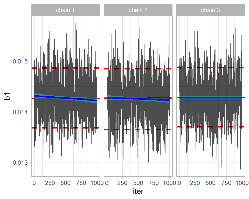
The chains seem to be in reasonable agreement. Perhaps, the first two are drifting down slightly, suggesting that a longer burn-in is needed.
The good numerical comparison of multiple chains is provided by an analysis of variance; how does the variance between chains compare with the variance within chains?
This idea is captured in the Gelman-Rubin-Brooks statistic, R, which is scaled so that chains drawn from identical distributions would have R=1. Due to random sampling, the estimated R (usually called Rhat) might be greater than 1, but not greatly so. The threshold for what Rhat is acceptable has changed over time; originally, anything below 1.20 was accepted, then 1.1 was used and now most people require Rhat to be below 1.05.
This statistic is available in coda via the gelman.diag() function. To convert a tibble of multiple chains to coda format, coda provides the mcmc.list() function.
# --- coda format of the 3 OpenBUGS chains ------------------------
bugs3Coda <- mcmc.list( mcmc( simBugs3DF %>%
                       filter( chain == 1) %>%
                       select(-chain, -iter)),
                     mcmc( simBugs3DF %>%
                       filter( chain == 2) %>%
                       select(-chain, -iter)),
                     mcmc( simBugs3DF %>%
                       filter( chain == 3) %>%
                       select(-chain, -iter)) )

# --- Gelman-Rubin-Brooks statistics ------------------------------
gelman.diag(bugs3Coda)
## Potential scale reduction factors:
##
## Point est. Upper C.I.
## b0 1.18 1.54
## b1 1.00 1.00
## b2_2 1.18 1.51
## b2_3 1.18 1.53
## b2_4 1.19 1.55
## b2_5 1.18 1.53
## b2_6 1.19 1.55
## b2_7 1.19 1.54
## b2_8 1.19 1.55
## b2_9 1.19 1.54
## b2_10 1.18 1.53
## b2_11 1.19 1.54
## b2_12 1.18 1.52
## b2_13 1.17 1.50
## b2_14 1.16 1.46
## b3 1.00 1.01
##
## Multivariate psrf
##
## 1.11b1 and b3 (the coefficients of year and gender) are acceptable, but the others would fail the test. Typically, the Rhats are just under 1.20 and the upper limits of their 95% CIs would stretch to around 1.50. For illustration, here is are the trace plots of b2_4 the 4th age category. The plot illustrates the problem detected by Rhat.
# --- 3 chain trace plot of b2_4 -----------------------------------
trace_plot(simBugs3DF, b2_4)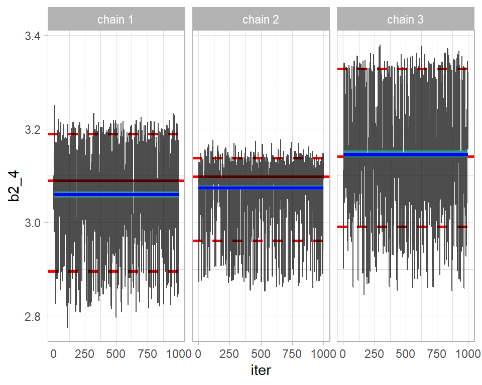
The academic literature contains countless other plots and statistics for convergence assessment, but a combination of trace plots, the geweke test, autocorrelation and Rhat will suffice for most problems.
Merging chains
When multiple chains are run and they all converge to the same distribution, then those chains can be combined into one for subsequent analysis.
2. Simulation accuracy
Provided that we are happy that the algorithm has converged, i.e located and covered the true posterior, the next question is whether they describe the posterior with sufficient accuracy. Of course, the answer will depend on what you want from the posterior. Estimating the posterior mean is usually quite simple, but estimating the 99% percentile of the posterior would be much more demanding because that estimate would be sensitive to a small subset of extremely large simulations. Keeping this in mind, most people concentrate on the accuracy of the posterior mean.
The key to accuracy is the standard error of the mean, but the autocorrelation in MCMC simulations makes this difficult to estimate. Coda uses a time series approach to estimating the standard error, which gives reasonable results.
The standard error of the posterior mean is sometimes called the MCMC Error, a name that I prefer because it emphasises that it tell us about the accuracy of the MCMC chain, rather than anything about the parameter.
We know that the nimble chain has very high autocorrelation, so I use that chain for illustration. coda::summary() produces two tables of results, but here I am only interested in the first of these.
# --- first table returned by coda::summary() ------------------
summary(nimbleCoda)[[1]]
## Mean SD Naive SE Time-series SE
## b0 -0.27476242 0.356351606 1.126883e-02 0.289473864
## b1 0.01193991 0.002867817 9.068835e-05 0.001303865
## b2_1 0.00000000 0.000000000 0.000000e+00 0.000000000
## b2_2 0.12143075 0.330514249 1.045178e-02 0.248454251
## b2_3 1.15088000 0.328160617 1.037735e-02 0.260610968
## b2_4 1.87299856 0.329783507 1.042867e-02 0.266510478
## b2_5 2.42750142 0.330193195 1.044163e-02 0.268952478
## b2_6 2.79904144 0.329082370 1.040650e-02 0.269984074
## b2_7 2.98838024 0.330207155 1.044207e-02 0.273725537
## b2_8 3.06305465 0.329449550 1.041811e-02 0.267751524
## b2_9 3.03905896 0.330560969 1.045326e-02 0.271384005
## b2_10 2.88153019 0.329186091 1.040978e-02 0.268113554
## b2_11 2.52249280 0.329222017 1.041091e-02 0.266488262
## b2_12 2.15396109 0.330057753 1.043734e-02 0.244815436
## b2_13 1.67765258 0.331872046 1.049472e-02 0.256510828
## b2_14 1.02544812 0.330460227 1.045007e-02 0.220627662
## b3 0.76421914 0.010234748 3.236511e-04 0.002553265So for b1 the naive estimate of the MCMC error that ignores autocorrelation is 0.000091, while the more appropriate time series MCMC error is 0.00130, about 14 times larger.
Rounding everything for simplicity and taking the mean plus or minus 2 standard deviations as the range of a distribution. The analysis suggests that the coefficient of year, b1, is between 0.012-2*0.003=0.006 and 0.012-2*0.003=0.018 with the posterior mean at 0.012. However, these values are themselves estimates that become more accurate the longer the chain and at present the chain of length 1000 measured the mean, 0.012, to within about 2*0.001= 0.002. We expect the true posterior mean to be between 0.010 and 0.014. If this is not accurate enough for your purposes, then run the chain for longer.
A useful measure of performance of the algorithm is the ratio of the two standard errors. It captures the loss due to autocorrelation.
# --- Ratio of True (time-series) SE to ideal (naive) SE -----------
summary(nimbleCoda)[[1]] %>%
  as_tibble( rownames="term") %>%
  mutate( ratio =  `Time-series SE` / `Naive SE`) %>%
  select( term, Mean, ratio)
## # A tibble: 17 x 3
## term Mean ratio
## <chr> <dbl> <dbl>
## 1 b0 -0.275 25.7
## 2 b1 0.0119 14.4
## 3 b2_1 0 NaN
## 4 b2_2 0.121 23.8
## 5 b2_3 1.15 25.1
## 6 b2_4 1.87 25.6
## 7 b2_5 2.43 25.8
## 8 b2_6 2.80 25.9
## 9 b2_7 2.99 26.2
## 10 b2_8 3.06 25.7
## 11 b2_9 3.04 26.0
## 12 b2_10 2.88 25.8
## 13 b2_11 2.52 25.6
## 14 b2_12 2.15 23.5
## 15 b2_13 1.68 24.4
## 16 b2_14 1.03 21.1
## 17 b3 0.764 7.89This tells us that we are losing a lot of information due to the autocorrelation in the chain, but that is not the same as saying that the chain is not good enough. The information left may be sufficient for your needs.
Often the information loss is summarised by the effective sample size, for which coda has a function.
effectiveSize(nimbleCoda)## b0 b1 b2_1 b2_2 b2_3 b2_4 b2_5 b2_6
## 1.515440 4.837683 0.000000 1.769651 1.585578 1.531191 1.507249 1.485706
## b2_7 b2_8 b2_9 b2_10 b2_11 b2_12 b2_13 b2_14
## 1.455266 1.513958 1.483661 1.507459 1.526236 1.817617 1.673902 2.243461
## b3
## 16.068029This says that the 1000 correlated nimble samples of b1 are equivalent to about 5 (4.84) random draws from the posterior of b1. The information loss is huge. The effective sample size is calculated as Run length/(SEratio^2), i.e. 1000/14^2=5.
Would you be willing to work with an analysis that describes a posterior by 5 random values drawn from that distribution. Probably not, in which case a longer chain is needed, or you could look for an algorithm with lower autocorrelation.
If you wanted the equivalent of 50 random values from the posterior of b1, then you would need an equivalent nimble chain that is 10 times as long, i.e. 10,000 iterations.
4. Describing the posterior
I am going to take the next two questions out of order, because model evaluation, which logically should come next, requires samples from the predictive distribution as well as the posterior.
Let’s move on to the situation in which we are happy with the model and the convergence and accuracy of the algorithm. Now we need to interpret the results. For illustration, I’ll concentrate on b1, the coefficient of year, and I’ll use the combined three OpenBUGS chains.
I start by combining the 3 chains and plotting the posterior density
# --- Posterior density ----------------------------------------
simBugs3DF %>%
  ggplot( aes(x=b1)) +
  geom_density( fill="steelblue")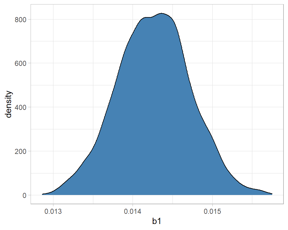
The message is that the distribution is fairly symmetrical and centred close to 0.0142. With high probability, b1 is between 0.0130 and 0.0155. We can be sure that alcohol related deaths are increasing over time because there is no support for a negative b1.
In a Poisson regression, b1, is the log relative rate, so we might prefer to look at the relative rate, or even the percentage change. One of the nice features of simulations is that, unlike summary statistics, we can transform them.
# --- density of the relative rate -----------------------------
simBugs3DF %>%
  ggplot( aes(x=exp(b1))) +
  geom_density( fill="steelblue") +
  labs(x="relative annual increase in alcohol related deaths")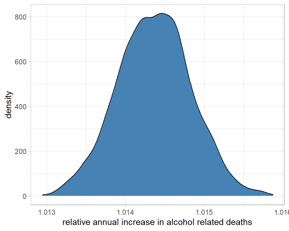
On average, each year the number of deaths increases by a factor that we estimate to be about 1.0145 or 1.45%
# --- density of the percentage increase per year --------------
simBugs3DF %>%
  ggplot( aes(x=100*(exp(b1)-1))) +
  geom_density( fill="steelblue") +
  labs(x="annual percentage increase in alcohol related deaths")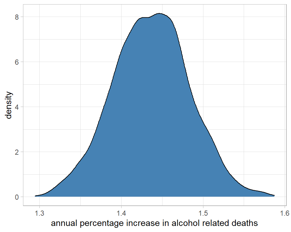
I could use the summary() function from coda to make these interpretations more precise. It is important to transform the raw simulations and then calculate the summary statistics. You cannot transform the summary statistics of the raw simulations.
# --- max digits to display -----------------------------------
options(pillar.sigfig = 7)
# --- percentage changes associated with each coefficient -----
simBugs3DF %>%
  select( -chain, -iter) %>%
  mutate( across(everything(), ~ 100*(exp(.)-1) ))  %>%
  mcmc() %>%
  summary() %>%
  { .[[1]]} %>%
  as_tibble(rownames="term") %>%
  filter( term != "b0" ) %>%
  select( term, Mean, SD) %>%
  mutate( across(Mean:SD, ~ round(., 2) ) )
## # A tibble: 15 x 3
## term Mean SD
## <chr> <dbl> <dbl>
## 1 b1 1.44 0.05
## 2 b2_2 284.71 42.97
## 3 b2_3 975.14 118.64
## 4 b2_4 2117.15 243.51
## 5 b2_5 3760.92 422.65
## 6 b2_6 5490.2 612.03
## 7 b2_7 6660.67 739
## 8 b2_8 7182.36 795.06
## 9 b2_9 7013.71 778.13
## 10 b2_10 5972.78 663.5
## 11 b2_11 4138.15 463.74
## 12 b2_12 2835.84 323.16
## 13 b2_13 1725.47 203.91
## 14 b2_14 853.93 108.52
## 15 b3 117.66 1.23So the rate is about 1.4% higher each year, b3 says that men have a rate that is 118% (more than double) higher than women and relative to the baseline age group of 20-24 year olds, other age groups are much higher.
The useful feature of posterior distributions is their probability interpretation. We could for example calculate the probability that the true annual increase is over 1.5%, which turns out to be about 0.09.
simBugs3DF %>%
  mutate( pct = 100*(exp(b1)-1) ) %>%
  summarise( prb = mean(pct > 1.5))
## # A tibble: 1 x 1
## prb
## <dbl>
## 1 0.0893. Model Criticism
Strictly, I should have addressed model criticism before interpreting the results, but criticism relies heavily on the predictive distribution, so it is convenient for me to deal with it last.
Good models make accurate predictions, so the quality of a model can be assessed by comparing real data with model predictions. Ideally, the real data should be different from those that were used to fit the model, but that is not always practical and often we have to resort to model assessment based on predictions for the analysis dataset.
Bayesian models produce predictive distributions, so unlike traditional statistics or machine learning, the model criticism will compare a real data point with a distribution.
For illustration, I will take the example of the number of deaths in men aged 40-44 in 2005 and I’ll start by finding the observed number.
# --- read the raw data --------------------------------------------
home     <- "C:/Projects/kaggle/sliced/methods/methods_bayes_software"
filename <- "alcoholspecificdeaths2020.xlsx"

alcDF <- readRDS( file.path(home, "data/rData/alc.rds"))

# --- select the row of interest ------------------------------------
alcDF %>%
  filter( age == "40-44" & gender == "male" & year == "2005")
## # A tibble: 1 x 5
## # Groups: gender, age [1]
## year age gender deaths pop
## <dbl> <fct> <chr> <dbl> <dbl>
## 1 2005 40-44 male 432 21.82432 deaths in a population of 2.18million.
What does the model predict? I’ll use theOpenBUGS analysis based on a single chain of 1000 iterations. The predicted mean log number of deaths, mu, for the selected group isThe true values of the parameters b0, b1, b2_5, b3 are not known, but we do have 1000 estimates of their values, so we can create 1000 estimates of mu. The predicted number of deaths will be a poisson value with a mean of exp(mu).
# --- seed for reproducibility -------------------------------------
set.seed(9823)
# --- predictions for the selected group ---------------------------
simBugsDF %>%
  mutate( mu = b0 + 4*b1 + b2_5 + b3 + log(21.8),
          pred_mean_deaths = exp(mu),
          pred_deaths = rpois(1000, pred_mean_deaths)) %>%
  select( mu, pred_mean_deaths, pred_deaths) %>%
  print() -> predictionDF
## # A tibble: 1,000 x 3
## mu pred_mean_deaths pred_deaths
## <dbl> <dbl> <int>
## 1 6.046010 422.4242 440
## 2 6.032970 416.9515 409
## 3 6.049150 423.7527 395
## 4 6.036170 418.2879 390
## 5 6.040970 420.3005 415
## 6 6.025350 413.7864 377
## 7 6.038490 419.2595 441
## 8 6.023290 412.9349 417
## 9 6.060390 428.5425 438
## 10 6.047270 422.9568 434
## # ... with 990 more rowsA density plot gives a good summary of the predictive distribution.
# --- predicted number of deaths -----------------------------------
predictionDF %>%
  ggplot( aes(x=pred_deaths)) +
  geom_density( fill="steelblue") +
  geom_vline( xintercept=432, size=2, colour="red") +
  labs( title="Predict deaths in men aged 40-44 in 2005")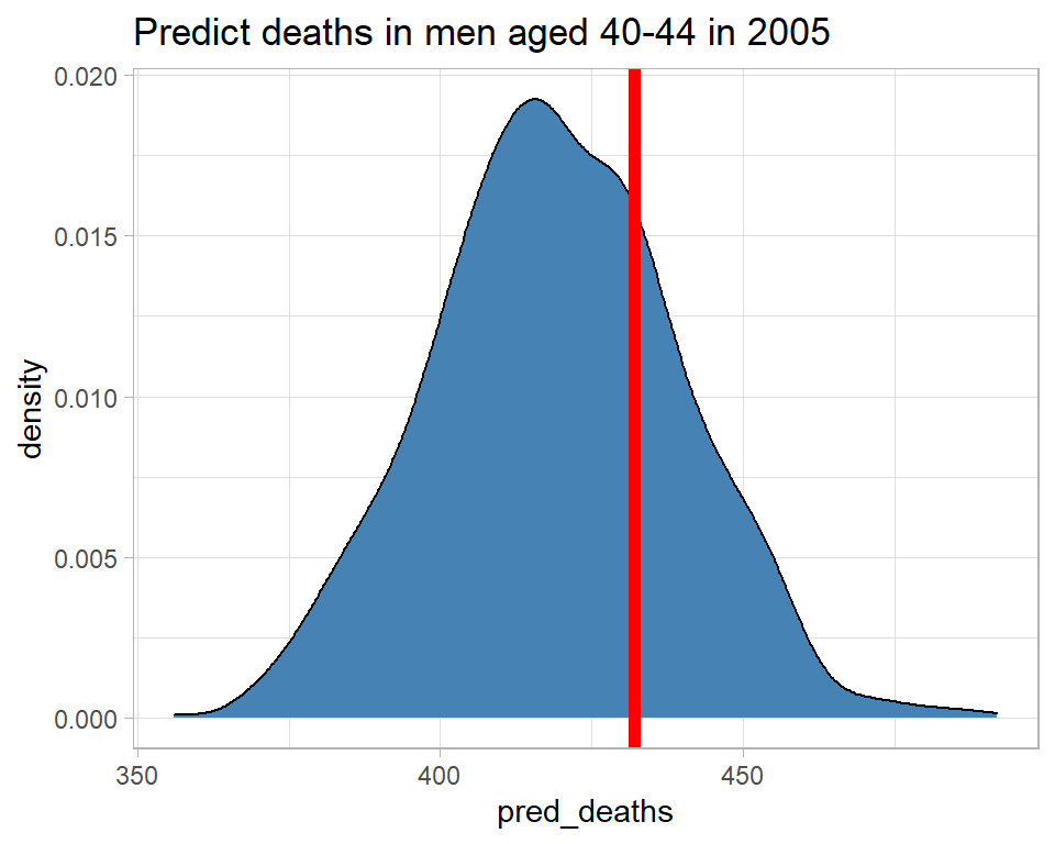
The model predicts between about 370 and 470 deaths and there were, in fact, 432, which is consistent with the predictive distribution. So this observation gives us no reason to doubt the model.
A number of measures have been suggested to capture the consistency of the observation and the predictive distribution, of which I will illustrate two. I find that the Bayesian residual, r, is the most useful summary unless the shape of the predictive distribution is very non-normal, in which case the Bayesian p-value is more reliable.
Here are the two measures calculated for men aged 40-44 in 2005.
# --- two measures of surprise -------------------------------------
predictionDF %>%
  summarise( p = mean( pred_deaths >= 432 ),
             r = (432 - mean(pred_deaths))/sd(pred_deaths))
## # A tibble: 1 x 2
## p r
## <dbl> <dbl>
## 1 0.27 0.6361520The predictive p-value is the tail probability associated with the actual observation. In this case the model suggests a 27% chance that the number of deaths would be 432 or more. So 432 is not that surprising. Had p been, say, 0.01 or 0.99 then there would be reason to question the model.
The Bayesian residual, r, is 0.58 so the observed number of deaths is only just over half a standard deviation from the mean, not a very surprising result. Had r been outside -2 to +2, I might have questioned the model.
All we need to do now is automate this calculation and find the measures of surprise for all of the observations. Places were the model predicts poorly should indicate ways of improving the model.
# --- measures of surprise for all 560 observations -------------------
set.seed(5619)
# --- space in alcDF to hold the measures -----------------
alcDF$p <- alcDF$r <- 0
# --- loop over the 560 observations ----------------------
nObs <- nrow(alcDF)
for( i in 1:nObs) {
  # --- data for that row ---------------------------------
  nYears <- alcDF$year[i] - 2001
  male   <- as.numeric(alcDF$gender[i] == "male")
  ageGp  <- as.numeric(alcDF$age[i])
  offset <- log(alcDF$pop[i])
  d      <- alcDF$deaths[i]
  simBugsDF %>%
    mutate( mu = b0 + nYears*b1 + male*b3 + offset,
            mu = ifelse( ageGp == 1, mu, mu + simBugsDF[[ageGp+3]]),
            pred_mean_deaths = exp(mu),
            pred_deaths = rpois(1000, pred_mean_deaths)) %>%
    summarise( p = mean( pred_deaths > d ),
               r = (d - mean(pred_deaths))/sd(pred_deaths)) -> surpDF
  # --- add measures to alcDF -----------------------------
  alcDF$p[i] <- surpDF$p
  alcDF$r[i] <- surpDF$r
}
alcDF %>%
  ungroup() -> alcDF

# --- show measures --------------------------------------------------
alcDF %>%
  arrange( desc(abs(r)))
## # A tibble: 560 x 7
## year age gender deaths pop r p
## <dbl> <fct> <chr> <dbl> <dbl> <dbl> <dbl>
## 1 2018 70-74 male 471 12.33 9.226007 0
## 2 2020 70-74 male 479 12.33 8.558862 0
## 3 2019 40-44 male 349 21.82 -7.255436 1
## 4 2020 75-79 male 259 9.23 7.169238 0
## 5 2017 75-79 male 248 9.23 6.881285 0
## 6 2020 55-59 female 534 19.62 6.399612 0
## 7 2020 65-69 male 717 14.87 6.373617 0
## 8 2009 40-44 male 563 21.82 5.746027 0
## 9 2019 35-39 male 199 21.72 -5.495433 1
## 10 2015 40-44 male 369 21.82 -5.468915 1
## # ... with 550 more rowsIt looks as though the model did a particularly poor job of predicting for men aged 70-74 in 2018, so let’s look at that particular predictive distribution.
# --- seed for reproducibility ---------------------------------------
set.seed(1323)
# --- predictive distribution for men aged 70-74 in 2018 -------------
simBugsDF %>%
  mutate( mu = b0 + 17*b1 + b2_11 + b3 + log(12.3),
          pred_mean_deaths = exp(mu),
          pred_deaths = rpois(1000, pred_mean_deaths)) %>%
  select( mu, pred_mean_deaths, pred_deaths) %>%
  ggplot( aes(x=pred_deaths)) +
  geom_density( fill="steelblue") +
  geom_vline( xintercept=471, size=2, colour="red")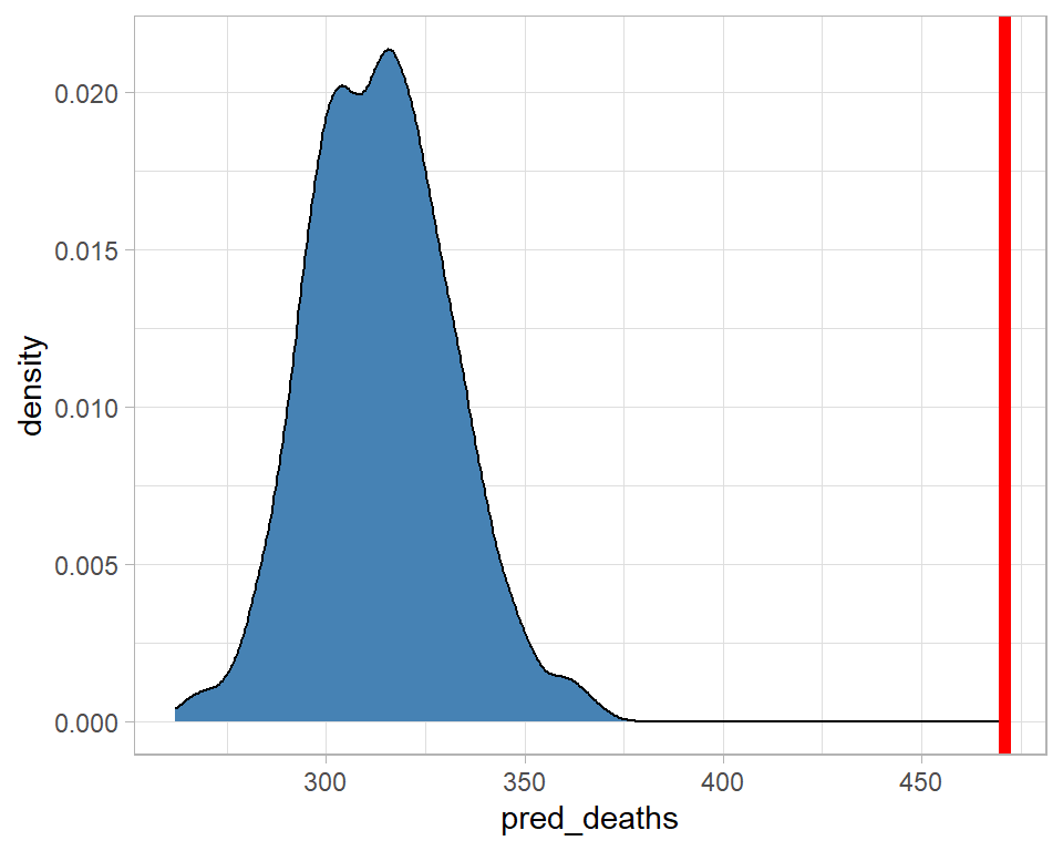
The model predicted about 320 deaths, with zero probability that there would be more than about 375, yet there were 471. The model fails quite dramatically for this category.
Here is a plot of the Bayesian residuals by age and gender. The individual points represent different years within the age-gender categories.
# --- Bayesian residuals ------------------------------------------
alcDF %>%
  ggplot( aes(x=age, y=r, fill=gender)) +
  geom_boxplot() +
  geom_hline( yintercept=c(-2,0,2), colour="red", lty=c(2,1,2)) +
  labs(y="Residual",
       title="Observations that are surprising under the model")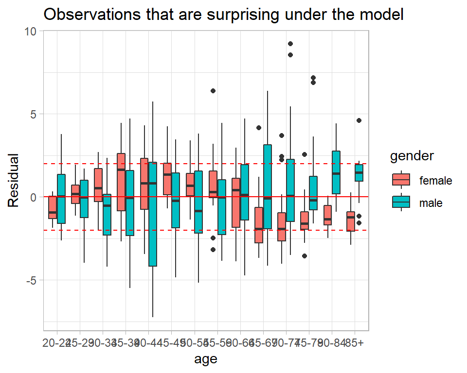
In the older age groups the model often under predicts the data for men and over predicts the data for women. Perhaps, an age by gender interaction is needed.
We get the same information from the predictive p-values.
# --- Predictive p-values -------------------------------------------
alcDF %>%
  ggplot( aes(x=age, y=p, fill=gender)) +
  geom_boxplot() +
  geom_hline( yintercept=c(0.05, 0.5, 0.95), colour="red", lty=c(2,1,2)) +
  labs(y="Predictive p-value",
       title="Observations that are surprising under the model")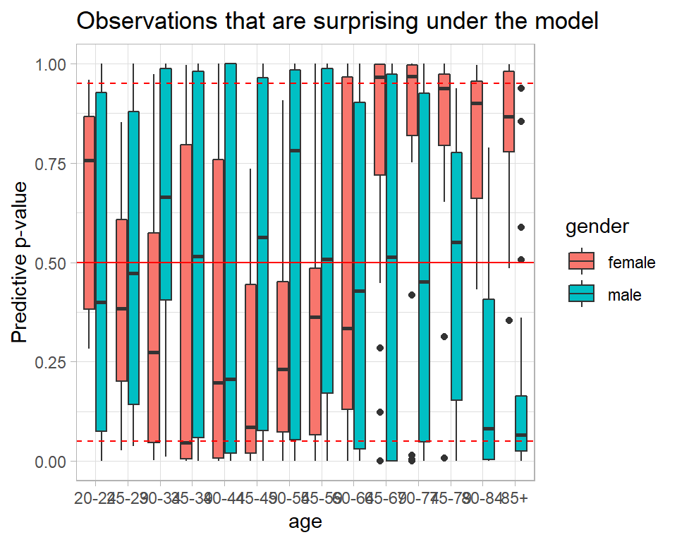
Were the model perfect, the p-values would follow a uniform (0,1) distribution. So we could make a probability plot
alcDF %>%
  arrange(p) %>%
  mutate( expected = (row_number() - 0.5)/n() ) %>%
  ggplot( aes(x=expected, y=p)) +
  geom_point() +
  geom_abline() +
  labs( x = "Expected p-value",
        y = "Observed p-value",
        title = "Probability Plot for the Poisson Regression model")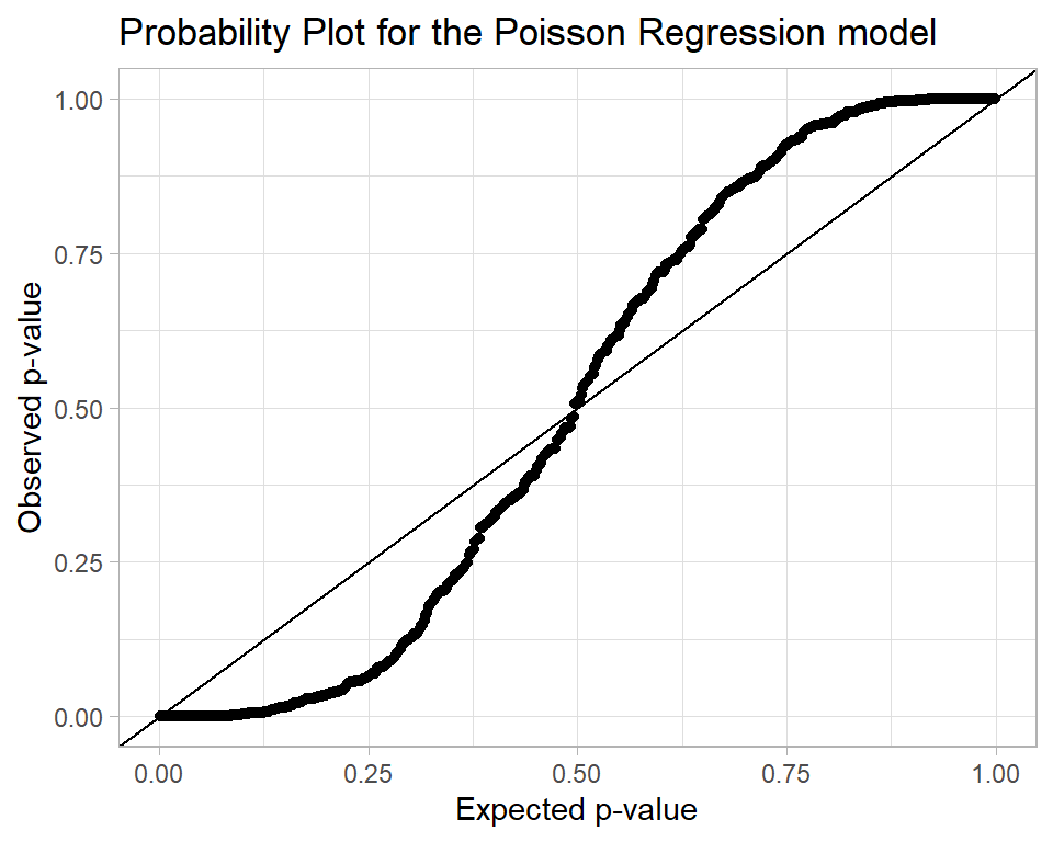
The interpretation of this plot is that there are problems with the model fit because there are too many p-values close to 0 and 1.
Appendix
My function for creating trace plots.
trace_plot <- function(thisDF, parameter, layout="rows") {
  chains <- unique(thisDF$chain)
  if( length(chains) == 1)  {
    thisDF %>% pull({{parameter}}) -> y
    q <- quantile(y, prob=c(0.1, 0.5, 0.9))
  # --- make the trace plot -------------------
  thisDF %>%
    ggplot( aes(x=iter, y={{parameter}} )) +
    geom_hline( yintercept=q, colour="red", lty=c(2, 1, 2), size=1) +
    geom_line() +
    geom_smooth( fill="cyan", colour="blue", size=1)
  } else if( layout == "overlay" ) {
    thisDF %>% pull({{parameter}}) -> y
    q <- quantile(y, prob=c(0.1, 0.5, 0.9))
    thisDF %>%
      mutate(chain = factor(chain)) %>%
      ggplot( aes(x=iter, y={{parameter}}, colour=chain )) +
      geom_hline( yintercept=q, colour="red", lty=c(2, 1, 2), size=1) +
      geom_line( alpha=0.4) +
      geom_smooth( aes(colour=chain), size=1.1)
  } else {
    nc = length(chains)
    lev <- levels(factor(thisDF$chain))
    stat <- data.frame(chain=paste("chain", lev), q1=rep(0,nc), q2=rep(0,nc), q3=rep(0,nc))
    i <- 0
    for( c in chains) {
     i <- i + 1
     thisDF %>% filter( chain == c ) %>% pull(b1) -> y
     q <- quantile(y, prob=c(0.1, 0.5, 0.9))
     stat[i, 2:4] <- q
    }
    thisDF %>%
      mutate(chain = factor(chain, levels=lev,
                            labels=paste("chain", lev))) %>%
      ggplot( aes(x=iter, y=b1 ), colour="black") +
      geom_hline( data=stat, aes( yintercept=q1), colour="red", lty=2, size=1) +
      geom_hline( data=stat, aes( yintercept=q2), colour="red", lty=1, size=1) +
      geom_hline( data=stat, aes( yintercept=q3), colour="red", lty=2, size=1) +
      geom_line( alpha=0.7) +
      geom_smooth( aes(group=chain), colour="blue", fill="cyan", size=1.1) +
      facet_grid( . ~ chain)
  }
}