Kaggle Playground November 2022: BART again
Introduction
Each month, kaggle releases a “playground” tabular dataset intended to test some aspect of machine learning. These data form the basis for a competition with its own leaderboard and kaggle merchandise as the prizes. In November 2022, the dataset consisted of 5,000 attempts at a binary classification task, think 5,000 entries to a kaggle competition. Each entry used a slightly different model to estimate predicted probabilities of a positive response for each of 40,000 items. The 5,000 entries were ranked by their log-loss and that log-loss was used to name the submission file. The objective was to combine the 5,000 entries and come up with a set of ensemble predictions. To help design the ensemble, the true labels for the first 20,000 items were provided.
Since the task involves binary classification, it offers an opportunity to try out different aspects of the Bayesian Additive Regression Tree package, BART, to those covered in my post on Airbnb price prediction. For an introduction to Bayesian tree models, you could read my methods post from 31st October.
Data Exploration
First, I’ll read the names of the 5,000 submission files
library(tidyverse)

# --- all file names -----------------------------------
submission_home <- "C:/Projects/Kaggle/Playground/Nov2022/data/rawData/submission_files"
submission_files <- list.files(submission_home)

head(submission_files)
## [1] "0.6222863195.csv" "0.6223807245.csv" "0.6225426578.csv" "0.6247722291.csv"
## [5] "0.6253455681.csv" "0.6254850917.csv"tail(submission_files)## [1] "0.7522329272.csv" "0.7523602310.csv" "0.7526089604.csv" "0.7526999358.csv"
## [5] "0.7551167673.csv" "0.7575039918.csv"So the top ranking submission had a log-loss of 0.6223 and the worst had a log-loss of 0.7575. At the time of writing, the leaderboard, based on 25% of the test items, i.e. the items for which we are not told the true label, is topped by an entry with a log-loss of 0.514. The top 100 entries on the leaderboard all have log-losses below 0.517. This suggests that lots of different approaches all do equally well.
Next, I read the labels for the first 20,000 of the 40,000 items.
# --- read labels for rows 0 to 19999
labfile <- "C:/Projects/Kaggle/Playground/Nov2022/data/rawData/train_labels.csv"

read.csv(labfile) %>%
  as_tibble() -> labDF

table(labDF$label)
##
## 0 1
## 10000 10000So there are equal numbers of zeros and ones in the training data.
Let’s visualise the top submission. For binary classification models, I like to plot divisions of the prediction scale. I have written a simple function called plot_groups() that creates the plot. It’s code is given at the end of this post.
The plot is based on the first 20,000 predictions for the top submission
# plot for the top submission
file.path(submission_home, submission_files[1]) %>%
  read.csv() %>%
  plot_groups() +
  labs(title = "Performance of the top submission")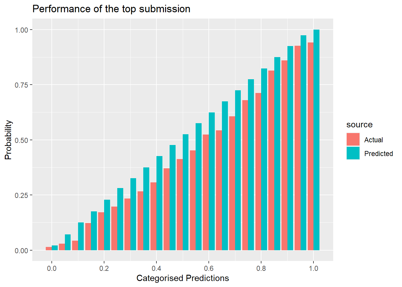
The predictions are divided into groups using cut-points that are 0.05 apart. So the reddish bars represent the proportion of ones in the true labels for that category and the blue bars represent the average prediction. A well-calibrated method would produce actual and predicted bars of equal height. So, we can see that this submission tends to produce predictions that are too high.
For comparison here is an example of a submission that was poorly calibrated
# Plot for submission 53
file.path(submission_home, submission_files[53]) %>%
  read.csv() %>%
  plot_groups() +
  labs(title = "Performance of submission 53")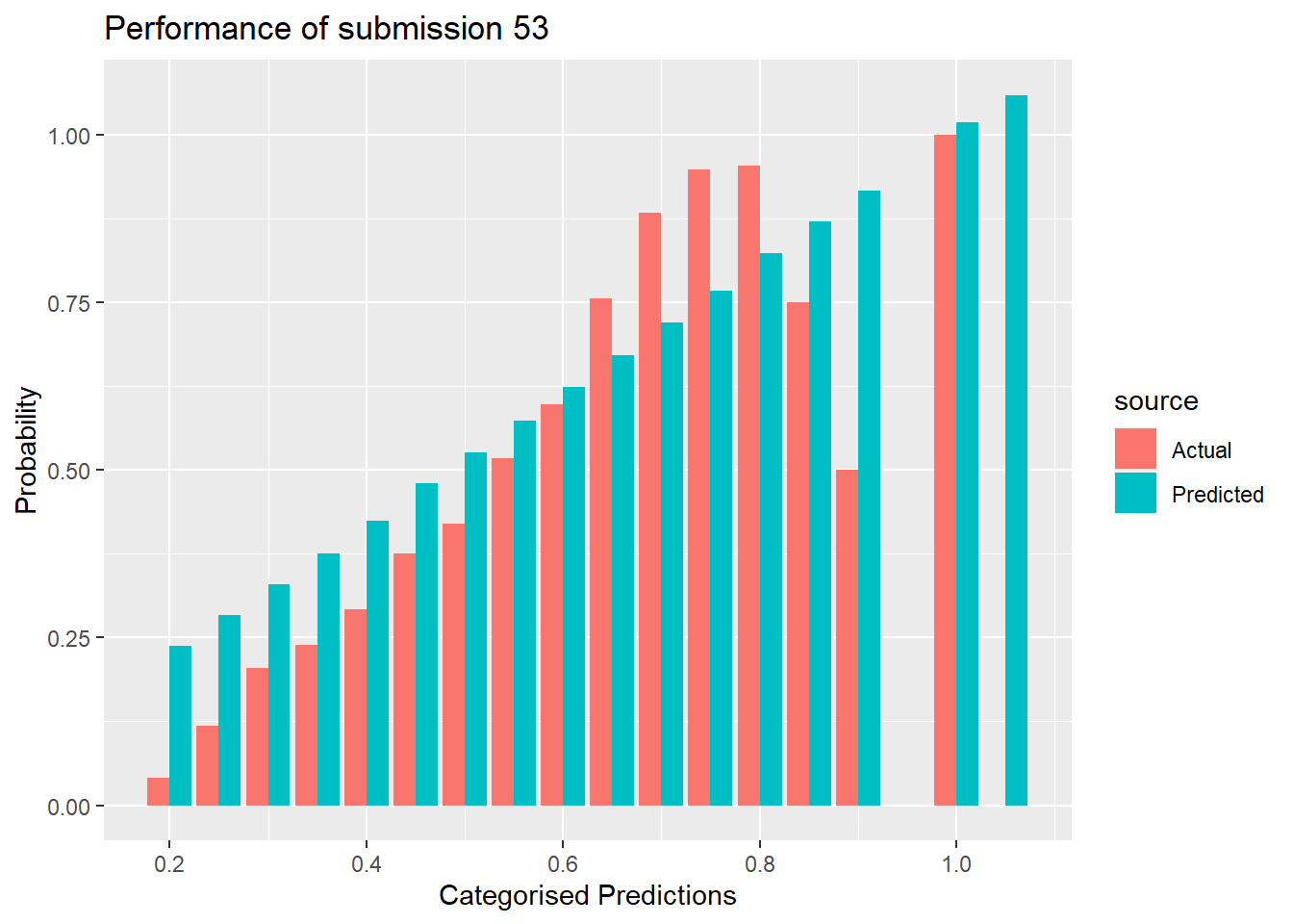
This submission has a file name that tells us that the log-loss is 0.6460, which puts it in the top 100. Some of the predicted probabilities are over 1.0 and overall the agreement looks very poor.
Here is the log-loss of submission 53 for the 20,000 training observations after truncating the predictions to lie in the range (0.001, 0.999)
# log-loss for submission 53
file.path(submission_home, submission_files[53]) %>%
  read.csv() %>%
  inner_join(labDF, by = "id") %>%
  mutate( pred = pmax(pmin(pred, 0.999),0.001)) %>%
    summarise( logloss = - mean( label*log(pred) + (1-label)*log(1-pred)) )
## logloss
## 1 0.6446402If this submission was ranked 53 our of 5000, the overall quality of the submissions is not that great.
Model Development
Splitting the data
While I am developing my BART model. I’ll divide the 20,000 training items into an estimation set of 15,000 and a validation set of 5,000.
# 5000 random rows for validation
set.seed(3672)
split <- sample(1:20000, size=5000, replace=FALSE)
I’ll start by basing my model on the top 100 submissions.
# Construct a single tibble of all of the training data
trainDF <- labDF
for( i in 1:100) {
  read.csv(file.path(submission_home, submission_files[i])) %>%
    as_tibble() %>%
    slice( 1:20000 ) %>%
    setNames( c("id", paste0("p",i)) )   %>%
    { left_join(trainDF, ., by="id" ) } -> trainDF
}
# Split the training data into an estimation and a validation set
trainDF %>%
  slice( split ) -> validDF

trainDF %>%
  slice( -split ) -> estimDF
The BART package requires the data to be in matrices.
# Place the predictors and response in vectors and matrices
estimDF %>%
  select( starts_with("p")) %>%
  as.matrix()  -> X

estimDF %>%
  pull( label) -> Y

validDF %>%
  select( starts_with("p")) %>%
  as.matrix()  -> XV

validDF %>%
  pull( label) -> YV
A default model
BART contains a suite of functions for different types of response variable. A probit-style model for binary responses based on the inverse normal transformation is provided by pbart. There is also a function lbart() that uses a logistic model, but it is much slower to fit and so I did not use it for these data.
library(BART)

set.seed(4873)
bt1 <- pbart(x.train = X, y.train = Y, x.test = XV, nskip=1000)
The model takes just over 30 seconds to fit. I have accepted most of the pbart defaults, except that I have allowed a burn-in of 1000 instead of the default of 100.
Briefly, this model creates its predictions by summing the contributions from 50 trees. The priors are designed to make the trees stumpy, that is, they are not very deep. The predictors all have the same chance of being chosen as the basis for splitting a tree and the prior on the cut points places them equally across the range of that predictor. The default is to create an MCMC chain of length 1000.
The majority of the top 100 submissions agree that the first item in the estimation dataset (id=0) should have a positive response, even though the true label is 0.
# Histogram of the 100 predictions for id=0
tibble( p = X[1, ] ) %>%
  ggplot( aes(x=p)) +
  geom_histogram( bins=20, fill="steelblue") +
  geom_vline( xintercept=0.5, linetype=2) +
  labs( x = "Predicted Probability of a Positive Response",
        title = "Predictions for the first item in the estimation set")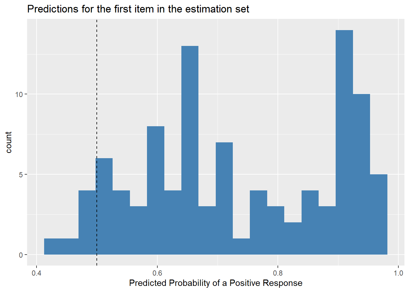
The simple average of the 100 predicted probabilities is 0.73.
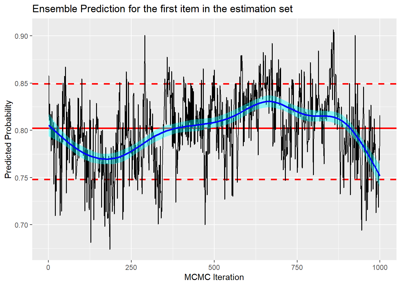
In order to help judge convergence, I show the trace plot of the BART prediction for the this item.
# trace plot for item 1 in the estimation set.
library(MyPackage)

tibble(
  chain = rep(1, 1000),
  iter = 1:1000,
  phat = bt1$prob.train[, 1] ) %>%
trace_plot(phat) +
  labs(title = "Ensemble Prediction for the first item in the estimation set",
       y="Predicted Probability",
       x = "MCMC Iteration")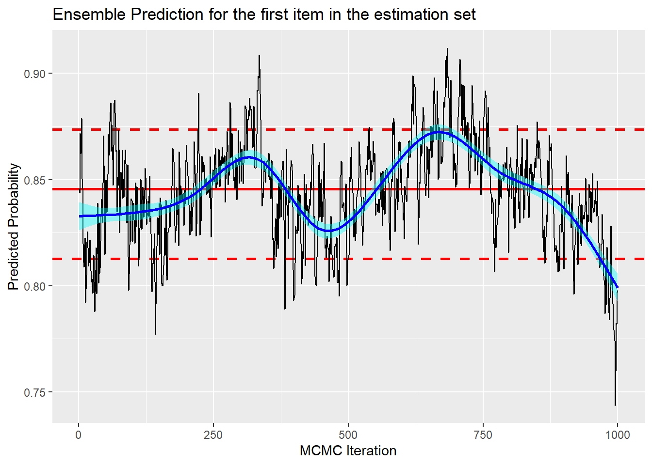
The chain mixes quite slowly and the dip at the end makes one wonder if the chain is still searching for the true level.
The validation log-loss based on the posterior mean predictions for each item is 0.54, so despite the questionable convergence the BART model has improved on the performance of the best single submission.
# log-loss in the validation data
validDF %>%
  select(id, label) %>%
  mutate( p = bt1$prob.test.mean) %>%
  summarise( logloss = - mean( label*log(p) + (1-label)*log(1-p)) )
## # A tibble: 1 × 1
## logloss
## <dbl>
## 1 0.540As this is a Bayesian method, there are 1000 iterations that give 1000 samples from the posterior distribution of the log-loss. It is worth looking at that distribution.
# trace plot of the validation log-loss
logloss <- rep(0, 1000)
for( i in 1:1000 ) {
  p <- bt1$prob.test[i, ]
  logloss[i] <- - mean( validDF$label*log(p) + (1-validDF$label)*log(1-p))
}

tibble(
  chain = rep(1, 1000),
  iter = 1:1000,
  logloss = logloss ) %>%
trace_plot(logloss) +
  labs(title = "Validation set log-loss",
       y="Log-loss",
x = "MCMC Iteration") 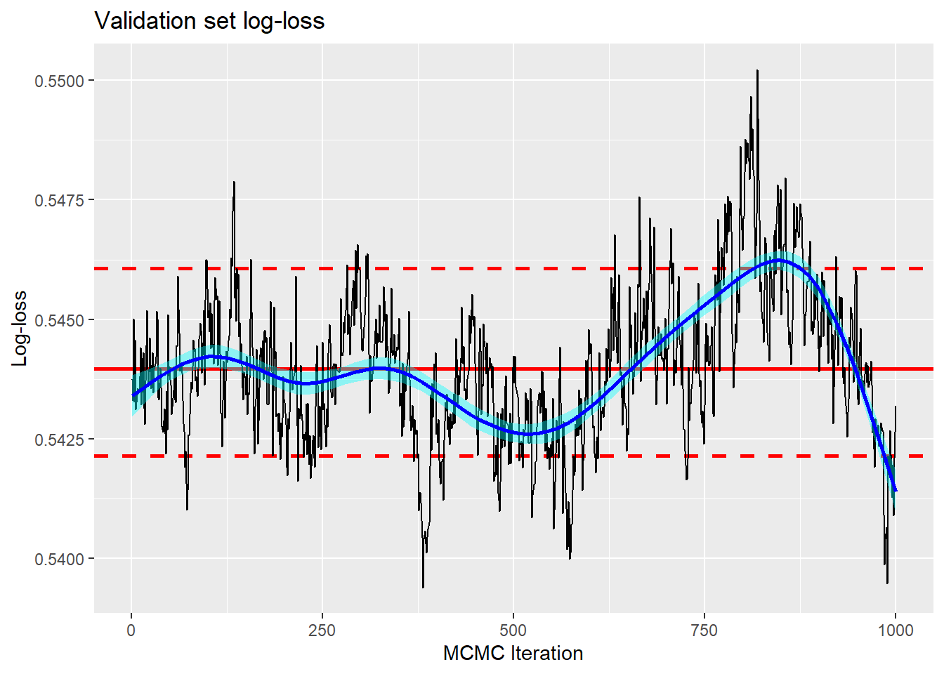
First, the trace shows that the posterior mean log-loss (0.544) is not the same as the log-loss based on the average predictions (0.540). It also shows that the estimate of the validation log-loss is quite narrowly defined despite the questionable convergence.
It is worth emphasising that the narrowness of the range of the trace plot refers to the prediction of the log-loss for this particular randomly selected validation set. It tells us nothing about how different the log-loss would be if we randomly selected a new validation set in the style of cross-validation.
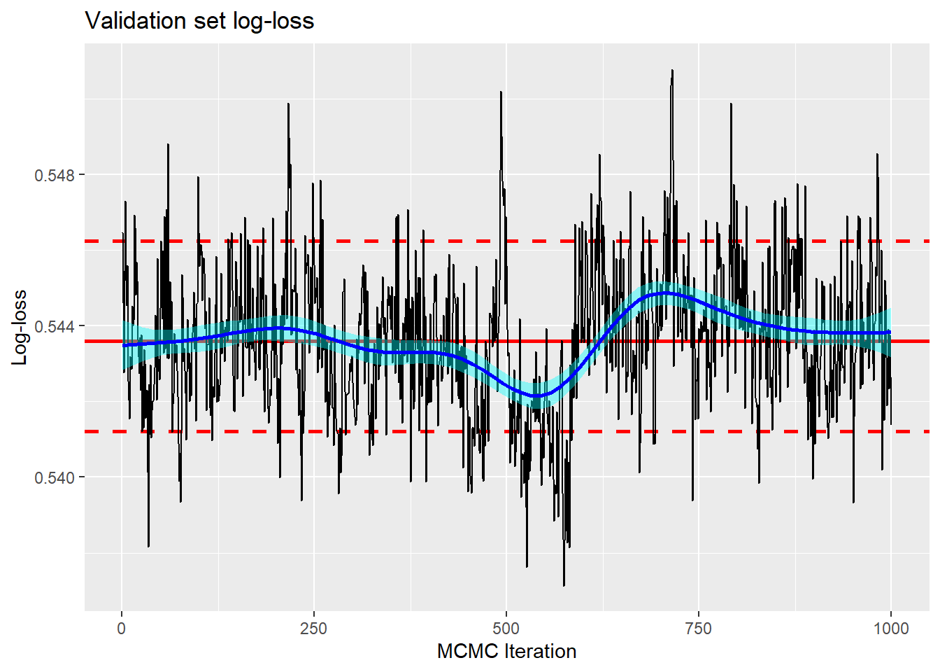
A longer chain
Since convergence is questionable, I next try a chain of length 30,000. The first 5,000 are dropped and every 25th item from the remainder is kept so that once again we have 1000 samples from the posterior.
# pbart model with a longer chain
set.seed(1866)
bt2 <- pbart(x.train = X, y.train = Y, x.test = XV, nskip=5000,
             keepevery=25)
I show the same plots as before but without giving the code.
The trace plot for the ensemble prediction for the first item in the estimation set does show that the chain has settled at a lower level, although mixing is still not ideal. The posterior mean is about 0.80, while in the default chain it was about 0.85. Given that the mean prediction over the top 100 submissions is 0.73, there is a concern that it might drift even lower. However, this chain has a length of 30,000, so if that were the case, the burn-in would need to be very long indeed.
Remember that the BART ensemble model is free to select the submissions that it uses from the set that it is given, so many will remain unused. The ensemble prediction is not just a simple averaging process.
The validation log-loss based on the average ensemble predictions is now 0.537 (cf 0.540 for the default model) and the trace plot of the validation log-loss is more stable and has a posterior mean of 0.544 (cf 0.544).
It is the posterior mean of the validation log-loss, i.e. 0.544 that truely describes the performance of the model, but the log-loss of the average ensemble predictions that describes how well the BART model will do if we submit it to kaggle. What is more, both are only point estimates of performance based on a single validation sample.
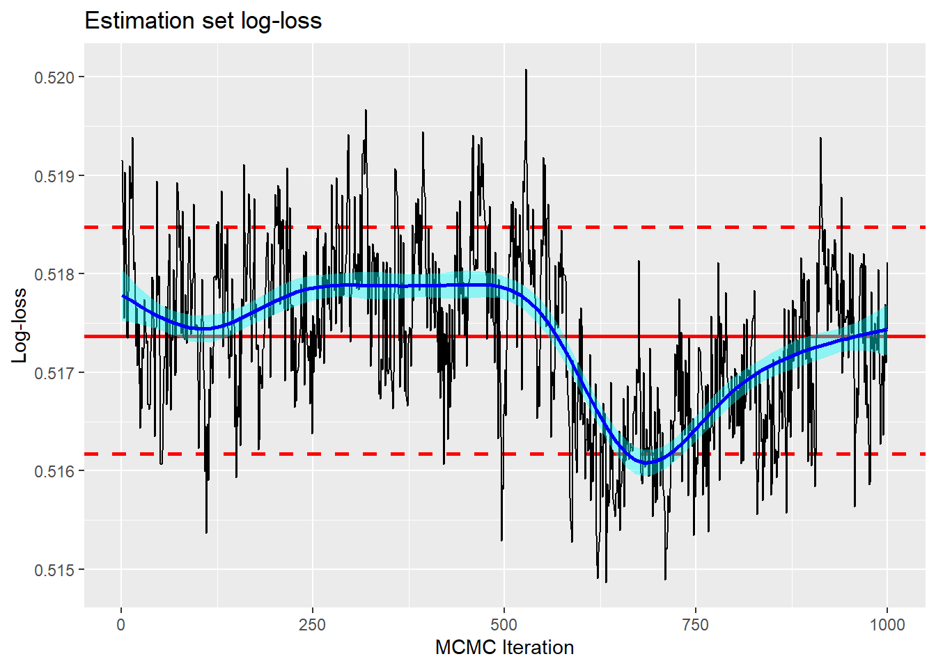
To give a feel for the degree of over-fitting, here is a trace plot of the log-loss in the estimation set of 15,000 items. As you might expect, log-loss in the estimation data is noticeably optimistic.
Re-running the longer chain
There are two questions of accuracy that we need to consider.
- would the log-loss change if we re-ran the MCMC analysis with a new seed but the same estimation/validation split?
- would the log-loss change if we re-ran the MCMC analysis with a different estimation/validation split?
The first tells us about the stability of the algorithm and the second tells us about our ability to measure the performance of the model.
Since a single chain of 30,000 takes 7.5 minutes, I do not feel inclined to run lots of chains in what is after all, just an analysis run for my own benefit. I know that I should have parallelised the computation, but I didn’t.
First, I re-ran the analysis 2 more times with the same estimation/validation split, but a different random seed. Previously the validation log-loss based on the average ensemble predictions was 0.5371, in the repeat run this changed to 0.5376 and the 0.5371 again. My conclusion is that the algorithm is pretty stable.
Next, I re-ran the analysis with different estimation/validation splits, the new validation log-losses were 0.5227 and 0.5302, quite different from the original 0.5371. The original split seems to have randomly poor performance and I would expect a kaggle submission to do a little better than this log-loss suggests.
This knowledge does not enable us to improve any submission that we might make to kaggle, but it does encourage us to be a bit more optimistic about the likely performance. The kaggle leaderboard tell us to aim for 0.514; I am probably a little closer to that than 0.537 would suggest.
There is still some way to go before it would be worth making a submission to kaggle, as there are plenty of options to try. I could fit a modified model, perhaps a model based on 100 trees would be better than a model based on 50 trees, or perhaps deeper trees would be better than stumpy trees. I also have the option of using more of the training data, there are 5,000 submission files and I have only used the top 100.
Modifying the model
The model parameter that is mostly likely to affect performance is the number of trees. For most of the BART methods the default is 200 trees, but pbart() has a default of 50. So I tried 100 trees and 200 trees with the same estimation/validation split and the same 30,000 chain length.
For the 100 tree model, the log-loss based on the posterior mean predictions is 0.537 as it was for the 50 tree model.
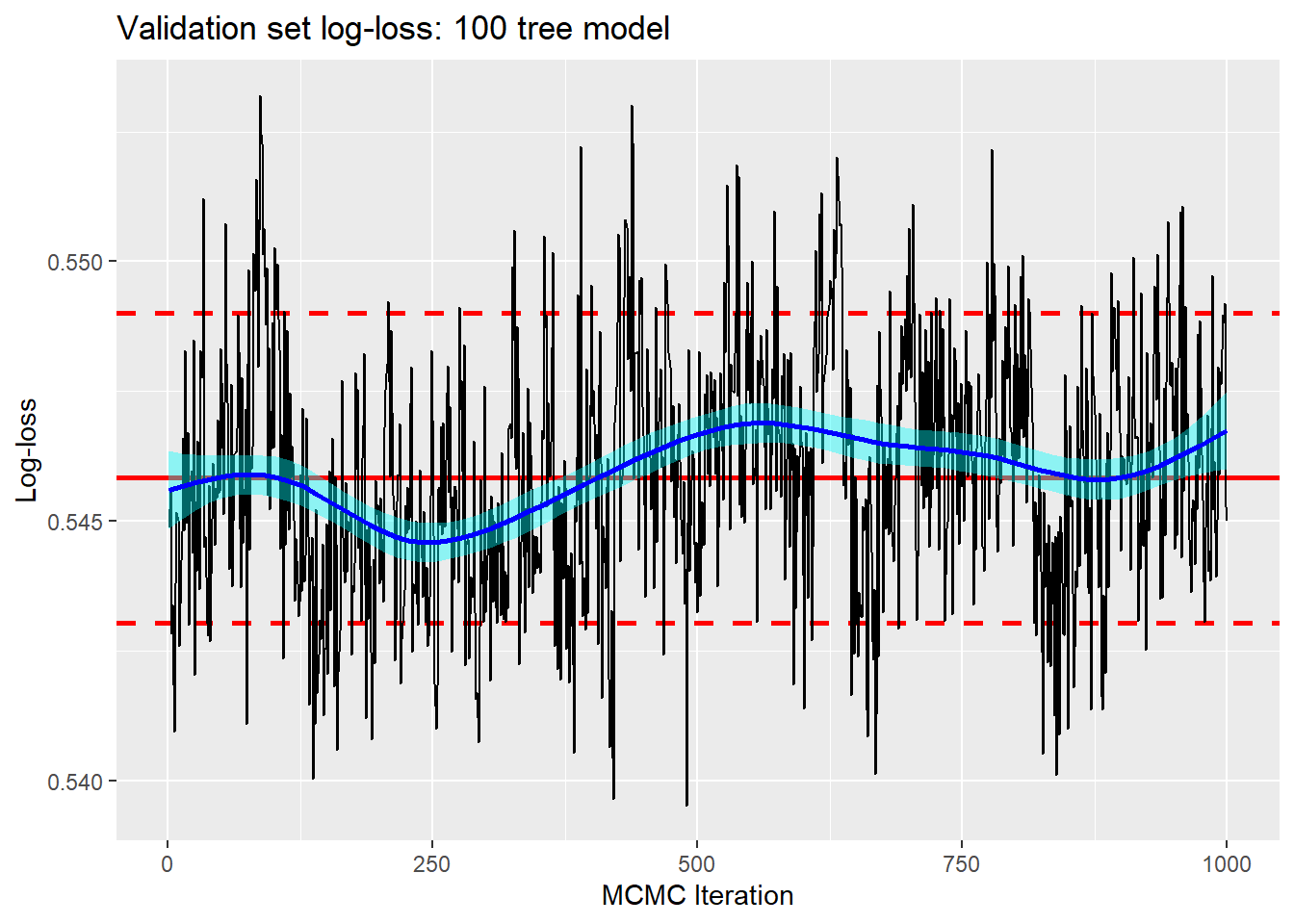
For the 200 tree model the log-loss is 0.538, a difference that I treat as irrelevant.
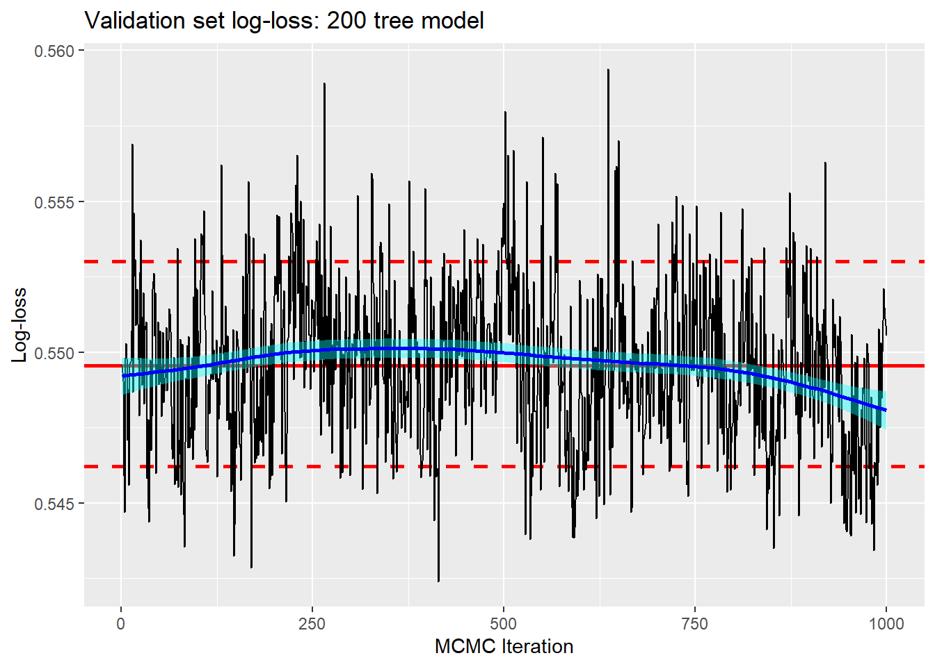
Perhaps the mixing is a little better for models with more trees, but the run-time is much longer, 45 minutes for 200 trees as opposed to 7.5 minutes for 50 trees, and predictive performance is no better. I will stick with 50 trees.
The other thing that is worth trying is to use the priors to encourage deeper trees. I tried base=0.99 and power=0.5 as extreme choices. The average number of splits per tree increases from 1.1 with the default parameters to 1.6 with the new prior, but the log-loss is unchanged at 0.537.
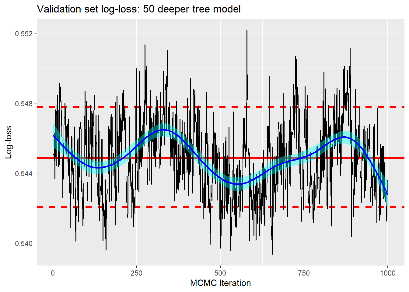
This rather confirms my prejudice that with large datasets the BART priors are relatively unimportant.
Using more of the data
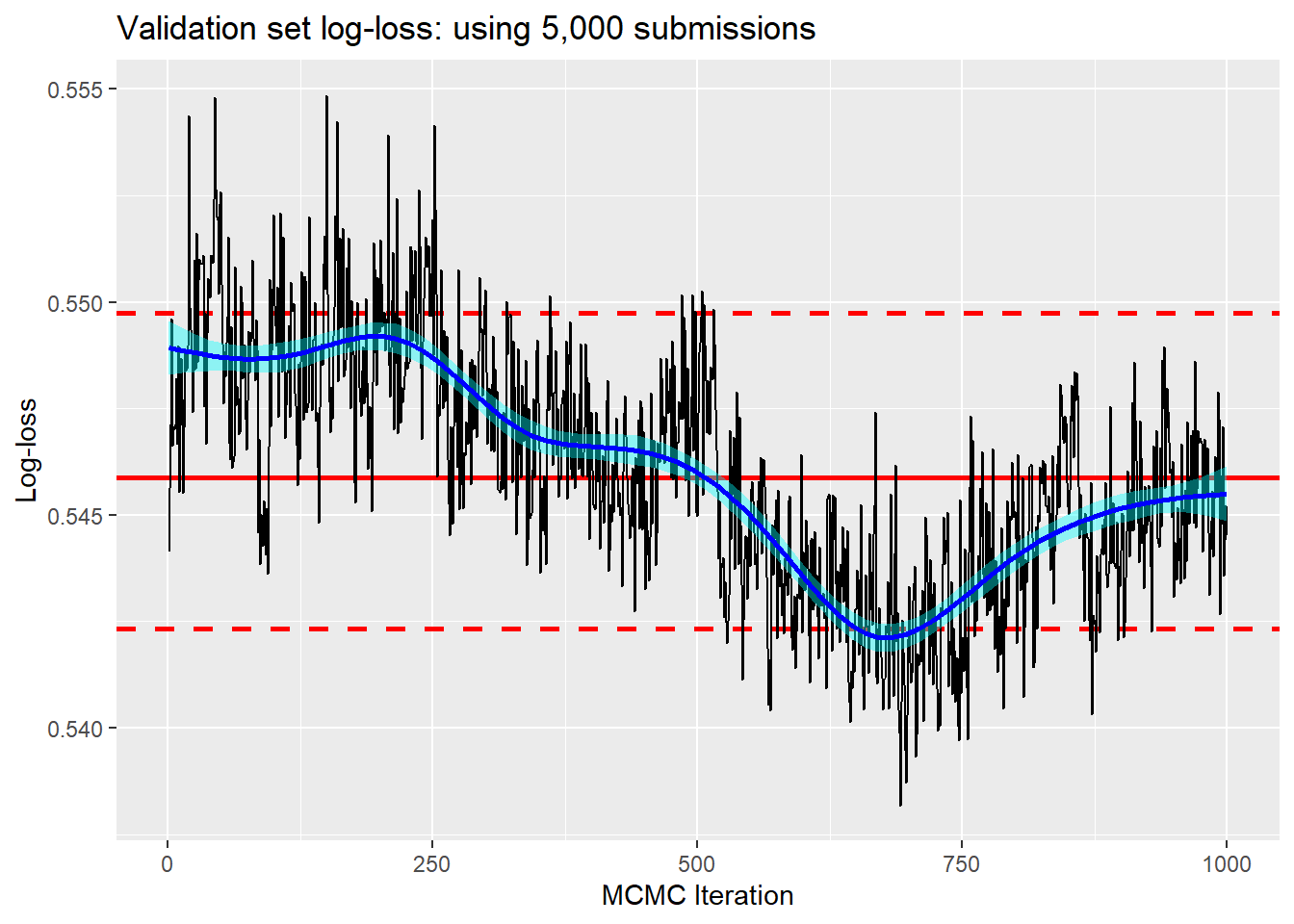
The full dataset consists of 5,000 submissions and so far I have only used to top 100, which opens the possibility that there might be a little more information to feed into the ensemble.
Below is the log-loss for a default run of 30,000 using all 5,000 submissions. The predictive performance is 0.538, worse than the previous 0.537 but by an amount that I am happy to ignore. I would expect worse mixing when there are so many features to choose from and perhaps the trace plot supports that prejudice.
It is interesting to ask which features are used most often and to help us address that question, pbart() returns an object called varcount that gives the number of times each feature is used to split a tree. Here are the most frequently used features.
## # A tibble: 4,998 × 2
##    feature  freq
##    <chr>   <dbl>
##  1 p145    1.64
##  2 p122    1.58
##  3 p452    1.01
##  4 p1936   1.01
##  5 p3163   1.00
##  6 p402    0.957
##  7 p101    0.794
##  8 p533    0.775
##  9 p88     0.703
## 10 p81     0.611
## # … with 4,988 more rows
Notice that the 145th submission, which I have not used so far, is the most frequent, but it is only used an average of 1.6 times in 50 trees. It looks as though the predictive information is spread fairly evenly over the submissions and that, because of duplication of information, it is not necessary to us them all.
BART offers the option of using a sparsity prior. Instead of giving every feature the same chance of being used each time a tree is constructed or modified, the algorithm is allowed to learn which features are most predictive and to favour those features when it needs to choose a feature. I wanted to strongly encourage sparsity, because weak priors will be swamped by the data, so I set the rho parameter to 200. The default is 5000 equal to the number of features.
The validation log-loss is back to 0.537 and the important features are,
## # A tibble: 4,998 × 2
##    feature   freq
##    <chr>    <dbl>
##  1 p63     27.3
##  2 p122    17.4
##  3 p145     8.64
##  4 p4830    1.23
##  5 p2322    0.719
##  6 p1839    0.678
##  7 p706     0.268
##  8 p4988    0.253
##  9 p4040    0.181
## 10 p3049    0.165
## # … with 4,988 more rows
The algorithm seems to have identified a handful of features that are more informative than the others.
My final analysis takes the top 100 features identified by the sparsity prior and runs a default model with those features. If you have followed the previous analyses, then you will not be surprised to hear that performance was no better than the analysis that used the top 100.
A Submission
So, I have tried several variations and found that they all give a very similar performance. The choice for my submission to kaggle is a little arbitrary. I like the idea of taking the 100 most important features from the analysis with a sparsity prior and using them as the basis of a 50 tree default analysis using the full training set of 20,000 items. Which is what I did.
The public leaderboard, which is revealed while the competition is live, is based on a random sample of 25% of the withheld labels, i.e 5,000 labels. At the end of the month, the private leaderboard will show how the model performance on the remaining test data.
My log-loss on the public leaderboard was 0.5193, which at the time of submission put me in position 166 out of 335, about halfway. The ranking is not great, but the best submission was 0.5137, not that much better in absolute terms than my model.
You may recall that when I tried different evaluation/validation splits of the training data, also with 5,000 valuation items, the default model gave log-losses of 0.5371, 0.5227 and 0.5302. The difference between the best and the worst was 0.0144, while the difference between my submission and the top submission on the public leaderboard is only 0.0056. One can imagine that, had a different random set of 5,000 items been chosen for the public leaderboard, the rankings would have been very different. I could panic and try other variants on my BART model in the hope of improving my ranking, but I would be chasing noise.
Appendix
The function used in the data exploration
# --- Plot groups defined by prediction ------------------
#  df    ... a file of predicted probabilties
#  width ... the width of the groups
#
plot_groups <- function(df, width=0.05) {
 df %>%
  inner_join(labDF, by = "id") %>%
  mutate( gp = floor(pred / width)) %>%
  group_by( gp ) %>%
  summarise( n    = n(),
             pred = mean(pred),
             p    = mean(label)) %>%
  pivot_longer(pred:p, names_to="source", values_to="p") %>%
    mutate( source = factor(source, labels=c("Actual", "Predicted"))) %>%
  ggplot( aes(x = gp*width, y=p, fill=source) ) +
            geom_bar(stat="identity", position="dodge") +
    scale_x_continuous( breaks=seq(0, 1, by=0.2)) +
    labs(x = "Categorised Predictions", y="Probability")
}