Sliced Episode 7: Customer Churn
Summary:
Background: In episode 7 of the 2021 series of Sliced, the competitors were given two hours in which to analyse a set of data on bank customers. The aim was to predict whether a customer would churn (leave the bank).
My approach: I started with the idea that people churn for different reasons and because of this, it will be difficult to find a single scale that distinguishes churners from non-churners. I decided to treat the data exploration as a search for customer clusters and I used to distance based methods, multi-dimensional scaling and self-organising maps. Afterwards I used xgboost to model the data. In particular, I looked at the impact of the the hyperparameter max_depth on the model.
Result: My model would have come 4th on the leaderboard, but I think that the clusters identified in the data exploration are at least as interesting as the predictive model.
Conclusion: Distance-based exploratory analysis can be very useful especially when you suspect that the individuals or items that you want to predict fall into distinct clusters.
Introduction
The seventh of the sliced episodes required the contestants to predict a binary measure of customer churn (yes/no) from data on bank customers. As usual for binary data, the metric for evaluation is mean logloss. The data can be downloaded from https://www.kaggle.com/c/sliced-s01e07-HmPsw2.
This is a rather standard example that could be used to illustrate almost any classification algorithm. To try to create some interest, I thought that I would use the data to illustrate multivariate data explorations based on distance.
Reading the Data
It is my practice to read the data asis and to immediately save it in rds format within a directory called data/rData. For details of the way that I organise my analyses you should read my post called Sliced Methods Overview.
# --- setup the libraries etc. ---------------------------------
library(tidyverse)

theme_set( theme_light())

# --- the project folder ---------------------------------------
home  <- "C:/Projects/kaggle/sliced/s01-e07"

# -- read the rds data files -----------------------------------
trainRawDF <- readRDS( file.path(home, "data/rData/train.rds"))

testRawDF <- readRDS( file.path(home, "data/rData/test.rds"))
Data Summary
As always, I started by looking at the structure of the data with skimr. I’ve hidden the output because of its length.
# --- summarise training data with skimr -----------------------
skimr::skim(trainRawDF)
In summary, skim() shows that there are data on 7088 customers of whom 16% churned (left the bank). There are 3 categorical predictors and 10 continuous predictors. There is no problem of missing data for the continuous measures, but there are unknown categories for the customer’s education and income.
Preliminary cleaning
Let’s make factors of the categorical variables and at the same time we can create some shorter variable names.
I’ve written a cleaning function that is applied to both datasets.
# --------------------------------------------------------
#  clean()
# function to clean the data prior to analysis
#
clean <- function(thisDF) {
  thisDF %>%
    # --- create factors ------------------------------------
    mutate( gender = factor(gender, levels=c("M","F"),
                          labels=c("male", "female")),
            education = factor(education_level,
                      levels=c("Uneducated", "High School",
                        "College", "Graduate", "Post-Graduate",
                        "Doctorate", "Unknown")),
            income = factor(income_category, levels=c(
            "Less than $40K", "$40K - $60K", "$60K - $80K",
            "$80K - $120K", "$120K +", "Unknown"))
          ) %>%
    select( -education_level, -income_category) %>%
    # --- if attrition_flag is present rename it ------------
    rename_if( str_detect(names(.), "attrition"), ~ "churn") %>%
    # --- rename all variables known to be present ----------
    rename( age      = customer_age,
            contacts = total_relationship_count,
            inactive = months_inactive_12_mon,
            limit    = credit_limit,
            balance  = total_revolving_bal,
            balq4q1  = total_amt_chng_q4_q1,
            amount   = total_trans_amt,
            number   = total_trans_ct,
            numq4q1  = total_ct_chng_q4_q1,
            usage    = avg_utilization_ratio
          ) %>%
     return()
}

# --- clean the training and test data ----------
trainDF <- clean(trainRawDF)
testDF  <- clean(testRawDF)
The only code of interest is the line that renames the response variable attrition_flag as churn. The test data do not include the response, so I use the rename_if() function.
Data Exploration
Although I want to make some multivariate plots, I think that it is still important to start with a univariate exploration. An earlier episode of Sliced (s01-e04) looked at wildlife strikes on aircraft and for that analysis I created a function to plot the percentage of aircraft that were damaged. The same type of plot will work well for these data; I’ve called this function plot_churn(), but the code is essentially the same as I wrote before.
# ============================================================
# --- plot_churn() ------------------------------------------
# function to plot a factor and show the percent churn
#   thisDF ... the source of the data
#   col    ... column within thisDF
#
plot_churn <- function(thisDF, col) {
  thisDF %>%
    # --- make a missing category ----------------
    mutate( across({{col}}, fct_explicit_na)) %>%
    mutate( stay = factor(1-churn)) %>%
    # --- calculate the percent churn ----------
    group_by({{col}}, stay) %>%
    summarise( n = n(), .groups="drop" ) %>%
    group_by( {{col}} ) %>%
    mutate( total = sum(n),
            pct   = ifelse( total == 0, 0, 100*n/total ),
            lab   = ifelse( stay == 0,
                      paste(round(pct,1),"%",sep=""), NA)) -> tDF
    offset = max(tDF$n)/20
    # --- make bar chart ------------------------
    tDF %>%
    ggplot( aes( x=n, y={{col}}, fill=stay)) +
    geom_bar( stat="identity") +
    labs( y = "Frequency",
          title=paste("Percent churn by",
                      deparse(substitute(col))) ) +
    # --- show percentages ----------------------
    geom_text( aes(y={{col}}, x=total, label=lab),
               nudge_x=offset, na.rm=TRUE) +
    theme( legend.position="none")
}
Now we can plot each of the potential predictors.
Gender hardly needs a plot, but it shows that there is slightly more churn in women and there are more female customers.
# --- plot churn by gender ----------------------------------
trainDF %>%
  plot_churn(gender)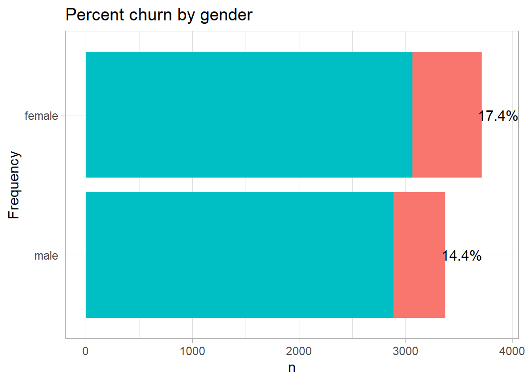
Churn is marginally higher in well-educated people.
# --- plot churn by education -------------------------------
trainDF %>%
  plot_churn(education)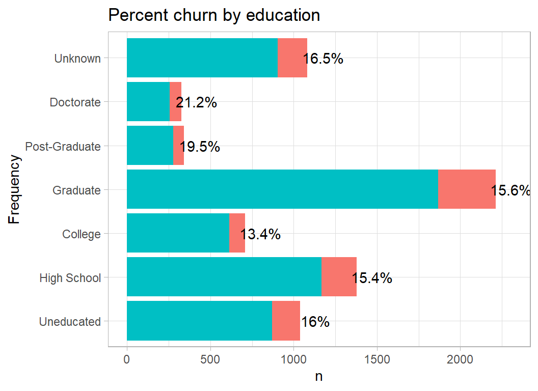
Churn is slightly higher at both ends of the income range, adding strength to by prior belief that people churn for different reasons. One can imagine high income people churning because they are offered a better deal by another bank and low income people churning because the bank does not treat them well. The differences are small and I may just be seeing what I want to see.
# --- plot churn by income ----------------------------------
trainDF %>%
  plot_churn(income)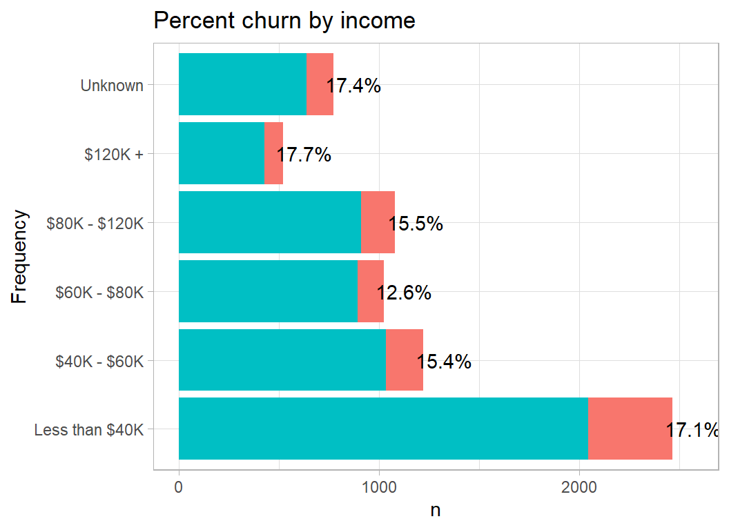
Not much of a relationship between age and churn, although we can see that most of this bank’s customers are middle aged.
# --- plot churn by categorised age -------------------------
trainDF %>%
  mutate( age = cut(age, breaks=seq(20, 80, by=10))) %>%
  plot_churn(age)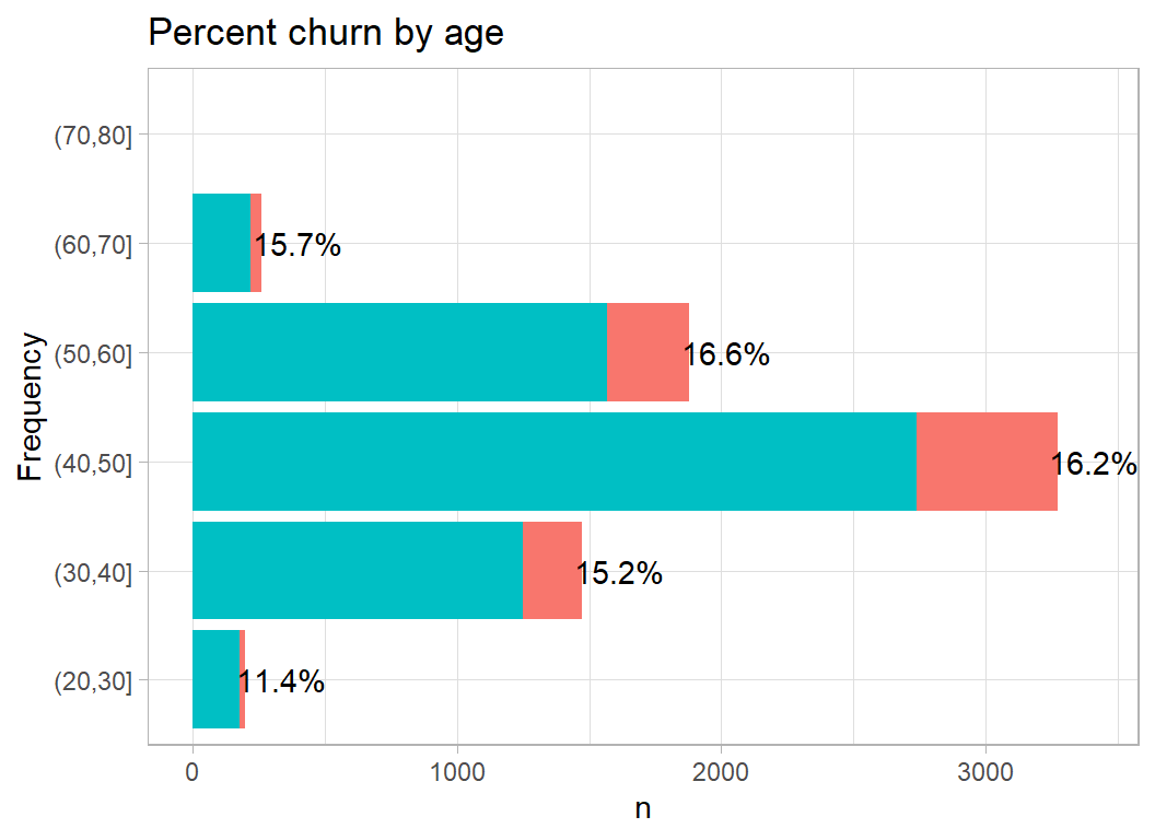
I am not certain what the variable contacts means. The data dictionary defines it as the customer’s “number of relationships”. This means something quite different to me, but I assume that it refers to the number of bank employees who dealt with the customer. Here a smaller number of contacts is associated with an increased churn rate.
# --- plot churn by contacts --------------------------------
trainDF %>%
  mutate( contacts = factor(contacts)) %>%
  plot_churn(contacts)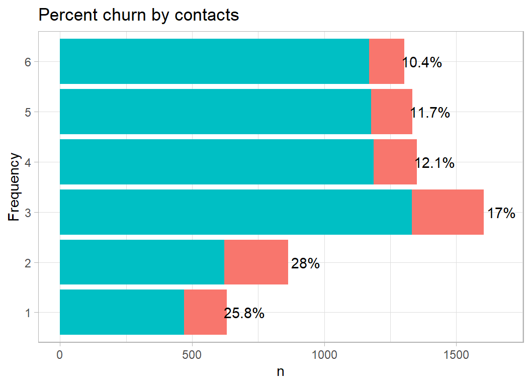
Credit limit does not have much effect on churn
# --- plot churn by credit limit ----------------------------
trainDF %>%
  mutate( limit = cut( limit, breaks=5000*(0:7), dig.lab=5)) %>%
  plot_churn(limit)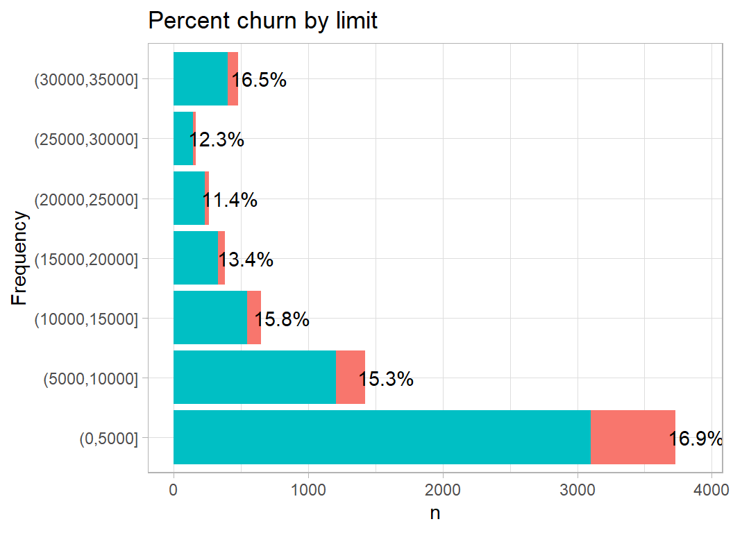
Balance does seem to have a large effect on churn, with a high churn rate in people with either very high or very low balances. This supports the idea of subgroups of customers who churn for different reasons.
# --- plot churn by balance ---------------------------------
trainDF %>%
  mutate( balance = cut( balance, breaks=c(-1, 500*(1:6)),
                         dig.lab=4)) %>%
  plot_churn(balance)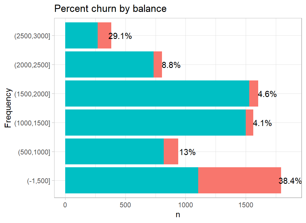
Change in balance over the period covered by the data collection (quarter4 to quarter1). A small change is associated with a very high churn rate. Perhaps a small change means little activity.
# --- plot churn by change in balance -----------------------
trainDF %>%
  mutate( balq4q1 = cut( balq4q1,
                         breaks=c(-1,0.5, 1, 1.5, 3.5))) %>%
  plot_churn(balq4q1)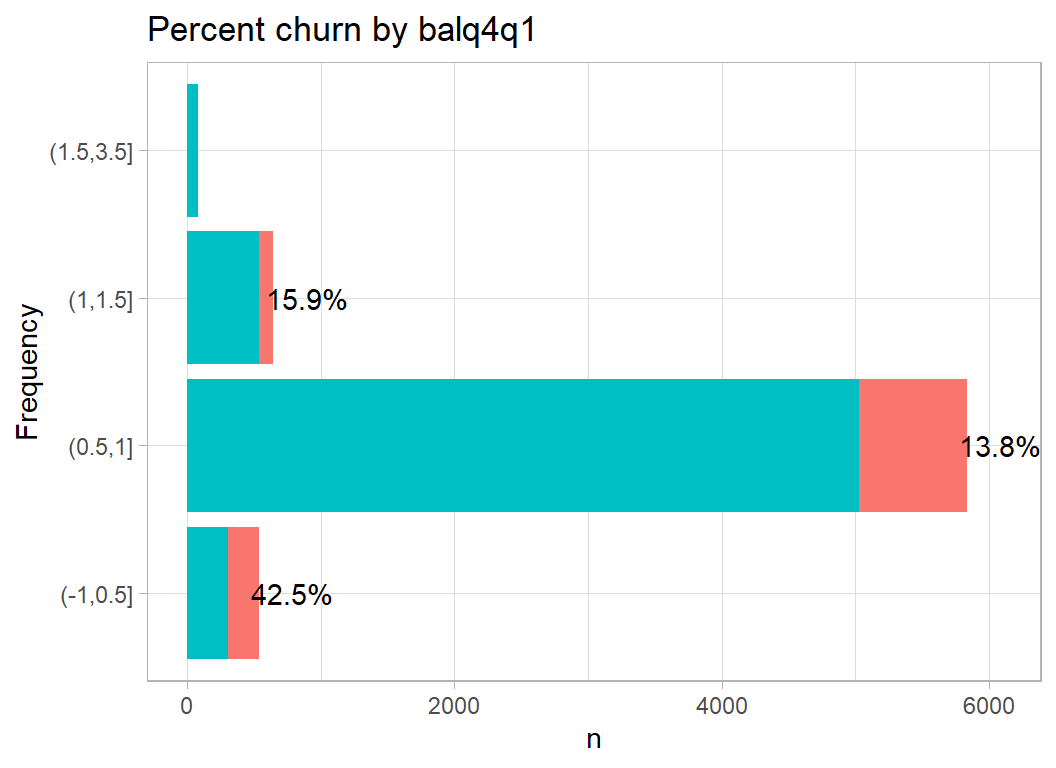
The scale of these changes in balance, 0 to 3.5, is strange , it could be percent or change in $1000s but why only positive numbers. Perhaps it is absolute change.
Amount measures the total value of the customer’s transactions. The pattern is odd, churn moves up and down as the amount increases
# --- plot churn by total transactions ----------------------
trainDF %>%
  mutate( amount = cut( amount,
                        breaks=c(0, 1000, 2000, 3000,
                              4000, 5000, 10000, 20000),
                        dig.lab=5)) %>%
  plot_churn(amount)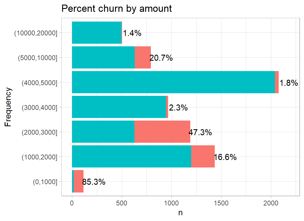
Number measures the total number of transactions; churn is high when the number of transactions is low.
# --- plot churn by number of transactions ------------------
trainDF %>%
  mutate( number = cut( number,
                        breaks=25*(0:6))) %>%
  plot_churn(number)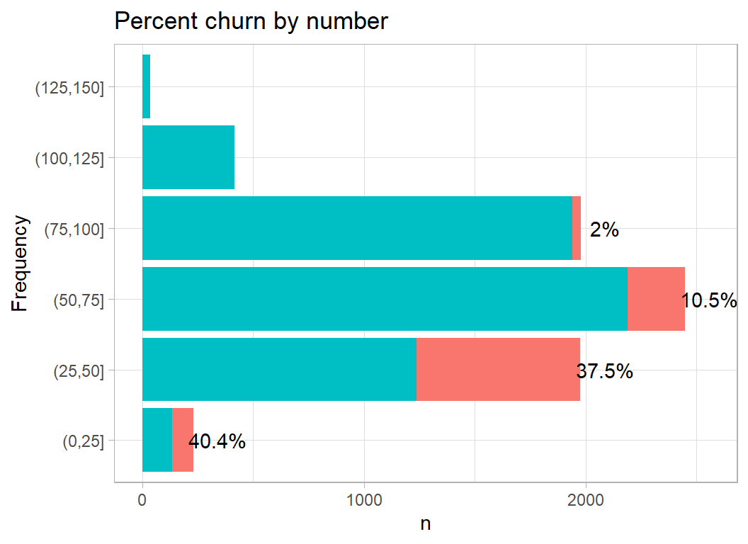
Next comes change in the number of transactions over the period of the study. The scale is strange in much the same way as balq4q1.
# --- plot churn by change in number of transactions ---------
trainDF %>%
  mutate( numq4q1 = cut( numq4q1,
                        breaks=c(-0.1, 0.5*(1:5), 4)) ) %>%
  plot_churn(numq4q1)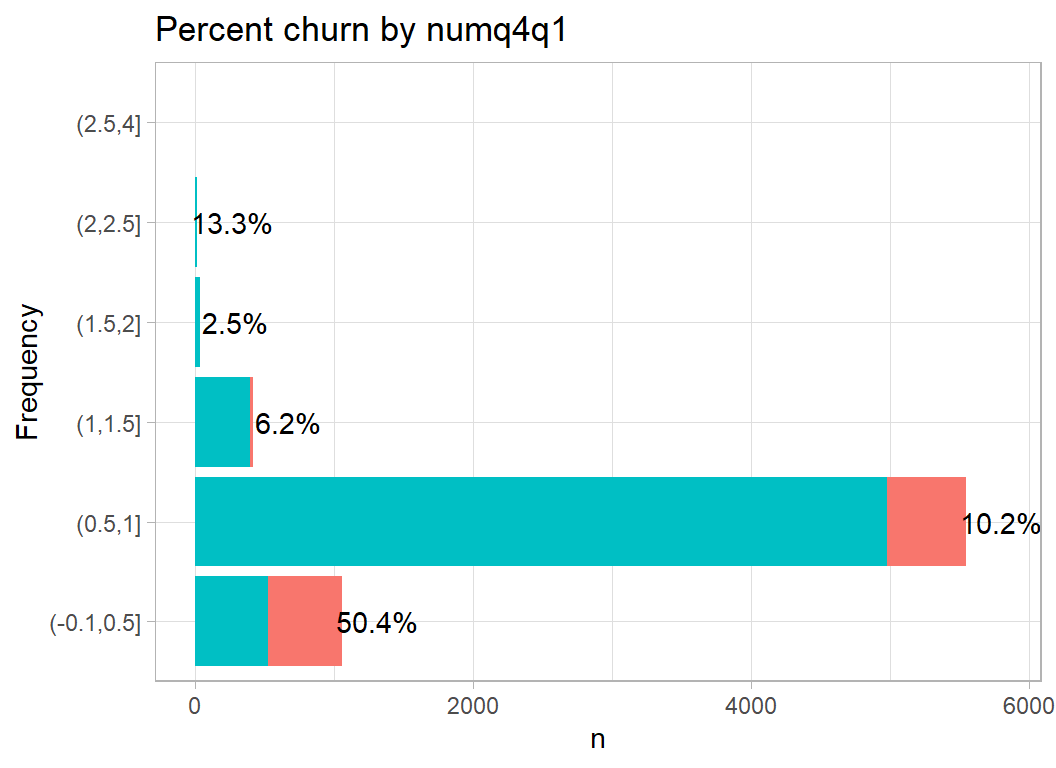
I am not at all sure what a utilization ratio is, but I assume that it measures activity, in which case low activity is associated with churn.
# --- plot churn by usage ratio ------------------------------
trainDF %>%
  mutate( usage = cut( usage,
                        breaks=c(-.1,0.25*(1:4))) ) %>%
  plot_churn(usage)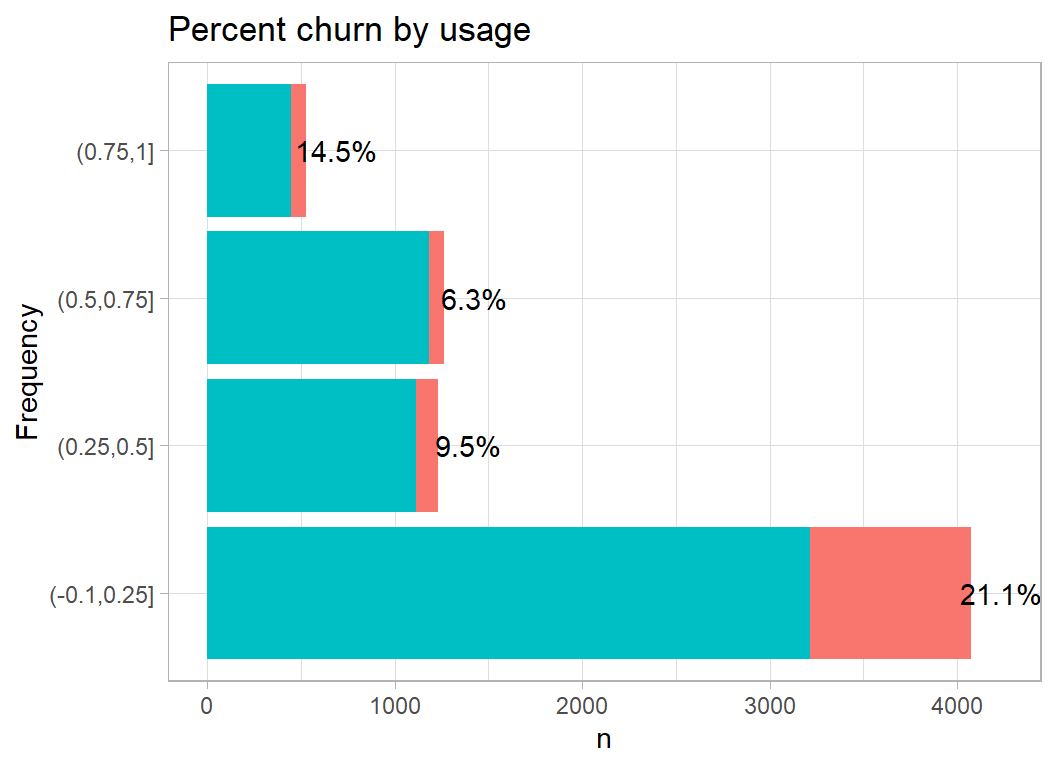
Multivariate exploration
My belief prior to seeing the data was that people would churn for different reasons, so it makes sense to look for clusters of customers within the dataset. There are many techniques that create a measure of distance between pairs of individuals, in this case customers, and then look for clusters of individuals who are similar.
Cluster analysis is the general name for algorithms that sort items into groups, but I prefer to start with MDS (multidimensional scaling). MDS attempts to plot individuals on a graph in such a way that the plot’s Euclidean distance between any pair approximates the high-dimensional distance between them.
MDS
I start by creating a distance measure. If I were to use the raw measurements in trainDF, the distance would be dominated by balance because two balances can differ by $1000s, while two values of contacts can only differ by up to 5. We need to scale the variables.
I start by looking at the 9 variables that relate to customer activity.
In this code I use classical mds (cmdscale) in which the approximation to the high-dimensional distances is based on eigenvectors.
# --- classical MDS -----------------------------------------
trainDF %>%
  # --- pick numerical variables ----------------------------
  select( -id, -churn, -age, -education, -income, -gender) %>%
  # --- scale the data --------------------------------------
  mutate( across(contacts:usage, scale)  ) %>%
  # --- find euclidean distance matrix ----------------------
  { dist(.) } %>%
  # --- approximate the distance in 3D ----------------------
  { cmdscale(. , eig=TRUE, k=3) } %>%
  # --- save to an rds file ---------------------------------
  saveRDS( file.path(home, "data/dataStore/cmds.rds") )
# --- read the MDS results ----------------------------------
mds <- readRDS( file.path(home, "data/dataStore/cmds.rds") )Since there are only 9 variables the Euclidean distance matrix has only 9 non-zero eigenvalues. As with a principal component analysis, these eigenvalues tell us how much of the information is captured by each dimension.
# --- plot of the eigenvalues as percentages ----------------
tibble( order = 1:10,
        eig = mds$eig[1:10] ) %>%
  mutate( pct = 100 * eig / sum(eig) ) %>%
  ggplot( aes(x=order, y=pct)) +
  geom_bar( stat="identity", fill="steelblue") +
  scale_x_continuous( breaks=1:10) +
  labs(title="Percentage of distance captures by each eigenvector")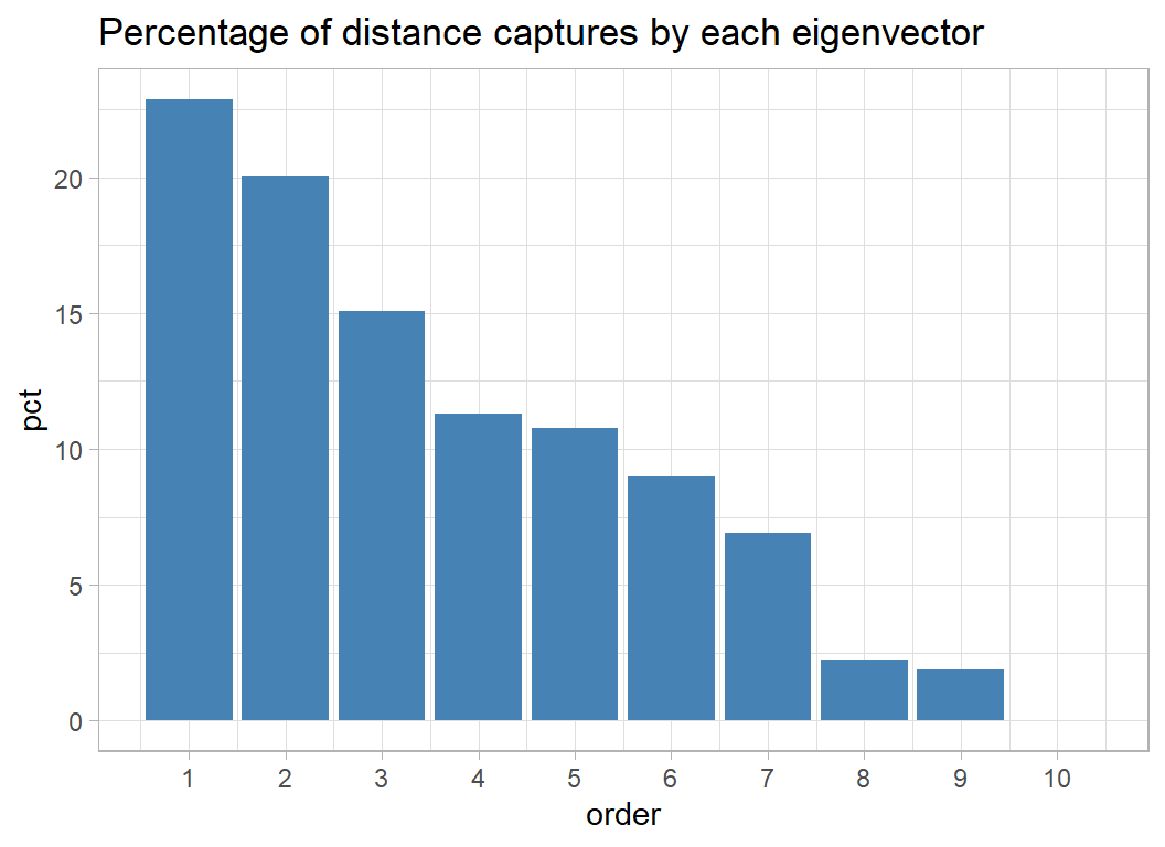
The first three dimensions together capture about 60% of the distance information. I plot these data by merging the mds results with the original data and colouring by churn.
# --- plot the first 3 MDS dimensions -----------------------
library(gridExtra)

tibble( dim1 = mds$points[, 1],
        dim2 = mds$points[, 2]) %>%
  bind_cols( trainDF ) %>%
  ggplot( aes(x=dim1, y=dim2, colour=factor(churn))) +
  geom_point() +
  theme( legend.position="none") -> p12

tibble( dim1 = mds$points[, 1],
        dim3 = mds$points[, 3]) %>%
  bind_cols( trainDF ) %>%
  ggplot( aes(x=dim1, y=dim3, colour=factor(churn))) +
  geom_point() +
  theme( legend.position="none") -> p13

tibble( dim2 = mds$points[, 2],
        dim3 = mds$points[, 3]) %>%
  bind_cols( trainDF ) %>%
  ggplot( aes(x=dim2, y=dim3, colour=factor(churn))) +
  geom_point() +
  theme( legend.position="none") -> p23

grid.arrange( grobs=list(p12,p13,p23),
              layout_matrix=matrix( c(1, 2, NA, 3), ncol=2))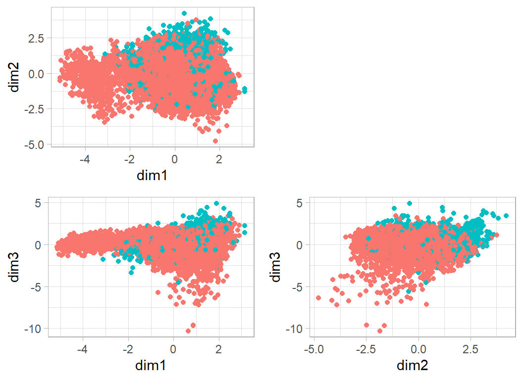
In this plot, every point corresponds to a customer. The points are very dense, but there are three features that stand out. I’ll refer to them as clusters A, B and C.
Cluster A is the group with values on dim1 below about -2.5. These people are well separated from the bulk and contain few who churned. A better separator would be sloping line, dim2+2*dim1=-5
# --- A: the customers who score high on dim1 -----------------------
tibble( dim1 = mds$points[, 1],
        dim2 = mds$points[, 2],
        dim3 = mds$points[, 3]) %>%
  bind_cols( trainDF ) %>%
  mutate( cluster = factor(dim2+2*dim1 < -5, levels=c(FALSE, TRUE),
          labels=c("main", "cluster A"))) %>%
  group_by(cluster) %>%
    summarise( n=n(),
               chu = mean(churn),
               ina = mean(inactive),
               bal = mean(balance),
               amo = mean(amount),
               num = mean(number),
               lim = mean(limit))
## # A tibble: 2 x 8
## cluster n chu ina bal amo num lim
## <fct> <int> <dbl> <dbl> <dbl> <dbl> <dbl> <dbl>
## 1 main 6524 0.173 2.34 1147. 3532. 60.8 8166.
## 2 cluster A 564 0.00355 2.20 1431. 13945. 109. 14923.So cluster A are non-churners and they comprise about 8% of customers. They have a high credit limit and make a lot of transactions for a lot of money.
My cluster B are those people who are positive on dim2 and positive on dim3. A good separator would be dim3+2*dim2>4
# --- B: low on dim1 and dim2 -----------------------------
tibble( dim1 = mds$points[, 1],
        dim2 = mds$points[, 2],
        dim3 = mds$points[, 3]) %>%
  bind_cols( trainDF ) %>%
  mutate( cluster = factor(dim3+2*dim2 > 4,
                           levels=c(FALSE, TRUE),
          labels=c("main", "cluster B"))) %>%
  group_by(cluster) %>%
    summarise( n=n(),
               chu = mean(churn),
               ina = mean(inactive),
               bal = mean(balance),
               amo = mean(amount),
               num = mean(number),
               lim = mean(limit))
## # A tibble: 2 x 8
## cluster n chu ina bal amo num lim
## <fct> <int> <dbl> <dbl> <dbl> <dbl> <dbl> <dbl>
## 1 main 6511 0.112 2.30 1254. 4557. 66.7 8418.
## 2 cluster B 577 0.697 2.74 218. 2144. 41.4 11935.Cluster B includes about 5% of customers. They are heavy churners (70% churn), they have small balances, but large credit limits and they make few transactions for small amounts.
Finally Cluster C has a value for dim1 of about -2 (say between -2.5 and -1.5) and a value for dim3 below 0.
# --- C: cluster around dim1 == 2 --------------------------
tibble( dim1 = mds$points[, 1],
        dim2 = mds$points[, 2],
        dim3 = mds$points[, 3]) %>%
  bind_cols( trainDF ) %>%
  mutate( cluster = factor(dim1 < -1.5 & dim1 > -2.5 & dim3 < 0,
                           levels=c(FALSE, TRUE),
          labels=c("main", "cluster C"))) %>%
  group_by(cluster) %>%
    summarise( n=n(),
               chu = mean(churn),
               ina = mean(inactive),
               bal = mean(balance),
               amo = mean(amount),
               num = mean(number),
               lim = mean(limit))
## # A tibble: 2 x 8
## cluster n chu ina bal amo num lim
## <fct> <int> <dbl> <dbl> <dbl> <dbl> <dbl> <dbl>
## 1 main 6980 0.154 2.33 1174. 4305. 64.4 8525.
## 2 cluster C 108 0.537 2.25 905. 7928. 78.8 20272.Cluster C is a very small group with a high churn rate (54%) low balance and very high credit limit but they are quite active with a high number of transactions for large amounts.
Self-organising map
A self-organising map (SOM) is a neat form of unsupervised learning that is an alternative to MDS. SOM creates clusters of similar individuals using a simple but intuitively sensible algorithm that has some similarities with a neural net.
The first step is to choose a grid size. Let’s suppose that we go for a 10x10 grid. In each of the 100 cells we place a randomly chosen bank customer. So each cell has associated with it a balance, a credit limit, a number of transaction etc., all taken from the chosen customer.
Once the cells are occupied, we pick another random customer and we find the cell that best matches that customers profile; here we judge a match by a distance or similarity measure. The balance etc. of the best matching cell are adjusted to that they move towards the characteristics of the newly allocated customer and crucially, we also move the characteristics of the neighbouring cells in the grid towards the same allocated client, but not as strongly.
The process of selecting a customer, allocating them to a cell and updating the characteristics of that cell and its neighbours is repeated thousands of times, slowly reducing the strength of the adjustment that is made so that eventually the cell profiles settle down.
We now have a 10x10 and each cell has associated with it a set of characteristics. A final allocation is made of each customer to their best matching cell and so 100 clusters are created. When we picture the clusters as a grid, neighbouring cells will have similar characteristics.
The package class includes a function that implements this algorithm.
First I’ll set up the grid size. My grid is 7x7 and rectangular, but you could also chose a hexagonal grid, which would change the number of neighbours that get updated.
library(class)

# --- define the grid -----------------------------------
sGrid <- somgrid(xdim=7, ydim=7, topo="rectangular")
It is possible to select the number of updates and the rate of decay of those updates but I go with the defaults, which are 10000 updates with the strength of the update reducing linearly from 0.05 to 0.
As with the MDS, we need to scale the data before analysing it.
trainDF %>%
  select( -id, -churn, -age, -education, -income, -gender) %>%
  mutate( across(contacts:usage, scale)  ) -> scaleDF
# --- fit the self-organizing map -----------------------
set.seed(9820)

SOM(data=scaleDF, grid=sGrid) -> sm
The package includes a plotting function.
plot(sm)
In this plot the variables are shown as the 9 spokes in a wheel with longer spokes corresponding to higher values. The variables are plotted starting with contacts plotted horizontally to the right, then it progresses anti-clockwise in steps of 60 degrees. So inactive is at 60 degrees to the horizontal above contacts, and so on.
The cells in the bottom left corner are all very similar with moderately large values for all of the variables, but cell 26 (numbering is from the bottom left corner) looks very different, so let’s look at its characteristics. Cell 26 is the 5 element of the 4th row from the bottom.
# --- characteristic of grid cell (5,4) ----------------
sm$codes[26, 1:9]
## contacts inactive limit balance balq4q1 amount number
## -0.5274468 0.6615875 -0.7938517 -1.4343496 1.1013656 -1.0142095 -1.5702187
## numq4q1 usage
## -1.8598279 -0.9992837We can undo the standardisation to make the interpretation easier.
# --- characteristics on the original scales -----------
w <- sm$codes[26, 1:9]
for( v in names(w)) {
  w[v] <- mean(trainDF[[v]]) + w[v] * sd(trainDF[[v]])
}
print(round(w,1))
## contacts inactive limit balance balq4q1 amount number numq4q1
## 3.0 3.0 1438.3 0.0 1.0 974.0 28.0 0.3
## usage
## 0.0So this typical customer for cell 26 has moderately low contacts, moderately high inactivity and high balq4q1. Everything else is low.
It would help to know how many customers are in each cell, n, and the proportion, p, that churned. I’ll allocate customers using the nearest neighbour algorithm.
# --- extract churn into numeric c -------------
c <- as.numeric(trainDF$churn)
# --- use 1-nn to allocate everyone to a cell --
bins <- as.numeric(knn1(sm$code, scaleDF, 0:48))
# --- stats on each cell -----------------------
n <- p <- rep(0, 49)
for( i in 1:49) {
    h <- bins == i
    p[i] <- round(mean(c[h]),2)
    n[i] <- sum(h)
}
Print the summary statistics with cell 1 in the bottom left corner.
for( i in 7:1) {
  for(j in 1:7 ) {
    cat(sprintf("%4.2f(%3.0f)  ", p[(7-i)*7+j], n[(7-i)*7+j]))
  }
  cat("\n")
}
## 0.00( 11) 0.00( 4) 0.02( 62) 0.01(171) 0.60(124) 0.30(280) 0.21(248)
## 0.00( 8) 0.06(278) 0.05( 20) 0.29( 24) 0.88(200) 0.17( 92) 0.29( 45)
## 0.00( 45) 0.06( 31) 0.03( 40) 0.03( 65) 0.17(114) 0.10( 63) 0.05( 38)
## 0.02(134) 0.12( 26) 0.06( 67) 0.06(250) 0.77( 35) 0.01(200) 0.00(176)
## 0.10(115) 0.32(252) 0.00(376) 0.09(207) 0.14(153) 0.43( 67) 0.64(176)
## 0.08(106) 0.05(178) 0.11(163) 0.04(777) 0.71(170) 0.17(109) 0.11(174)
## 0.03(124) 0.22( 45) 0.11(149) 0.10(220) 0.04(157) 0.00(296) 0.21(223)Cell 26 is in position (middle row, column=5). It contains 35 people and 77% of them churned. I have already looked at the characteristics that define this cell. Here are the demographics of some of the 35 people. Remember that, the demographic features were not used to create the cluster.
trainDF %>%
  filter( bins == 26 ) %>%
  select( churn, age, gender, education, income)
## # A tibble: 35 x 5
## churn age gender education income
## <int> <int> <fct> <fct> <fct>
## 1 1 59 female Post-Graduate $40K - $60K
## 2 0 38 female Graduate Less than $40K
## 3 1 51 female Uneducated Unknown
## 4 1 55 male Uneducated $60K - $80K
## 5 1 51 female Unknown $40K - $60K
## 6 1 45 female Uneducated Less than $40K
## 7 0 59 male Post-Graduate $40K - $60K
## 8 0 57 female Graduate $40K - $60K
## 9 1 64 female High School $40K - $60K
## 10 1 43 female Post-Graduate Less than $40K
## # ... with 25 more rowsThey are predominantly women with relatively low incomes.
I’ll make a final plot to show the proportions that churned.
tibble( x = rep(1:7, times=7),
        y = rep(1:7, each=7),
        p = p,
        n = n) %>%
  ggplot(aes(x=x, y=y, colour=p, size=n) ) +
  geom_point() +
  scale_size_area(max_size=20) +
  scale_x_continuous( breaks=1:7) +
  scale_y_continuous( breaks=1:7) +
  labs(x=NULL, y=NULL)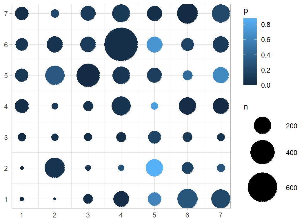
We can see the 26th cell in position x=5, y=4 is light blue indicating its high churn rate.
The other clusters with a high churn rate are at positions (2,5), (6,5) and (5,7). In contrast the largest cluster (6,4) has a very low churn.
I find this analysis very informative, but it is unsupervised, that is, it does not use the churn rate in the clustering and so we cannot expect it to be a brilliant predictive model.
Modelling
Initial thoughts
The exploratory analyses confirm my initial belief that people churn for many different reasons and because of this people with very different profiles might choose to leave a bank.
This is a difficult problem for a classification model because it has to find quite distinct groups of people. Linear models such as logistic regression are likely to perform particularly poorly. Tree-based analyses should do better because the distinct clusters of churners can be identified down different branches of the tree, or by different trees.
I suspect that boosting will work especially well. The algorithm successively models the residuals from the current fit, so after identifying one cluster, the algorithm will naturally be drawn towards the next.
I have spent a long time on the exploration, so I will keep the modelling simple. I will run an xgboost analysis using code almost identical to that which I used in the Airbnb price data of episode 5 that way I will not have much to explain.
I start by converting factors to numbers and then I split the training data into an evaluation and a validation set.
# --- convert the factors to numbers ----------------------
trainDF %>%
  mutate( gender = as.numeric(gender=="male"),
          income = as.numeric(income),
          education = as.numeric(education)) -> trainDF

# --- split the data --------------------------------------
set.seed(7818)
split <- sample(1:7088, size=2000, replace=FALSE)

estimateDF <- trainDF[-split, ]
validateDF <- trainDF[ split, ]
By default xgboost uses the error rate as its performance metric in binary classification; I want to monitor the logloss, so I need to set the eval_metric option.
Based on what I said about the learning rate in the Airbnb episode, I’ll reduce the eta to 0.1 from the default of 0.3. This is not likely to make much difference, but the problem is small and computation time is not a problem.
I’ll introduce one further parameter, max_depth, which controls the depth of the trees. A max_depth of 1 corresponds to what is often called a stump, one split of a single variable. As the boosting progresses and more trees are added, different variables can be chosen, but since two variables are used in the same tree, it is impossible to create an interaction. Such a tree-model is equivalent to a main effects model. Increasing the max_depth allows for more and more complex interactions. The more complex the model that you allow, the greater the tendency to overfit the data and the less well that the model will generalise.
xgboost defaults to max_depth=6, which seems to me to be excessive given the small number of variables and the small sample size. A data scientist would probably choose the max_depth that minimises the logloss, while I am inclined to say that I cannot remember a single statistical model in which four-variable interactions were of interest. In my opinion, the default max_depth is too large for this problem, so I’ll use max_depth=3.
Having chosen max_depth and eta, I still need to experiment to find the appropriate number of iterations.
library(xgboost)

# --- set the estimation data ----------------------------
estimateDF %>%
  select( -id, -churn ) %>%
  as.matrix() -> X

estimateDF %>%
  pull(churn) -> Y

dtrain <- xgb.DMatrix(data = X, label = Y)

# --- set the validation data ---------------------------
validateDF %>%
  select( -id, -churn ) %>%
  as.matrix() -> XV

validateDF %>%
  pull(churn) -> YV

dtest <- xgb.DMatrix(data = XV, label=YV)

# --- fit the xgboost model -----------------------------
xgb.train(data=dtrain,
        watchlist=list(train=dtrain, test=dtest),
        objective="binary:logistic",
        eval_metric="logloss",
        nrounds=500, eta=0.1, max_depth=3,
        verbose=2, print_every_n =50) -> xgmod
## [1] train-logloss:0.622073 test-logloss:0.623269
## [51] train-logloss:0.124621 test-logloss:0.143333
## [101] train-logloss:0.085506 test-logloss:0.110245
## [151] train-logloss:0.066953 test-logloss:0.096825
## [201] train-logloss:0.055997 test-logloss:0.092081
## [251] train-logloss:0.047080 test-logloss:0.088793
## [301] train-logloss:0.039609 test-logloss:0.087718
## [351] train-logloss:0.033871 test-logloss:0.087830
## [401] train-logloss:0.029116 test-logloss:0.088644
## [451] train-logloss:0.025626 test-logloss:0.089839
## [500] train-logloss:0.022472 test-logloss:0.089952# --- show estimation & validation logloss --------------
xgmod$evaluation_log %>%
ggplot( aes(x=iter, y=train_logloss)) +
geom_line(colour="blue") +
geom_line( aes(y=test_logloss), colour="red") +
scale_y_continuous( limits = c(0, 0.2), breaks=seq(0, 0.2, by=.02)) +
labs(x="Iteration", y="mean log loss",
title="In-sample and out-of-sample log loss")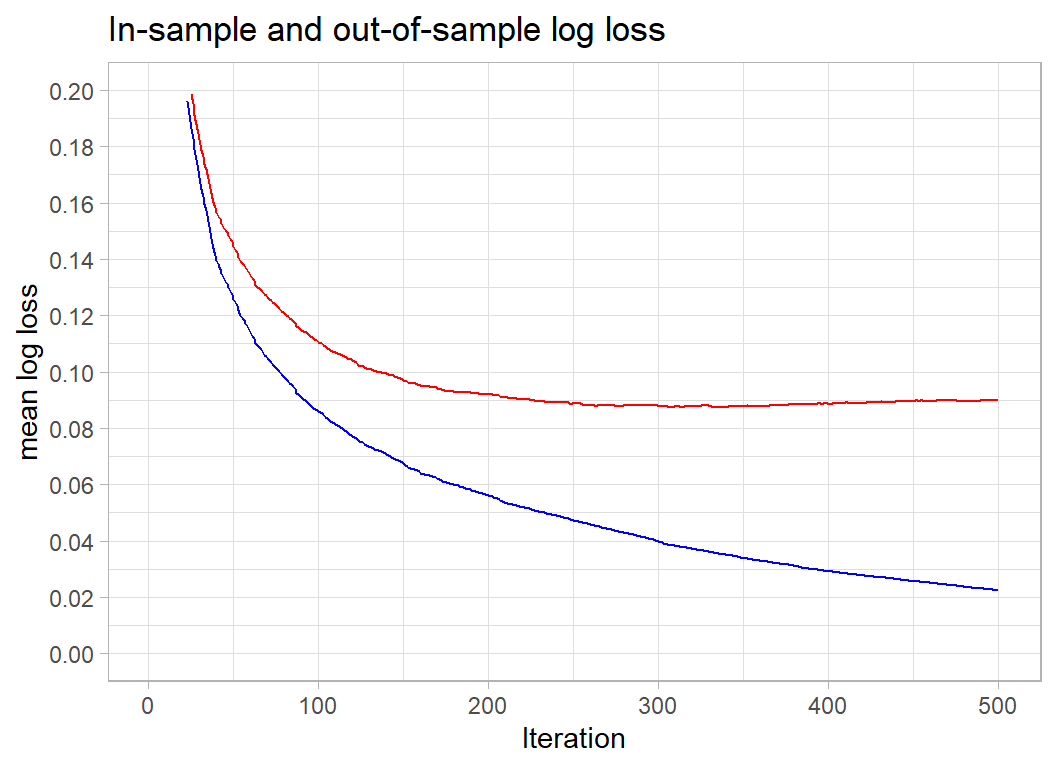
xgmod$evaluation_log %>%
  summarise( minIter = which(test_logloss == min(test_logloss))[1] ) %>%
  pull(minIter) -> minIteration
# --- logloss at the optimum ------------------
minLogloss <- xgmod$evaluation_log$test_logloss[minIteration]

print( c(minIteration, minLogloss))
## [1] 336.000000 0.087356Obviously, there is huge overfitting. If we concentrate on the out of sample (validation) measure shown in red, it appears that 500 iterations overshots the best solution, which is found after after 336 iterations when the out-of-sample logloss is 0.08736.
A submission
I build a submission based on 300 rounds, eta=0.1 and max_depth=3. I fit the model to the entire training set and then predict for the test set.
# --- place predictors is matrix X -------------------------
trainDF %>%
  select( -id, -churn ) %>%
  as.matrix() -> X

# --- place response in vector Y ---------------------------
trainDF %>%
  pull(churn) -> Y

# --- fit the model ----------------------------------------
xgboost(data=X, label=Y, nrounds=300, eta=0.1,
        max_depth=3, verbose=0,
        objective="binary:logistic") -> xgmod

testDF %>%
  mutate( gender = as.numeric(gender=="male"),
          income = as.numeric(income),
          education = as.numeric(education))  %>%
  select( -id ) %>%
  as.matrix() -> XT

# --- make predictions and save ----------------------------
testDF %>%
  mutate( attrition_flag = predict(xgmod, newdata=XT ) ) %>%
  select(id, attrition_flag) %>%
  write.csv( file.path(home, "temp/submission1.csv"),
             row.names=FALSE)
This model gives a logloss of 0.07392 putting it in 6th place on the leaderboard, but differing by a trivial amount from 4 other entries that scored between 0.072 and 0.074. The leader scored 0.06800, which does appear to be appreciably better than the rest.
Optimising over max_depth
I have argued against tuning the max_depth hyperparameter. So I thought that I would end by putting my prejudice to the test. I’ll try different values of max_depth together with the corresponding optimum number of iterations.
# --- variables for saving the results
minIteration <- minLogloss <- rep(0,8)
for( i in 1:8 ) {
  # --- fit the xgboost model -----------------------------
  xgb.train(data=dtrain,
        watchlist=list(train=dtrain, test=dtest),
        objective="binary:logistic",
        eval_metric="logloss",
        nrounds=1000, eta=0.1, max_depth=i,
        verbose=0) -> xgmod

  xgmod$evaluation_log %>%
    summarise( minIter = which(test_logloss == min(test_logloss))[1] ) %>%
    pull(minIter) -> minIteration[i]
  # --- logloss at the optimum ------------------
  minLogloss[i] <- xgmod$evaluation_log$test_logloss[minIteration[i]]
}
tibble( depth      = 1:8,
        iterations = minIteration,
        logloss    = minLogloss)
## # A tibble: 8 x 3
## depth iterations logloss
## <int> <dbl> <dbl>
## 1 1 1000 0.116
## 2 2 725 0.0832
## 3 3 336 0.0874
## 4 4 237 0.0889
## 5 5 173 0.0886
## 6 6 115 0.0899
## 7 7 113 0.0937
## 8 8 88 0.0942The results show that, the shallower the trees, the longer it takes to reach the minimum logloss, which intuitively seems right. Many simple trees are likely to be equivalent to a few more complex trees. My gut feeling that max_depth should be small seems to be supported. The default value of max_depth, 6, is clearly too large for these data. What shocks me is the big difference in performance between max_depth of 2 and 3.
A second submission is called for with max_depth=2.
# --- place predictors is matrix X -------------------------
trainDF %>%
  select( -id, -churn ) %>%
  as.matrix() -> X

# --- place response in vector Y ---------------------------
trainDF %>%
  pull(churn) -> Y

# --- fit the model ----------------------------------------
xgboost(data=X, label=Y, nrounds=725, eta=0.1,
        max_depth=2, verbose=0,
        objective="binary:logistic") -> xgmod

testDF %>%
  mutate( gender = as.numeric(gender=="male"),
          income = as.numeric(income),
          education = as.numeric(education))  %>%
  select( -id ) %>%
  as.matrix() -> XT

# --- make predictions and save ----------------------------
testDF %>%
  mutate( attrition_flag = predict(xgmod, newdata=XT ) ) %>%
  select(id, attrition_flag) %>%
  write.csv( file.path(home, "temp/submission2.csv"),
             row.names=FALSE)
The logloss for this submission is 0.07239, enough to move the model up to 4th place on the leaderboard, but it is still in the group of models that scored between 0.072 and 0.074 and I treat this improvement as meaningless.
The real message is, don’t over-interpret a single validation sample; use cross-validation instead. I’ll do that next time I use xgboost.
As far as max_depth is concerned, my choice of 3 seems perfectly reasonable.
What this example shows
I have treated these data as an exercise in data exploration and as a consequence I have not as much effort into the modelling.
The multivariate exploration using MDS showed that quite distinct clusters of people will churn. This ought to alert us to fact that linear models will have difficulty in capturing the pattern. The descriptions of the clusters tell us a lot about the nature of churning and would probably be as useful to the bank as the prediction model.
Self-organising maps (SOMs) offer a very good alternative to MDS and in my opinion SOMs should be used more. The properties of the algorithm and its relationship with neural nets would be good topics for more research.
The xgboost model is pretty standard, except that I choose eta and max_depth based on my feelings about the type of model that I wanted to fit rather than by hyperparameter tuning. So long as you choose reasonable values for the hyperparameters, xgboost will produce good predictions. These data are insufficient to justify fine tuning. My prejudice is that hyperparameter tuning is often used in a lazy way; it saves the analyst from having to understand what they are doing.