Sliced Episode 9: Baseball home runs
Summary
Background: In episode 9 of the 2021 series of Sliced, the competitors were given two hours in which to analyse a set of data on baseball. The aim was to predict whether or not a hit went for a home run.
My approach: I ran an extensive exploratory analysis relating the percentage of home runs to each of the exploratory factors. The type of hit is extremely predictive; for instance, you cannot hit a home run off a ground ball. The speed and angle of the ball when it leaves the bat are also critical. Using a selectively chosen set of predictors and the xgboost algorithm I created a prediction model.
Result: The default hyperparameter values together with my selected predictors create a model that would have finished second on the leaderboard. Subjectively picking hyperparameter values that I thought would improve the model, created a model that would have won the competition.
Conclusion: Tiny changes in the hyperparameters lead to changes in the loss function that would move my model from the top of the leaderboard to fifth place. It is nice when one of your models wins but, as with any sport, the result is a combination of skill and luck. It is best not to get carried away by a good result; next time, luck might not be with you.
Introduction:
The data for the ninth episode of Sliced 2021 can be downloaded from https://www.kaggle.com/c/sliced-s01e09-playoffs-1. These data contain data on each hit made during the 2020 baseball playoffs. The objective is to predict whether or not the hit resulted in a home run. Evaluation is by logloss.
Reading the data:
It is my practice to read the data asis and to immediately save it in rds format within a directory called data/rData. For details of the way that I organise my analyses, read my post called Sliced Methods Overview.
# --- setup: libraries & options ------------------------
library(tidyverse)

theme_set( theme_light())

# --- set home directory -------------------------------
home <- "C:/Projects/kaggle/sliced/s01-e09"

# --- read downloaded data -----------------------------
trainRawDF <- readRDS( file.path(home, "data/rData/train.rds") )

parkRawDF <- readRDS( file.path(home, "data/rData/park_dimensions.rds") )

testRawDF <- readRDS( file.path(home, "data/rData/test.rds") )
Data Exploration
As usual, I start by summarising the training data with the skimr package and omitting the output from this post because of its length.
# --- summarise the training set -----------------------
skimr::skim(trainRawDF)
In summary, there were 46244 hits of which 2447 (5.3%) resulted in a home run. There is no missing data except for a handful of missing classifications of the type of hit and about 25% of the measures of the speed and angle with which the ball left the bat.
Predictors
The first thing to note is that home runs cannot be hit off a ground ball or a pop up, which means that over half of the hits can be eliminated without further consideration.
I label the hits that do not go for a home run as ‘in field’; I have no idea whether this would make sense to baseball fans.
# --- ball type and home runs -------------------------------------
trainRawDF %>%
  mutate( is_home_run = factor(is_home_run, levels=c(0,1),
                               labels=c("In_field", "Home_run"))) %>%
  count(bb_type, is_home_run) %>%
  pivot_wider( values_from=n, names_from=is_home_run, values_fill=0)
## # A tibble: 5 x 3
## bb_type In_field Home_run
## <chr> <int> <int>
## 1 fly_ball 8383 1345
## 2 ground_ball 20197 0
## 3 line_drive 11875 1102
## 4 popup 3336 0
## 5 <NA> 6 0In the following data exploration, I only consider fly balls and line drives.
Launch angle and speed
The next most important factors are the speed and angle of the hit.
# --- speed and angle of the hits ---------------------------------
trainRawDF %>%
  filter( bb_type %in% c("fly_ball", "line_drive")) %>%
  mutate( is_home_run = factor(is_home_run, levels=c(0,1),
                               labels=c("In_field", "Home_run"))) %>%
  ggplot( aes(x=launch_speed, y=launch_angle)) +
  geom_hex( bins=30) +
  scale_fill_viridis_c() +
  facet_wrap(~is_home_run)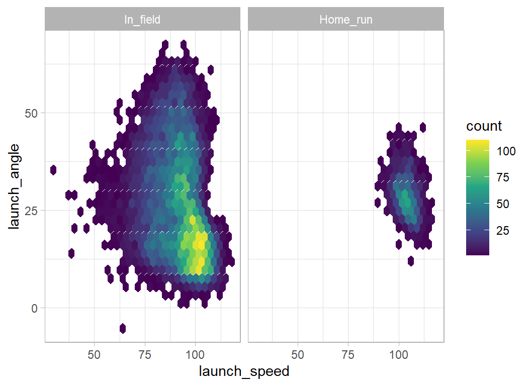
Even with fly_balls and line_drives, it is impossible to hit a home run if the launch angle is over 50 degrees or under 10 degrees. The launch speed needs to be over 85 mph.
Unfortunately, launch speed and angle are often missing.
# --- missing speed and angle of hit ---------------------------------
trainRawDF %>%
  filter( bb_type %in% c("fly_ball", "line_drive")) %>%
  mutate( is_home_run = factor(is_home_run, levels=c(0,1),
                               labels=c("In_field", "Home_run"))) %>%
  mutate( speed = ifelse(is.na(launch_speed), "missing", "measured"),
          angle = ifelse(is.na(launch_angle), "missing", "measured")) %>%
  group_by( speed, angle, is_home_run) %>%
  summarise( n = n(), .groups="drop") %>%
  pivot_wider( values_from=n, names_from=is_home_run) %>%
  mutate( pct = round(100*Home_run/(Home_run+In_field),1) )
## # A tibble: 4 x 5
## speed angle In_field Home_run pct
## <chr> <chr> <int> <int> <dbl>
## 1 measured measured 11465 1317 10.3
## 2 measured missing 3727 462 11
## 3 missing measured 3709 502 11.9
## 4 missing missing 1357 166 10.9Nearly, half of all home runs have one or other or both missing, but it seems that missingness is not very informative.
The pitch
The type of pitch is not very predictive.
# --- type of pitch --------------------------------------------------
trainRawDF %>%
  filter( bb_type %in% c("fly_ball", "line_drive")) %>%
  mutate( is_home_run = factor(is_home_run, levels=c(0,1),
                               labels=c("In_field", "Home_run"))) %>%
  count( pitch_name, is_home_run) %>%
  pivot_wider( values_from=n, names_from=is_home_run, values_fill=0) %>%
  mutate( pct = round(100*Home_run/(Home_run+In_field),1) )
## # A tibble: 9 x 4
## pitch_name In_field Home_run pct
## <chr> <int> <int> <dbl>
## 1 4-Seam Fastball 7643 1014 11.7
## 2 Changeup 2423 263 9.8
## 3 Curveball 1506 177 10.5
## 4 Cutter 1478 170 10.3
## 5 Forkball 1 0 0
## 6 Knuckle Curve 345 41 10.6
## 7 Sinker 3339 360 9.7
## 8 Slider 3203 385 10.7
## 9 Split-Finger 320 37 10.4Nor is the speed of the pitch
# --- pitch speed ----------------------------------------------------
trainRawDF %>%
  filter( bb_type %in% c("fly_ball", "line_drive")) %>%
  mutate( is_home_run = factor(is_home_run, levels=c(0,1),
                               labels=c("In_field", "Home_run"))) %>%
  ggplot( aes(x=pitch_mph, fill=is_home_run)) +
  geom_density( alpha=0.5)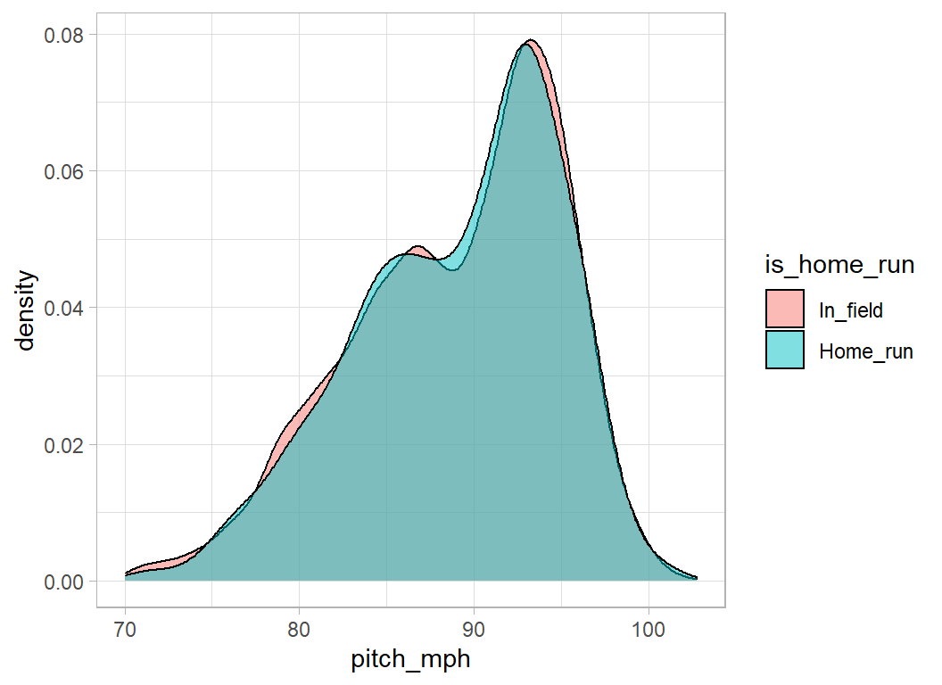
Position in the hit zone
The position of the pitch in the hitting zone is important, anything central can go for a home run, but not those pitches on the edge of the zone.
# --- position in the hit zone ---------------------------------------
trainRawDF %>%
  filter( bb_type %in% c("fly_ball", "line_drive")) %>%
  mutate( is_home_run = factor(is_home_run, levels=c(0,1),
                               labels=c("In_field", "Home_run"))) %>%
  ggplot( aes(x=plate_x, y=plate_z)) +
  geom_hex( bins=30) +
  scale_fill_viridis_c() +
  facet_wrap(~is_home_run)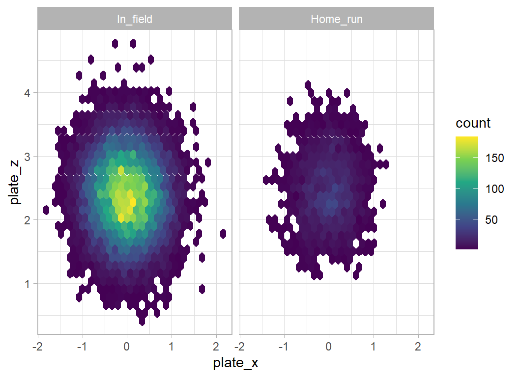
It is important to check whether the batter is right or left-handed
# --- position in the hit zone ---------------------------------------
trainRawDF %>%
filter( bb_type %in% c("fly_ball", "line_drive")) %>%
mutate( is_home_run = factor(is_home_run, levels=c(0,1),
labels=c("In_field", "Home_run"))) %>%
mutate( is_batter_lefty = factor(is_batter_lefty, levels=0:1,
labels=c("right handed", "left handed"))) %>%
ggplot( aes(x=plate_x, y=plate_z)) +
geom_hex( bins=30) +
scale_fill_viridis_c() +
facet_grid(is_batter_lefty ~ is_home_run)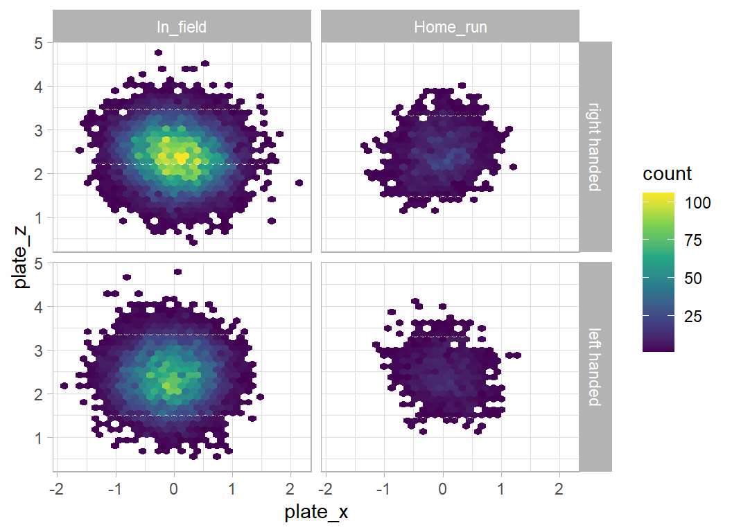 There is a sloping line that goes along a different diagonal for home runs hit by right and left handed batters, but the difference is hardly predictive.
Direction of the hit
I assume that the bearing refers to the direction of the hit relative to the plate. In which case it is again important to distinguish left and right-handed batters.
# --- direction of the hit ----------------------------------------
trainRawDF %>%
  filter( bb_type %in% c("fly_ball", "line_drive")) %>%
  mutate( is_home_run = factor(is_home_run, levels=c(0,1),
                               labels=c("In_field", "Home_run"))) %>%
  mutate( is_batter_lefty = factor(is_batter_lefty, levels=0:1,
                               labels=c("right handed", "left handed"))) %>%
  count( is_batter_lefty, bearing, is_home_run) %>%
  pivot_wider( values_from=n, names_from=is_home_run, values_fill=0) %>%
  mutate( pct = round(100*Home_run/(Home_run+In_field),1) )
## # A tibble: 6 x 5
## is_batter_lefty bearing In_field Home_run pct
## <fct> <chr> <int> <int> <dbl>
## 1 right handed center 4305 953 18.1
## 2 right handed left 3482 434 11.1
## 3 right handed right 3909 109 2.7
## 4 left handed center 3241 567 14.9
## 5 left handed left 2993 53 1.7
## 6 left handed right 2328 331 12.4Most home runs are hit to centre field. Right-handers rarely hit home runs to the right and left-handers rarely hit them to the left. It seems to be like cricket, where it is much harder to hit a six over the off-side.
State of play
The state of play seems to have a slight impact. Perhaps batters are more likely to go after the pitch when they are ahead of the pitcher, 3-0, 2-0 or 3-1
# --- balls and strikes ------------------------------------------------
trainRawDF %>%
  filter( bb_type %in% c("fly_ball", "line_drive")) %>%
  mutate( is_home_run = factor(is_home_run, levels=c(0,1),
                               labels=c("In_field", "Home_run"))) %>%
  count( balls, strikes, is_home_run) %>%
  pivot_wider( values_from=n, names_from=is_home_run, values_fill=0) %>%
  mutate( difference = balls - strikes ) %>%
  mutate( pct = round(100*Home_run/(Home_run+In_field),1) ) %>%
  arrange(pct) %>%
  select( balls, strikes, difference, In_field, Home_run, pct)
## # A tibble: 12 x 6
## balls strikes difference In_field Home_run pct
## <dbl> <dbl> <dbl> <int> <int> <dbl>
## 1 0 2 -2 1305 108 7.6
## 2 1 2 -1 2279 220 8.8
## 3 0 1 -1 2460 248 9.2
## 4 2 2 0 2338 260 10
## 5 3 2 1 1895 218 10.3
## 6 1 1 0 2277 279 10.9
## 7 2 1 1 1368 171 11.1
## 8 0 0 0 3112 417 11.8
## 9 1 0 1 1798 266 12.9
## 10 3 1 2 660 114 14.7
## 11 2 0 2 711 126 15.1
## 12 3 0 3 55 20 26.7The difference (balls minus strikes) seems to be predictive but, the number of outs is not very predictive.
# --- number of outs -----------------------------------------------
trainRawDF %>%
  filter( bb_type %in% c("fly_ball", "line_drive")) %>%
  mutate( is_home_run = factor(is_home_run, levels=c(0,1),
                               labels=c("In_field", "Home_run"))) %>%
  count( outs_when_up, is_home_run) %>%
  pivot_wider( values_from=n, names_from=is_home_run, values_fill=0) %>%
  mutate( pct = round(100*Home_run/(Home_run+In_field),1) )
## # A tibble: 3 x 4
## outs_when_up In_field Home_run pct
## <dbl> <int> <int> <dbl>
## 1 0 7224 930 11.4
## 2 1 6653 783 10.5
## 3 2 6381 734 10.3Batter’s team
Obviously some teams are better at batting than others.
# --- batter's team ----------------------------------------------
trainRawDF %>%
  filter( bb_type %in% c("fly_ball", "line_drive")) %>%
  mutate( is_home_run = factor(is_home_run, levels=c(0,1),
                               labels=c("In_field", "Home_run"))) %>%
  count( batter_team, is_home_run) %>%
  pivot_wider( values_from=n, names_from=is_home_run, values_fill=0) %>%
  mutate( pct = round(100*Home_run/(Home_run+In_field),1) ) %>%
  arrange( desc(pct)) %>%
  print(n = 30)
## # A tibble: 30 x 4
## batter_team In_field Home_run pct
## <chr> <int> <int> <dbl>
## 1 CWS 637 101 13.7
## 2 NYY 685 109 13.7
## 3 LAD 941 145 13.4
## 4 TB 736 114 13.4
## 5 SD 701 103 12.8
## 6 CIN 630 90 12.5
## 7 ATL 847 119 12.3
## 8 NYM 631 86 12
## 9 MIN 677 91 11.8
## 10 CHC 564 74 11.6
## 11 LAA 669 85 11.3
## 12 TOR 692 88 11.3
## 13 MIL 603 75 11.1
## 14 PHI 647 81 11.1
## 15 BOS 679 81 10.7
## 16 OAK 731 85 10.4
## 17 BAL 652 75 10.3
## 18 SF 699 80 10.3
## 19 KC 632 68 9.7
## 20 DET 582 62 9.6
## 21 TEX 586 62 9.6
## 22 HOU 860 90 9.5
## 23 MIA 617 64 9.4
## 24 SEA 599 60 9.1
## 25 PIT 602 58 8.8
## 26 WSH 687 66 8.8
## 27 CLE 646 60 8.5
## 28 COL 708 63 8.2
## 29 STL 625 54 8
## 30 ARI 693 58 7.7Pitcher’s team
Some teams are better at pitching
# --- pitcher's team -----------------------------------------------
trainRawDF %>%
  filter( bb_type %in% c("fly_ball", "line_drive")) %>%
  mutate( is_home_run = factor(is_home_run, levels=c(0,1),
                               labels=c("In_field", "Home_run"))) %>%
  mutate( pitcher_team = ifelse( batter_team == home_team, away_team,
                                 home_team)) %>%
  count( pitcher_team, is_home_run) %>%
  pivot_wider( values_from=n, names_from=is_home_run, values_fill=0) %>%
  mutate( pct = round(100*Home_run/(Home_run+In_field),1) ) %>%
  arrange( desc(pct)) %>%
  print(n = 30)
## # A tibble: 30 x 4
## pitcher_team In_field Home_run pct
## <chr> <int> <int> <dbl>
## 1 BOS 687 97 12.4
## 2 NYY 663 94 12.4
## 3 PHI 593 80 11.9
## 4 DET 682 91 11.8
## 5 ARI 705 93 11.7
## 6 PIT 608 80 11.6
## 7 WSH 710 93 11.6
## 8 NYM 628 81 11.4
## 9 STL 577 74 11.4
## 10 HOU 735 93 11.2
## 11 MIL 537 68 11.2
## 12 TOR 660 83 11.2
## 13 CIN 551 69 11.1
## 14 MIA 697 87 11.1
## 15 CHC 624 77 11
## 16 TB 827 101 10.9
## 17 KC 635 76 10.7
## 18 LAA 693 82 10.6
## 19 SEA 676 79 10.5
## 20 BAL 680 79 10.4
## 21 OAK 730 85 10.4
## 22 TEX 680 79 10.4
## 23 CLE 651 75 10.3
## 24 ATL 776 86 10
## 25 COL 755 83 9.9
## 26 CWS 663 73 9.9
## 27 LAD 801 86 9.7
## 28 SD 693 74 9.6
## 29 MIN 641 62 8.8
## 30 SF 700 67 8.7Team comparison
I combine the batting and pitching percentages of home runs so as to create an overall comparison between teams.
# --- batting percentages -------------------------------------------
trainRawDF %>%
  filter( bb_type %in% c("fly_ball", "line_drive")) %>%
  mutate( is_home_run = factor(is_home_run, levels=c(0,1),
                               labels=c("In_field", "Home_run"))) %>%
  count( batter_team, is_home_run) %>%
  pivot_wider( values_from=n, names_from=is_home_run, values_fill=0) %>%
  mutate( pctBatting = round(100*Home_run/(Home_run+In_field),1) ) %>%
  rename( team = batter_team ) %>%
  select( team, pctBatting ) -> batDF

# --- pitching percentages ------------------------------------------
trainRawDF %>%
  filter( bb_type %in% c("fly_ball", "line_drive")) %>%
  mutate( is_home_run = factor(is_home_run, levels=c(0,1),
                               labels=c("In_field", "Home_run"))) %>%
  mutate( pitcher_team = ifelse( batter_team == home_team, away_team, home_team)) %>%
  count( pitcher_team, is_home_run) %>%
  pivot_wider( values_from=n, names_from=is_home_run, values_fill=0) %>%
  mutate( pctPitching = round(100*Home_run/(Home_run+In_field),1) ) %>%
  rename( team = pitcher_team ) %>%
  select( team, pctPitching ) -> pitDF

# --- team statistics -----------------------------------------------
batDF %>%
  left_join( pitDF, by = "team") %>%
  ggplot( aes(x=pctBatting, y=pctPitching, label=team)) +
  geom_point() +
  geom_text(nudge_x=0.2)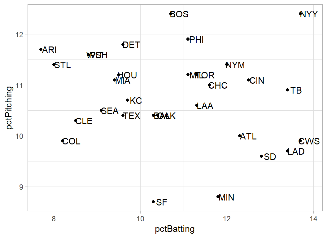
New York Yankees must be good to watch, they hit a lot of home runs and they give up a lot of home runs. Minesotta and San Francisco are good pitching teams. The best teams are in the bottom right of the plot and we should all feel sorry for the fans of Arizona.
If these data do refer to 2020 then Tampa Bay Rays (TB) played the LA Dodgers (LAD) in the final (bizarrely called the world series) and the Dodgers won. This would fit with the plot.
Home advantage
Slightly more home runs are hit by home teams
trainRawDF %>%
  filter( bb_type %in% c("fly_ball", "line_drive")) %>%
  mutate( is_home_run = factor(is_home_run, levels=c(0,1),
                               labels=c("In_field", "Home_run"))) %>%
  mutate( pitcher_team = ifelse( batter_team == home_team, away_team, home_team)) %>%
  mutate( at_home = factor(batter_team == home_team, levels=c(FALSE, TRUE),
                           labels=c("Away", "Home"))) %>%
  count( at_home, is_home_run) %>%
  pivot_wider( values_from=n, names_from=is_home_run, values_fill=0) %>%
  mutate( pct = round(100*Home_run/(Home_run+In_field),1) ) %>%
  arrange( desc(pct)) %>%
  print()
## # A tibble: 2 x 4
## at_home In_field Home_run pct
## <fct> <int> <int> <dbl>
## 1 Home 9896 1252 11.2
## 2 Away 10362 1195 10.3Baseball park
Unfortunately the park datafile does not include the name of the team that plays there. To make matters worse, some of the stadiums appear to have changed their names. To the best of my knowledge (by which I mean Google) I have matched teams to the stadiums.
teams <- c("LAA", "STL", "ARI", "NYM", "PHI", "DET", "COL",
           "LAD", "BOS", "TEX", "CIN", "CWS", "KC" , "MIA",
           "MIL", "HOU", "WSH", "NYY", "SF",  "BAL", "SD",
           "PIT", "CLE", "OAK", "TOR", "ATL", "SEA", "MIN",
           "TB",  "CHC")

parkRawDF %>%
  arrange(NAME) %>%
  mutate(home_team = teams)  -> parkDF

parkDF %>%
  select(NAME, home_team) %>%
  print()
## # A tibble: 30 x 2
## NAME home_team
## <chr> <chr>
## 1 Angel Stadium of Anaheim LAA
## 2 Busch Stadium III STL
## 3 Chase Field ARI
## 4 Citi Field NYM
## 5 Citizens Bank Park PHI
## 6 Comerica Park DET
## 7 Coors Field COL
## 8 Dodger Stadium LAD
## 9 Fenway Park BOS
## 10 Globe Life Park TEX
## # ... with 20 more rowsNow I can calculate the percentage of home runs hit in each stadium.
# --- baseball parks -------------------------------------------------
trainRawDF %>%
  left_join( parkDF, by = "home_team") %>%
  filter( bb_type %in% c("fly_ball", "line_drive")) %>%
  mutate( is_home_run = factor(is_home_run, levels=c(0,1),
                               labels=c("In_field", "Home_run"))) %>%
  count( NAME, is_home_run) %>%
  pivot_wider( values_from=n, names_from=is_home_run, values_fill=0) %>%
  mutate( pct = round(100*Home_run/(Home_run+In_field),1) ) %>%
  arrange( desc(pct)) %>%
  print(n = 30)
## # A tibble: 30 x 4
## NAME In_field Home_run pct
## <chr> <int> <int> <dbl>
## 1 Great American Ballpark 538 107 16.6
## 2 New Yankee Stadium 697 113 14
## 3 Guarantee Rate Park 585 91 13.5
## 4 Citi Field 613 93 13.2
## 5 Petco Park 673 98 12.7
## 6 Citizens Bank Park 652 92 12.4
## 7 Tropicana Field 760 108 12.4
## 8 Miller Park 549 76 12.2
## 9 Angel Stadium of Anaheim 705 96 12
## 10 Dodger Stadium 929 126 11.9
## 11 SunTrust Park 809 104 11.4
## 12 Fenway Park 721 89 11
## 13 Oriole Park at Camden Yards 641 77 10.7
## 14 T-Mobile Park 612 71 10.4
## 15 Minute Maid Park 710 81 10.2
## 16 Oracle Park 691 76 9.9
## 17 Comerica Park 605 65 9.7
## 18 Rogers Centre 664 71 9.7
## 19 Wrigley Field 627 67 9.7
## 20 PNC Park 619 64 9.4
## 21 Progressive Field 658 68 9.4
## 22 Busch Stadium III 595 61 9.3
## 23 Chase Field 719 73 9.2
## 24 Coors Field 774 78 9.2
## 25 Nationals Park 685 69 9.2
## 26 Globe Life Park 641 64 9.1
## 27 Target Field 690 69 9.1
## 28 Kauffman Stadium 675 67 9
## 29 Marlins Park 623 61 8.9
## 30 RingCentral Coliseum 798 72 8.3The big question is whether these differences are due to the size of the park or the team that plays there.
The length of hit needed for a home run depends on the dimensions of the park and the size of the wall that you have to hit over. These will vary between the centre, left and right of the park. I have created a crude overall measure by adding the distance to the height of the wall and then averaging over the three directions.
# --- park dimensions ------------------------------------------------]
trainRawDF %>%
  filter( bb_type %in% c("fly_ball", "line_drive")) %>%
  mutate( is_home_run = factor(is_home_run, levels=c(0,1),
                               labels=c("In_field", "Home_run"))) %>%
  count( home_team, is_home_run) %>%
  pivot_wider( values_from=n, names_from=is_home_run, values_fill=0) %>%
  mutate( pct = round(100*Home_run/(Home_run+In_field),1) ) %>%
  left_join( parkDF, by = "home_team") %>%
  mutate( size = (LF_Dim + LF_W + CF_Dim + CF_W + RF_Dim + RF_W)/3 ) %>%
  ggplot( aes(x=size, y=pct, colour=Cover)) +
  geom_point( size=3) +
  geom_smooth( colour="Black", method="lm") +
  scale_colour_manual(values=c("Green", "Blue", "Red")) +
  labs(y="Percent home runs", x="Average size of the Park") +
  theme( legend.position = c(0.8, 0.8))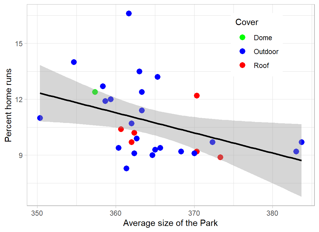
The trend of more home runs in smaller parks is there but it is weak.
Predictive Model
5.3% of all hits end in a home run
# --- home runs in all hits -----------------------------------------
trainRawDF %>%
  mutate( is_home_run = factor(is_home_run, levels=c(0,1),
                               labels=c("In_field", "Home_run"))) %>%
  count( is_home_run ) %>%
  mutate( pct = 100*n/sum(n))
## # A tibble: 2 x 3
## is_home_run n pct
## <fct> <int> <dbl>
## 1 In_field 43797 94.7
## 2 Home_run 2447 5.29There are 46244 hits in the training set but I can exclude 29471 (64%) hits that could not possibly be home runs due to the type of hit or the launch angle and speed. Of the remaining 16573 hits, 2447 (14.6%) were home runs.
# --- home runs of eligible hits ------------------------------------
trainRawDF %>%
  filter( bb_type %in% c("fly_ball", "line_drive")) %>%
  filter( launch_speed > 85 | is.na(launch_speed) ) %>%
  filter( (launch_angle > 10 & launch_angle < 50) |
            is.na(launch_angle)) %>%
  mutate( is_home_run = factor(is_home_run, levels=c(0,1),
                               labels=c("In_field", "Home_run"))) %>%
  count( is_home_run )
## # A tibble: 2 x 2
## is_home_run n
## <fct> <int>
## 1 In_field 14326
## 2 Home_run 2447This creates a very simple model, P(home run) = 0.0001 for the impossible cases and 0.14589 for the remainder. I submit this model, not because it is a good model, but because it will give me a feel as to how much I need improve.
First submission
I apply the crude rule based on type of hit, angle and speed to the test data.
# --- two-level model ---------------------------------------------
testRawDF %>%
  mutate( possible = bb_type %in% c("fly_ball", "line_drive")) %>%
  mutate( possible = possible &
            (launch_speed > 85 | is.na(launch_speed)) ) %>%
  mutate( possible = possible & (
    (launch_angle > 10 & launch_angle < 50) | is.na(launch_angle))) %>%
  mutate( is_home_run = 0.0001 * (possible==FALSE) +
                        0.14589 * (possible==TRUE) ) %>%
  select(bip_id, is_home_run) %>%
  write_csv( file.path(home, "temp/submisssion1.csv"))
When submitted, this simple model scores a mean logloss of 0.14556, which would put it in 20th place. To be competitive we need to reduce the loss to 0.08.
Improved predictive model
I’ll use XGBoost for the predictive model and implement it as in episode 7, except that this time I’ll use cross-validation rather than a validation data set.
First I prepare the data
# --- feature extraction: training set --------------------------
trainRawDF %>%
  mutate( possible = as.numeric(bb_type %in% c("fly_ball", "line_drive")),
          fly = as.numeric(bb_type == "fly_ball"),
          drive = as.numeric(bb_type == "line_drive")) %>%
  mutate( at_home = as.numeric(batter_team == home_team)) %>%
  mutate( pitcher_team = ifelse( batter_team == home_team,
                                 away_team, home_team)) %>%
  left_join( pitDF %>%
               rename(pitcher_team = team), by= "pitcher_team") %>%
  left_join( batDF %>%
               rename(batter_team = team), by= "batter_team") %>%
  mutate( centre = as.numeric(bearing == "center"),
          onside = as.numeric(bearing== "left" & is_batter_lefty==0 |
                          bearing=="right" & is_batter_lefty==1),
          offside = as.numeric(bearing== "left" & is_batter_lefty==1 |
                          bearing=="right" & is_batter_lefty==0) ) %>%
  left_join( parkDF, by = "home_team") %>%
  mutate( size = (LF_Dim + LF_W)*(bearing=="left") +
            (CF_Dim + CF_W)*(bearing=="center") +
            (RF_Dim + RF_W)*(bearing=="right") ) %>%
  saveRDS( file.path(home, "data/rData/prcessed_train.rds"))

# --- feature extraction: test set ----------------------------
testRawDF %>%
  mutate( possible = as.numeric(bb_type %in% c("fly_ball", "line_drive")),
          fly = as.numeric(bb_type == "fly_ball"),
          drive = as.numeric(bb_type == "line_drive")) %>%
  mutate( at_home = as.numeric(batter_team == home_team)) %>%
  mutate( pitcher_team = ifelse( batter_team == home_team, away_team, home_team)) %>%
  left_join( pitDF %>%
               rename(pitcher_team = team), by= "pitcher_team") %>%
  left_join( batDF %>%
               rename(batter_team = team), by= "batter_team") %>%
  mutate( centre = as.numeric(bearing == "center"),
          onside = as.numeric(bearing== "left" & is_batter_lefty==0 |
                          bearing=="right" & is_batter_lefty==1),
          offside = as.numeric(bearing== "left" & is_batter_lefty==1 |
                          bearing=="right" & is_batter_lefty==0) ) %>%
  left_join( parkDF, by = "home_team") %>%
  mutate( size = (LF_Dim + LF_W)*(bearing=="left") +
            (CF_Dim + CF_W)*(bearing=="center") +
            (RF_Dim + RF_W)*(bearing=="right") ) %>%
  saveRDS( file.path(home, "data/rData/prcessed_test.rds"))
I subjectively select what I expect to be important features and fit the model using 10-fold cross-validation. All of the hyperparameters are left at their default values.
library(xgboost)

trainDF <- readRDS(file.path(home, "data/rData/prcessed_train.rds"))
testDF  <- readRDS(file.path(home, "data/rData/prcessed_test.rds"))

# --- select the training data ----------------------------
trainDF %>%
  select( fly, drive, launch_angle, launch_speed, plate_x, plate_z,
          is_batter_lefty, balls, strikes, at_home, pctBatting, pctPitching,
          centre, onside, offside, size) %>%
  as.matrix() -> X

trainDF %>%
  pull(is_home_run) -> Y

dtrain <- xgb.DMatrix(data = X, label = Y)

set.seed(4107)
# --- cross-validate the xgboost model -----------------------------
xgb.cv(data=dtrain,
       objective="binary:logistic", metrics="logloss",
       nrounds=100,
       nfold=10,
       print_every_n = 50) -> xgcv
## [1] train-logloss:0.466068+0.000177 test-logloss:0.467010+0.000793
## [51] train-logloss:0.063877+0.000834 test-logloss:0.089175+0.003412
## [100] train-logloss:0.044056+0.000696 test-logloss:0.093888+0.004102The minimum value of the cross-validated logloss was 0.0884193, which occurred after 41 iterations. We can visualise the change in the logloss by using the data returned in xgcv$evaluation_log
Here is a plot of the cross-validated performance. The red line in the cross-validated logloss within its two standard deviation interval and the blue line is the in-sample logloss.
xgcv$evaluation_log %>%
  as_tibble() %>%
  ggplot( aes(x=iter, y=train_logloss_mean)) +
  geom_line( colour="blue") +
  geom_line( aes(y=test_logloss_mean), colour="red") +
  geom_ribbon( aes(ymin=test_logloss_mean-2*test_logloss_std,
                   ymax=test_logloss_mean+2*test_logloss_std),
               fill="pink", alpha=0.5) +
  labs(x="iteration", y="logloss",
       title="Cross-validated logloss") +
  scale_y_continuous(limits=c(0, 0.5))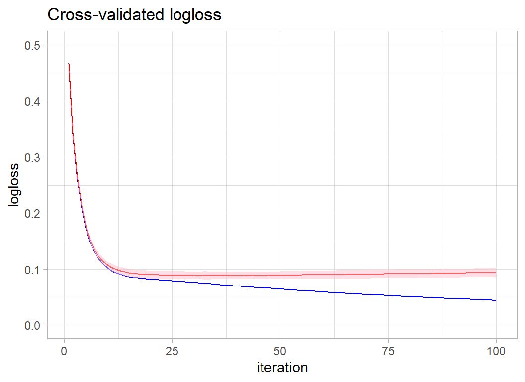
The best performance comes at around 30-40 iterations.
Second submission
I’ll create a submission by refitting the model with 35 iterations.
# --- fit the model ----------------------------------------
xgboost(data=X, label=Y, nrounds=35, verbose=0,
        objective="binary:logistic") -> xgmod

testDF %>%
  select( fly, drive, launch_angle, launch_speed, plate_x, plate_z,
          is_batter_lefty, balls, strikes, at_home, pctBatting, pctPitching,
          centre, onside, offside, size) %>%
  as.matrix() -> XT

# --- make predictions and save ----------------------------
testRawDF %>%
  mutate( is_home_run = predict(xgmod, newdata=XT ) ) %>%
  select(bip_id, is_home_run) %>%
  write_csv( file.path(home, "temp/submission2.csv") )
This default XGBoost model has a submission logloss of 0.08130, which places it in second place on the private leaderboard, very close to the leading model that scored 0.08115.
Had I chosen 40 rounds rather than 35 the submission logloss would have been 0.08120 still second but even closer to the leader. Looking at the plot of test logloss there is no way to distinguish between 30, 35, 40 or even 50 rounds, so the position on the leaderboard depends on an arbitrary decision and is thus rather meaningless.
The arbitrariness of the leaderboard is even more evident when you consider that the test set that was randomly selected by the organisers and it happens to give a much smaller logloss than the training set’s cross-validation. There is a strong degree of randomness induced by the selection of the test data. If the organisers had used a different random seed when splitting the test and training data, someone else might have won the competition.
Let’s win (just for fun)
I know from my experience of xgboost in earlier episodes of Sliced that reducing the learning rate eta will give us a small improvement in performance at the expense of run-time. Also, I have found that the default max_depth of six is generally too large. We do have quite a large data set, so I am not too concerned by max_depth, but I will bring it down slightly.
I am bound to need more iterations, so I’ll try 500.
set.seed(8337)
# --- cross-validate the xgboost model -----------------------------
xgb.cv(data=dtrain,
       objective="binary:logistic", metrics="logloss",
       eta = 0.1, max_depth=4,
       nrounds=500,
       nfold=10,
       print_every_n = 50) -> xgcv
## [1] train-logloss:0.609757+0.000082 test-logloss:0.609850+0.000524
## [51] train-logloss:0.094787+0.000598 test-logloss:0.097316+0.004799
## [101] train-logloss:0.083175+0.000539 test-logloss:0.088675+0.004754
## [151] train-logloss:0.078551+0.000660 test-logloss:0.087304+0.004874
## [201] train-logloss:0.074844+0.000607 test-logloss:0.087044+0.004987
## [251] train-logloss:0.071302+0.000519 test-logloss:0.087213+0.005065
## [301] train-logloss:0.068183+0.000587 test-logloss:0.087498+0.005197
## [351] train-logloss:0.065348+0.000708 test-logloss:0.087861+0.005263
## [401] train-logloss:0.062896+0.000747 test-logloss:0.088338+0.005365
## [451] train-logloss:0.060547+0.000752 test-logloss:0.088853+0.005222
## [500] train-logloss:0.058220+0.000731 test-logloss:0.089347+0.005239xgcv$evaluation_log %>%
as_tibble() %>%
ggplot( aes(x=iter, y=train_logloss_mean)) +
geom_line( colour="blue") +
geom_line( aes(y=test_logloss_mean), colour="red") +
geom_ribbon( aes(ymin=test_logloss_mean-2*test_logloss_std,
ymax=test_logloss_mean+2*test_logloss_std),
fill="pink", alpha=0.5) +
labs(x="iteration", y="logloss",
title="Cross-validated logloss") +
scale_y_continuous(limits=c(0, 0.5))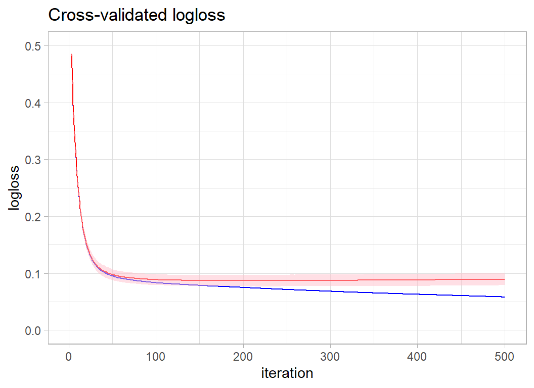
By eye it looks like I need between 200 and 250 iterations. I am quite optimistic because the cross-validated performance is certainly better than it was for the default hyperparameters.
# --- fit the model ----------------------------------------
xgboost(data=X, label=Y, nrounds=250, eta=0.1, max_depth=4,
        verbose=0,
        objective="binary:logistic") -> xgmod


# --- make predictions and save ----------------------------
testRawDF %>%
  mutate( is_home_run = predict(xgmod, newdata=XT ) ) %>%
  select(bip_id, is_home_run) %>%
  write_csv( file.path(home, "temp/submission3.csv") )
Hooray!! I win with a logloss of 0.8088.
Unfortunately it is all rather meaningless.
What we learn from this analysis
For me this was an interesting dataset. I am a big sports fan and although I have only ever been to watch two baseball games, one in Denver and one in Baltimore, I know that it is a fine game with a rich tradition of statistics.
The data make a fair example for a machine learning contest, provided that you know something about the sport, but perhaps the organisers should have removed the ground balls and pop ups.
The predictive models illustrate just how good an algorithm xgboost is, even naive use with default values would put you near the top of the leaderboard. My ability to beat the leading model from the actual competition by changing the hyperparameters based on experience, as opposed to using a tuning algorithm, shows the importance of understanding what xgboost is doing.
Perhaps the biggest lesson is that small differences in logloss are meaningless and therefore that the ranking provided by the leaderboard is only a rough guide to model quality. Sliced is fun, but like any good sport, it involves an element of luck. In creating a model, the analyst makes countless close decisions that cannot really be justified; those arbitrary decisions translate into small changes in the loss and so into a higher or lower position on the leaderboard. What is worse, the test/training split made by the organisers is itself random; a different split could result in a very different looking leaderboard.
My advice is, don’t take the Sliced leaderboard too seriously and don’t get obsessive about hyperparameter tuning.