Sliced Episode 5: Airbnb Price Prediction
Summary:
Background: In episode 5 of the 2021 series of Sliced, the competitors were given two hours in which to analyse a set of data on Airbnb properties in New York City. The aim was to predict the price per night.
My approach: I work on a log(price + 1) scale as suggested by the evaluation metric. I spend quite a lot of time on feature extraction. I extract keywords from the description of the property and I merge geographically close neighbourhoods with few properties. I use XGBoost on the derived features.
Result: My first XGBoost model performed well; it would have come second on the leaderboard. When I tuned the model, I got a small, but meaningless, improvement in performance.
Conclusion: XGBoost is a good algorithm but it is often misused. I use these data to question the sense of machine learning’s obsession with model tuning.
Introduction
For this episode of Sliced, the competitors were asked to predict the prices of Airbnb accommodation in New York City based on features that describe the property and its location. The evaluation metric was the RMSE measured on a log(x+1) scale.
This a relatively complex dataset that requires a lot of feature extraction prior to analysis. In particular, there is a text field that describes the property from which we need to extract key words. I use this example to demonstrate the use of XGBoost, although there is quite a lot of data cleaning to do first.
XGBoost is a very efficient, tree-based algorithm that has become the work-horse of machine learning competitions. It is ideal for complex prediction problems of the type used in Sliced. My doubts are not with algorithm, but rather with the way that it is sometimes used. I’ll discuss my concerns after the analysis.
Reading the data
The data for this episode can be downloaded from https://www.kaggle.com/c/sliced-s01e05-WXx7h8/overview.
It is my practice to read the data asis and to immediately save it in rds format within a directory called data/rData. For details of the way that I organise my analyses you should read my post Sliced Methods Overview.
# --- setup: libraries & options ------------------------
library(tidyverse)

theme_set( theme_light())

# --- set home directory -------------------------------
home <- "C:/Projects/kaggle/sliced/s01-e05"

# --- read downloaded data -----------------------------
trainRawDF <- readRDS( file.path(home, "data/rData/train.rds") )

testRawDF <- readRDS( file.path(home, "data/rData/test.rds") )
Data Exploration
As always, I start by looking at the training data using skim().
skimr::skim(trainRawDF)I have hidden the skim() output because of its length. You can run it yourself it you are interested, I’ll just summarise what I learned.
The training data describe 34,266 properties. As well as an identification number and the price per night, there are 14 potential predictors.
There are 4 predictors related to location
- neighbourhood: 217 small areas in NYC
- neighbourhood_ group: 5 Boroughs of NYC
- latitude:
- longitude:
Three predictors related to Airbnb reviews
- number_of_reviews:
- last_review: date of the last review
- reviews_per_month:
When the number of reviews is zero (7008/34226=20%), the other two predictors are missing
Three predictors related to the property
- room_type: entire, private room or shared room
- minimum_nights: minimum booking
- availability_365: number of days available in a year
Three predictors related to the host
- host name: first name of host
- host_id: unique identifier
- calculated_host_listings_count: the number of properties that this host is advertising on Airbnb
Finally, there is a free text field that is rather misleadingly called name; this contains a short piece of text describing the type of property and its location.
Apart from the lack of reviews for every property, missing data are rare; the name field is missing for 9 properties and the host_name is missing for 14.
The response
The average price of the properties is $152 per night and the prices range from $0 to $10,000. Much as Airbnb offers good value, I doubt that any property is being advertised for $0. I assume that the zeros represent either missing values or entry errors.
Here is some information on the eight, $0 per night, properties.
# --- properties with a price of $0 --------------------------
trainRawDF %>%
  filter( price == 0 ) %>%
  select( name, room_type, neighbourhood )
## # A tibble: 8 x 3
## name room_type neighbourhood
## <chr> <chr> <chr>
## 1 Best Coliving space ever! Shared room. Shared room Bushwick
## 2 Modern apartment in the heart of Williamsburg Entire home/a~ Williamsburg
## 3 Cozy yet spacious private brownstone bedroom Private room Bedford-Stuyvesa~
## 4 MARTIAL LOFT 3: REDEMPTION (upstairs, 2nd ro~ Private room Bushwick
## 5 ★Hostel Style Room | Ideal Traveling Buddi~ Private room East Morrisania
## 6 Coliving in Brooklyn! Modern design / Shared~ Shared room Bushwick
## 7 Spacious comfortable master bedroom with nic~ Private room Bedford-Stuyvesa~
## 8 Sunny, Quiet Room in Greenpoint Private room Greenpointand here is a histogram of the prices
# --- histogram of property prices ----------------------------
trainRawDF %>%
  ggplot( aes(x=price)) +
  geom_histogram( bins=100, fill="steelblue") +
  labs( title="Prices per night of airbnb properties in NYC")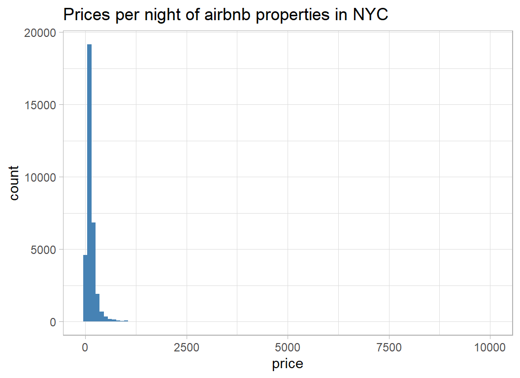
The distribution is extremely skew, so I can see why evaluation is on a log-scale and the offset of 1 has been inserted to allow for the zero prices.
# --- histogram of log(price+1) ------------------------------
trainRawDF %>%
  ggplot( aes(x=log(price+1)) ) +
  geom_histogram( bins=100, fill="steelblue") +
  labs(title="log transformed prices per night")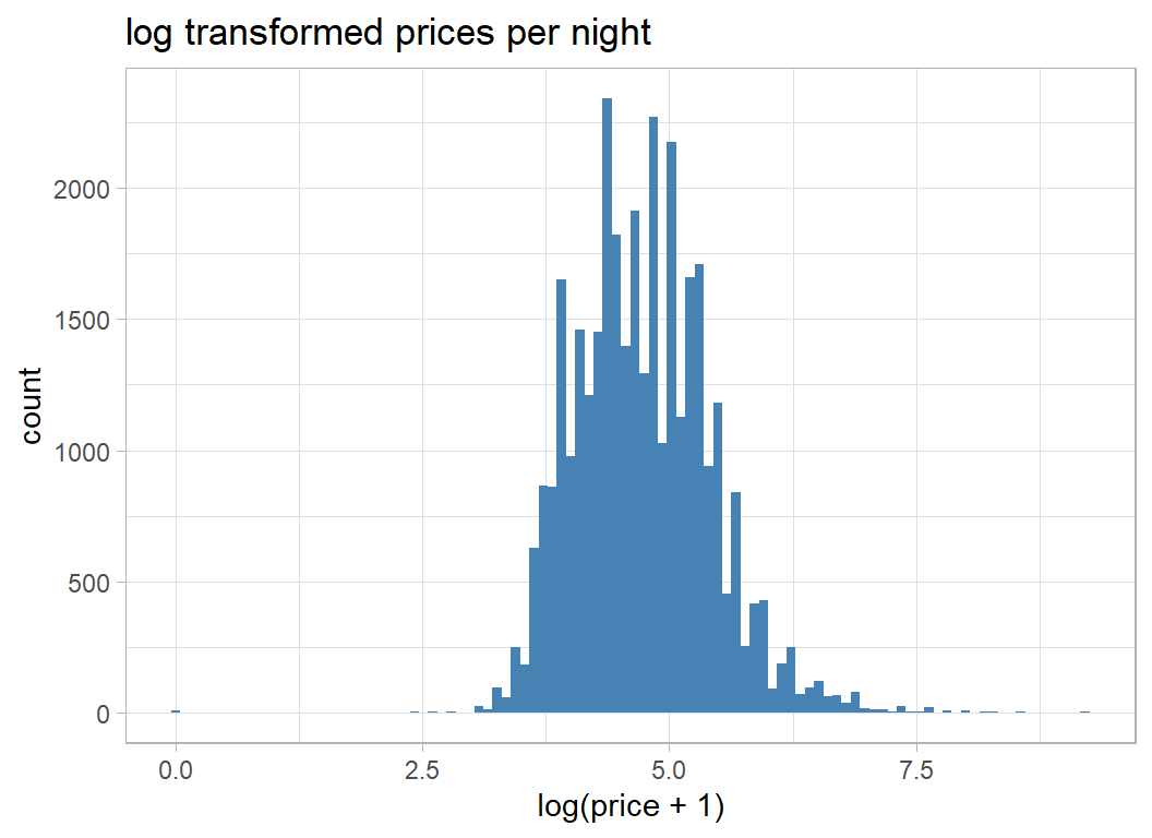
The distribution is much less skewed, but shows signs of digit preference in the pricing; $100 per night is much more common that $101 per night.
I will analyse price on the log(x+1) scale because that transformation is built into the evaluation metric, but I will delete the properties with a price of $0. There are only a few of them and they cannot be genuine.
# --- transform the response ---------------------------
trainRawDF %>%
  filter( price != 0 ) %>%
  mutate( price = log(price + 1)) -> prep1DF
prep1DF is may way of denoting the first stage of preprocessing.
The Predictors
Now I run a simple exploratory analysis of the predictors
Location
I start with the boroughs. I do not know NYC very well but the high prices in Manhattan are not surprising. gm (geometric mean) puts the average price back into dollars.
# --- average prices by borough ------------------------
prep1DF %>%
  group_by( neighbourhood_group ) %>%
  summarise( n = n(),
             m = mean(price),
             s = sd(price),
             gm = exp(m) - 1,
             .groups="drop")
## # A tibble: 5 x 5
## neighbourhood_group n m s gm
## <chr> <int> <dbl> <dbl> <dbl>
## 1 Bronx 760 4.26 0.583 70.1
## 2 Brooklyn 14091 4.58 0.635 96.5
## 3 Manhattan 15146 5.01 0.668 149.
## 4 Queens 3972 4.37 0.570 78.4
## 5 Staten Island 249 4.41 0.696 81.5Next the smaller areas
# --- average prices by neighbourhood ------------------
prep1DF %>%
  group_by( neighbourhood ) %>%
  summarise( n = n(),
             m = mean(price),
             s = sd(price),
             gm = exp(m) - 1,
             lat = mean(latitude),
             lng = mean(longitude),
             .groups="drop") %>%
  arrange( desc(m))
## # A tibble: 217 x 7
## neighbourhood n m s gm lat lng
## <chr> <int> <dbl> <dbl> <dbl> <dbl> <dbl>
## 1 Woodrow 1 6.55 NA 700 40.5 -74.2
## 2 Tribeca 128 5.82 0.813 335. 40.7 -74.0
## 3 Prince's Bay 3 5.60 1.38 270. 40.5 -74.2
## 4 Flatiron District 55 5.59 0.668 268. 40.7 -74.0
## 5 Neponsit 2 5.58 0.394 265. 40.6 -73.9
## 6 NoHo 53 5.54 0.546 254. 40.7 -74.0
## 7 Sea Gate 7 5.46 1.27 233. 40.6 -74.0
## 8 Midtown 1113 5.44 0.634 230. 40.8 -74.0
## 9 Breezy Point 2 5.40 0.175 221. 40.6 -73.9
## 10 West Village 525 5.38 0.554 217. 40.7 -74.0
## # ... with 207 more rowsSome neighbourhoods have very few properties, so the true average price in those areas will be poorly estimated. From the very small sample that I’ve looked at, it seems that the expensive properties are situated fairly close to one another.
Here is a histogram of the (geometric) average price for each neighbourhood in dollars.
# --- distribution of average prices by neighbourhood ---
prep1DF %>%
  group_by( neighbourhood ) %>%
  summarise( m = mean(price),
             .groups="drop") %>%
  mutate( mp = exp(m) - 1) %>%
  ggplot( aes(x=mp)) +
  geom_histogram( bins=100, fill="steelblue") +
  labs(title="Average price in each neighbourhood",
       x = "Geometric mean price per night (dollars)")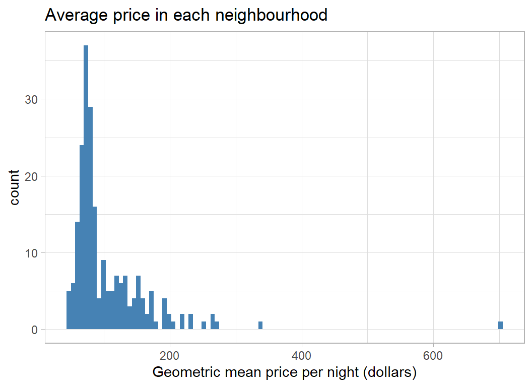
The Room
A key predictor is the type of accommodation, but unfortunately the categorisation is quite crude.
# --- prices by room type -------------------------------
prep1DF %>%
  group_by( room_type ) %>%
  summarise( n = n(),
             m = mean(price),
             s = sd(price),
             gm = exp(m) - 1,
             .groups="drop")
## # A tibble: 3 x 5
## room_type n m s gm
## <chr> <int> <dbl> <dbl> <dbl>
## 1 Entire home/apt 17806 5.15 0.561 171.
## 2 Private room 15615 4.31 0.506 73.3
## 3 Shared room 797 3.98 0.647 52.6The ordering and mean prices are much as one would expect.
Some accommodation is advertised with a minimum stay; usually up to a year but houses may be advertised for much longer. The range is wide enough to justify a log scale.
# --- price by minimum stay ----------------------------
prep1DF %>%
  ggplot( aes(x=log10(minimum_nights), y=price, colour=room_type)) +
  geom_point() +
  geom_smooth() +
  labs(title = "Price by minimum length of stay",
       y = "log(price+1)") +
  theme( legend.position = c(0.85, 0.85))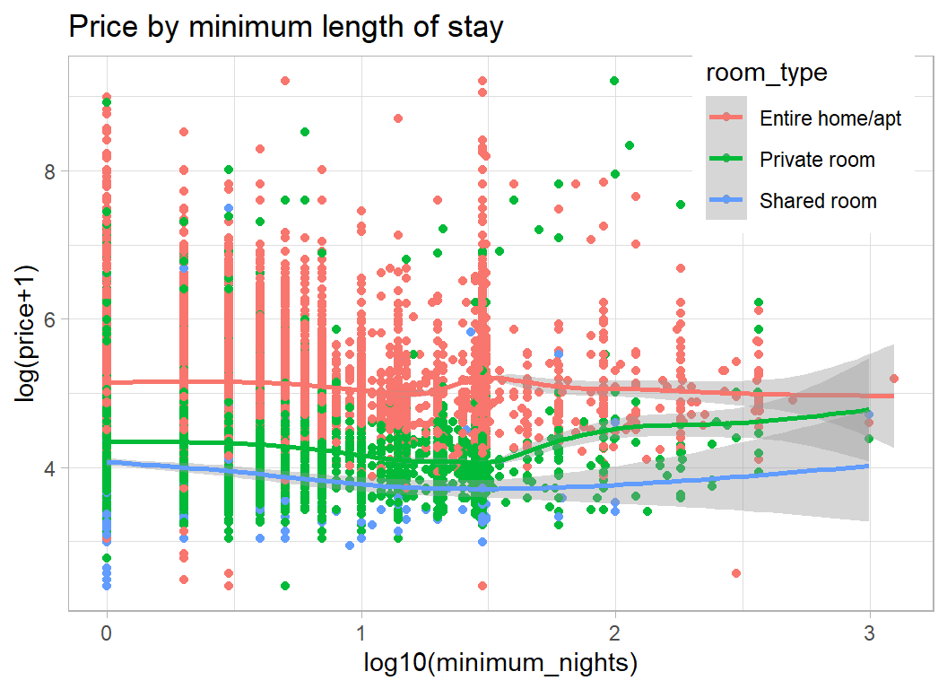
House/Apartment prices seem not to depend on the minimum length of stay, but perhaps room prices increase slightly for longer stays.
From the plot we can see clusters of properties that can be booked for a minimum of 1 night, 1 week, 1 month and 1 year. There are smaller groups at 2 weeks and at a few other lengths of stay.
It appears that the price per night drops for stays over 3 days, but is higher in the few properties available for over a month.
The next feature is the number of days in a year that the property is available. I assume that this was calculated for the most recent year because 12132 properties have availability of 0 indicating that the list of properties may, in part, be out of date.
It would be interesting to know how availability was calculated. If a room is let for a month, is it available during that time?
# --- days available in a given year ---------------------
prep1DF %>%
  ggplot( aes(x=availability_365, y=price)) +
  geom_point() +
  geom_smooth() +
  labs( title="Price and days available for rent in a year",
       y = "log(price+1)", x="days")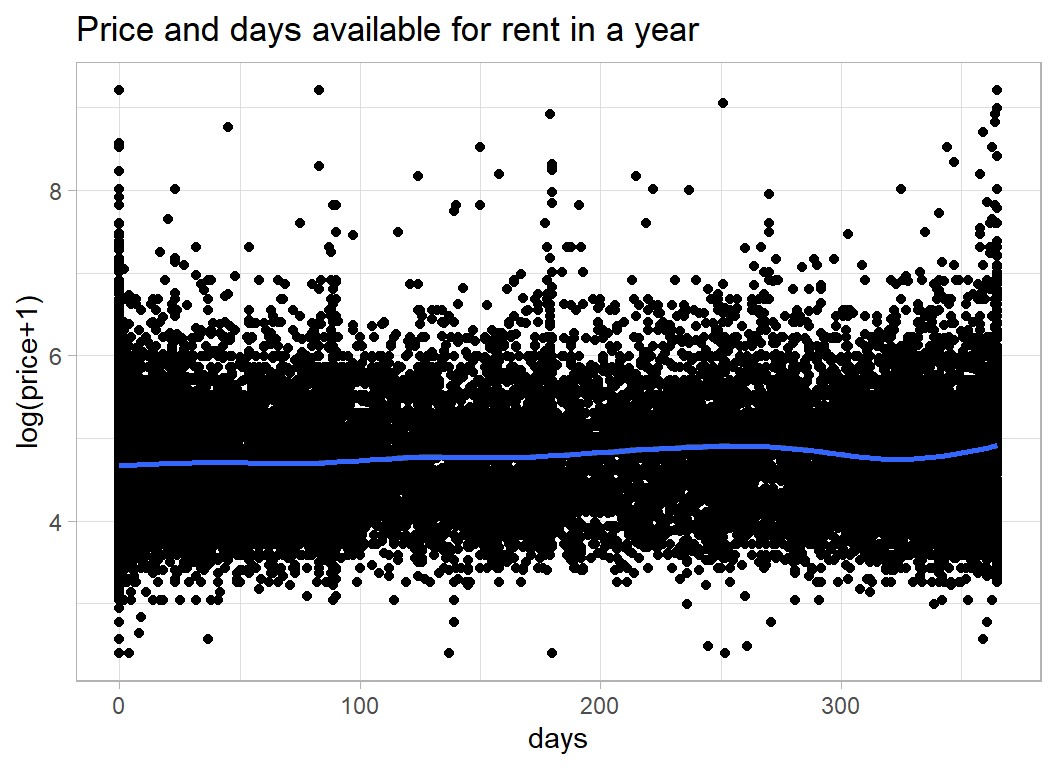
Reviews
The number of reviews tells you something about the number of people who have have rented the accommodation and the date of the last review says something about recent activity, but it is not obvious that these will relate to price.
Number of reviews tells you very little since it will be related to the length of time that the property has been on the market. From the plot it appears that cheaper properties have more reviews.
# --- number of reviews -----------------------------------
prep1DF %>%
  ggplot( aes(x=log10(number_of_reviews+1), y=price)) +
  geom_point() +
  geom_smooth() +
  labs(title="Price and the number of reviews",
       y = "log(price+1)", x="total number of reviews")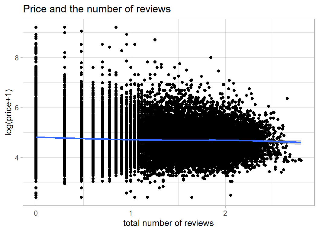
7008 properties have never had a review, so I’ve made reviews per month equal to zero when there were no reviews. I’ve also truncated reviews_per_month at 20; some properties had an incredibly high number of reviews per month (more than the number of days in a month).
# --- reviews per month -------------------------------------
prep1DF %>%
  mutate( reviews_per_month = ifelse(
                 number_of_reviews == 0, 0, reviews_per_month),
          reviews_per_month = pmin(20, reviews_per_month) ) %>%
  ggplot( aes(x=reviews_per_month, y=price)) +
  geom_point() +
  geom_smooth() +
  labs(title="Price and reviews per month",
       subtitle="truncated at 20",
       y = "log(price+1)", x="reviews per month")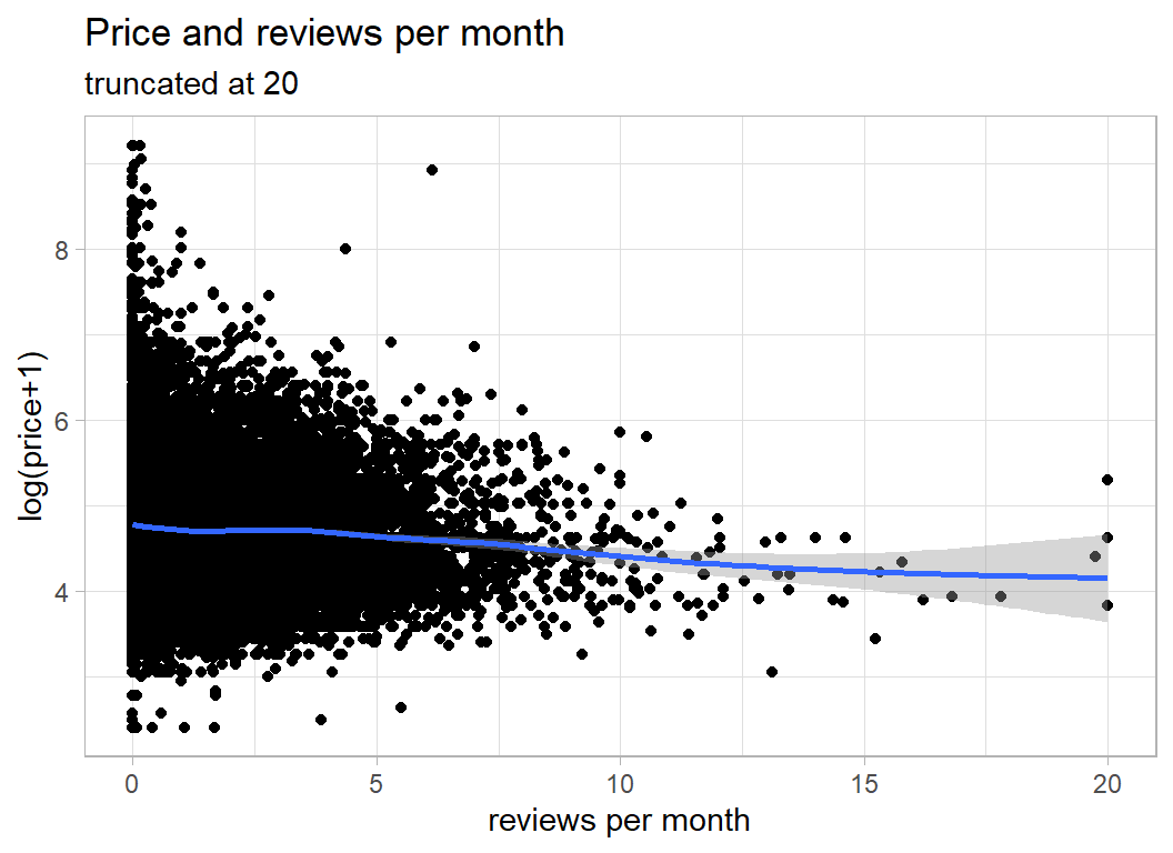
The date of the last review might say something about recent activity.
# --- date of last review -----------------------------------
prep1DF %>%
  mutate( last_review = as.Date(last_review)) %>%
  ggplot( aes(x=last_review, y=price)) +
  geom_point() +
  geom_smooth() +
  labs(title="Price and the date of the last review",
       subtitle="7008 properties had not been reviewed at all",
       y = "log(price+1)", x="date")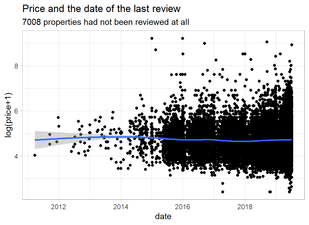
It does not look as though the last review is very predictive of price.
Host
It seems to me that the key host related feature is whether someone is running a business with lots of properties on Airbnb, or they are an individual renting out a single property or room. We can see this on a plot of price against the number of properties a host rents out.
# --- number of properties per host --------------------------
prep1DF %>%
  ggplot( aes(x=calculated_host_listings_count, y=price)) +
  geom_point() +
  geom_smooth() +
  labs(title="Price and number of properties that host rents out",
       y = "log(price+1)", x="number of properties")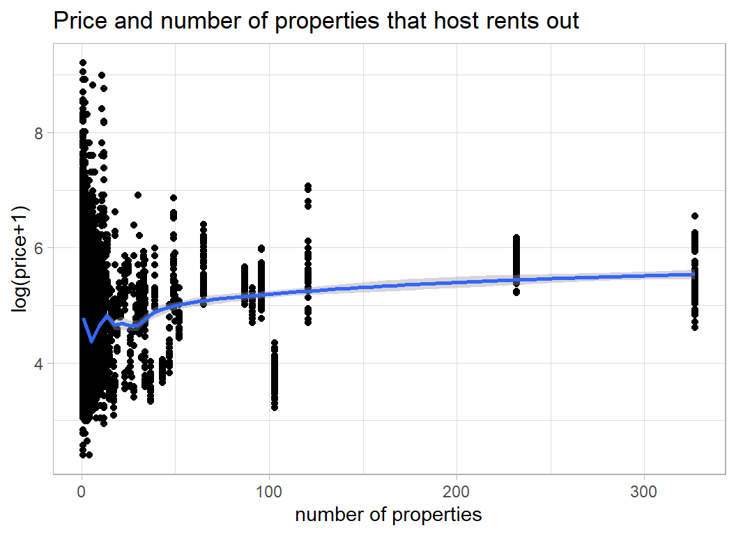
The cluster of properties over 300 were all rented out by the same person/company. Let’s look at them
# --- host with over 300 properties -------------------------
prep1DF %>%
  filter( calculated_host_listings_count > 300) %>%
  select( host_id, host_name,  calculated_host_listings_count)
## # A tibble: 229 x 3
## host_id host_name calculated_host_listings_count
## <int> <chr> <int>
## 1 219517861 Sonder (NYC) 327
## 2 219517861 Sonder (NYC) 327
## 3 219517861 Sonder (NYC) 327
## 4 219517861 Sonder (NYC) 327
## 5 219517861 Sonder (NYC) 327
## 6 219517861 Sonder (NYC) 327
## 7 219517861 Sonder (NYC) 327
## 8 219517861 Sonder (NYC) 327
## 9 219517861 Sonder (NYC) 327
## 10 219517861 Sonder (NYC) 327
## # ... with 219 more rowsSo, one company (Sonder) is plotted 327 times, because they have 327 properties.
Let’s plot the hosts rather than the properties and place the number on a log-scale
# --- average price by number of host's properties -----------
prep1DF %>%
  group_by( host_id ) %>%
  summarise( count = mean(calculated_host_listings_count),
             price = mean(price),
             .groups="drop") %>%
  mutate( count = pmin(50, count)) %>%
  ggplot( aes(x=count, y=price)) +
  geom_point() +
  geom_smooth() +
  labs(title="Average price and number of properties",
       subtitle="truncated at 50 properties",
       y = "log(price+1)", x="number of properties")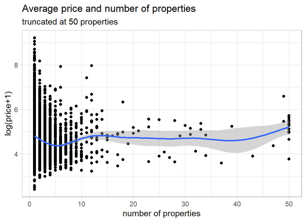
The dip around 5 properties is interesting and may reflect the division between individuals and companies.
name
name is a misnomer, what we actually have is a brief description of the property.
Here are some examples
# --- example of the name field ----------------------------
prep1DF %>%
  select( name)
## # A tibble: 34,218 x 1
## name
## <chr>
## 1 Cute big one bedroom
## 2 Feel like you never leave your home
## 3 Pristine Lower East Side Sanctuary
## 4 Luxe, Spacious 2BR 2BA Nr Trains
## 5 1BD brownstone apt in Fort Greene!
## 6 LOVELY LARGE SUNNY ROOM Sunset Park
## 7 NE..Comfortable Room All Inclusive
## 8 Bright, Spacious Studio in Brooklyn
## 9 Upper west Apt close to Central Pk
## 10 Artist's Jungle Suite + Private Bathroom
## # ... with 34,208 more rowsThere are problems with these descriptions. Some use abbreviations and other don’t, some describe the property and some describe the location and some do neither.
First, I convert everything to lower case, remove the punctuation and the digits and replace a few of the abbreviations
# --- clean the name field ---------------------------------
prep1DF %>%
  mutate( name = tolower(name),
          name = ifelse( is.na(name), "", name),
          name = gsub('[[:punct:] ]+',' ',name),
          name = gsub('[[:digit:] ]+',' ',name),
          name = str_replace(name, "bd ", "bedroom "),
          name = str_replace(name, "br ", "bedroom "),
          name = str_replace(name, "nr ", "near"),
          name = str_replace(name, " rm", " room"),
          name = str_replace(name, "pk", "park"),
          name = str_replace(name, "lux ", "luxury "),
          name = str_replace(name, " ft", " foot"),
          name = str_replace(name, "sq ", "square "),
          name = str_replace(name, " st ", " street "),
          name = str_replace(name, " apt", " apartment")) -> prep2DF
Next, I split the sentences into words (max 12) and make a long column out of all of the words. Of course, some (123) entries have more than 12 words and the extra words will be lost, c’est la vie.
For the first Spiced challenge, s01-e01, I wrote a function that does just what we need, you can find the code in that post. I placed the function in a package called myText and I’ll use it again here.
library(myText)

prep2DF %>%
  select_indicators(col=name, response=price,
                    nTerms=12, minCount=100, sep=" ") %>%
  filter( str_length(term) > 1 ) %>%
  filter( !(term %in% c("the", "an", "to", "in",
                        "of", "by", "with", "and",
                        "at", "from", "for", "on",
                        "w/")) ) %>%
  filter( count > 100 & p_value < 0.001 ) %>%
  print(n=20) -> wordsDF
## # A tibble: 174 x 5
## term count p_value mWithout mWith
## <chr> <int> <dbl> <dbl> <dbl>
## 1 room 16343 6.00e-323 4.87 4.59
## 2 private 5100 1.37e-303 4.79 4.44
## 3 cozy 3569 3.95e-157 4.77 4.48
## 4 village 1605 4.11e-156 4.72 5.14
## 5 luxury 1345 8.97e-150 4.72 5.27
## 6 bushwick 1025 2.97e-141 4.75 4.26
## 7 blueground 158 2.01e-129 4.73 5.71
## 8 bedroom 9034 1.32e-115 4.69 4.88
## 9 sonder 299 3.72e-107 4.73 5.43
## 10 bed 10834 1.14e- 97 4.68 4.85
## 11 apartment 8056 2.11e- 88 4.70 4.86
## 12 west 1132 1.94e- 84 4.72 5.13
## 13 art 9981 2.32e- 81 4.69 4.84
## 14 chelsea 501 1.40e- 75 4.73 5.27
## 15 own 2991 2.69e- 75 4.71 4.97
## 16 midtown 914 1.21e- 73 4.73 5.17
## 17 shared 307 3.65e- 68 4.74 4.02
## 18 studio 2917 1.34e- 67 4.72 4.90
## 19 doorman 317 2.79e- 67 4.73 5.37
## 20 gym 316 3.81e- 66 4.73 5.43
## # ... with 154 more rowsSo we have 174 potential features in the form of words that occur in the name variable. Some duplicate location information e.g. bushwick, others duplicate host information e.g. sonder or room type information e.g. bedroom. In my judgement it is not worth the effort of trying to edit the words any further and I take the 174 features asis.
Cleaning the data
Neighbourhoods
I need to sort out the problem of neighbourhoods with very few properties. Such neighbourhoods will produce unreliable estimates in the model.
I will employ a simple clustering algorithm that takes any neighbourhood with fewer that 25 properties and merges it with its closest neighbouring neighbourhood, where distance is calculated from the latitude and longitude.
I checked and found that some of the neighbourhoods in the test data do not appear in the training data and one neighbourhood (Bay Terrace) appears in the test data as Bay Terrace, Staten Island. I reclassify the neighbourhoods based on the combined test and training data in order to ensure that the classifications are consistent.
Here is the code
# --- create DF of unique neighbourhoods ------------
# merge is a flag that I'll use in the subsequent analysis
# it will be set to the row number of the neighbourhood
# that this neighbourhood is merged with
prep2DF %>%
  select( neighbourhood, latitude, longitude) %>%
  bind_rows( testRawDF %>%
               mutate( neighbourhood = str_replace(neighbourhood,
                      "Bay Terrace, Staten Island", "Bay Terrace")) %>%
             select( neighbourhood, latitude, longitude) ) %>%
  group_by( neighbourhood) %>%
  summarise( n = n(),
             lat = mean(latitude),
             lng = mean(longitude),.groups = "drop") %>%
  mutate( merge = 0 ) %>%
  print() -> nbdDF
## # A tibble: 220 x 5
## neighbourhood n lat lng merge
## <chr> <int> <dbl> <dbl> <dbl>
## 1 Allerton 42 40.9 -73.9 0
## 2 Arden Heights 4 40.6 -74.2 0
## 3 Arrochar 21 40.6 -74.1 0
## 4 Arverne 77 40.6 -73.8 0
## 5 Astoria 900 40.8 -73.9 0
## 6 Bath Beach 17 40.6 -74.0 0
## 7 Battery Park City 70 40.7 -74.0 0
## 8 Bay Ridge 141 40.6 -74.0 0
## 9 Bay Terrace 8 40.7 -73.9 0
## 10 Baychester 7 40.9 -73.8 0
## # ... with 210 more rowsNext I write a function that takes a target neighbourhood and merges it with its nearest neighbour
# --- merge_neighbourhoods --------------------------
# function to merge with the nearest neighbour
#    target ... name of neighbourhood to me merged
merge_neighbourhoods <- function(target) {
  # --- row to be merged ----------------------------
  row <- which(nbdDF$neighbourhood == target & nbdDF$merge == 0)
  # --- distances to other neighbourhoods -----------
  distance <- (nbdDF$lat - nbdDF$lat[row])^2 +
    (nbdDF$lng - nbdDF$lng[row])^2
  # --- make distance large if already merged -------
  distance <- ifelse( nbdDF$merge > 0, 999, distance )
  # --- make distance to itself large ---------------
  distance[row] <- 999
  # --- find the closest ----------------------------
  closest <- which( distance == min(distance) )[1]
  # --- find new total number -----------------------
  nbdDF$n[closest] <- nbdDF$n[row] + nbdDF$n[closest]
  # --- register the identity of the merge ----------
  nbdDF$merge[row] <- closest
  return(nbdDF)
}
Finally I make the merges by working through nbdDF looking for neighbourhoods with fewer than 25 properties.
# --- How many small areas are left unmerged? ------
nSmall <- sum( nbdDF$n < 25 & nbdDF$merge == 0)
# --- merge while small areas remain ---------------
while( nSmall > 0 ) {
  # --- find a target ------------------------------
  nbdDF %>%
    filter( n < 25 & merge == 0 )  %>%
    dplyr::slice(1) %>%
    pull(neighbourhood) -> target
  # --- merge using the function -------------------
  nbdDF <- merge_neighbourhoods( target)

  # --- How many small areas are left --------------
  nSmall <- sum( nbdDF$n < 25 & nbdDF$merge == 0)
}

print(nbdDF)
## # A tibble: 220 x 5
## neighbourhood n lat lng merge
## <chr> <int> <dbl> <dbl> <dbl>
## 1 Allerton 42 40.9 -73.9 0
## 2 Arden Heights 4 40.6 -74.2 101
## 3 Arrochar 21 40.6 -74.1 46
## 4 Arverne 77 40.6 -73.8 0
## 5 Astoria 900 40.8 -73.9 0
## 6 Bath Beach 17 40.6 -74.0 17
## 7 Battery Park City 70 40.7 -74.0 0
## 8 Bay Ridge 153 40.6 -74.0 0
## 9 Bay Terrace 8 40.7 -73.9 125
## 10 Baychester 7 40.9 -73.8 154
## # ... with 210 more rowsSo Allerton did not need to be merged but Arden Heights got merged with row 101 (Huguenot). I’m afraid that the names of the neighbourhoods mean little to me, but the merges look sensible on Google maps.
Next I reclassify the properties and create a new variable called neighbourhood2
# --- create a second neighbourhood variable ------
prep2DF$neighbourhood2 <- prep2DF$neighbourhood
# --- fill neighbourhood2 with the larger group ---
for( i in 1:nrow(nbdDF)) {
  if( nbdDF$merge[i] > 0 ) {
    from <- nbdDF$neighbourhood[i]
    to   <- nbdDF$neighbourhood[nbdDF$merge[i]]
    j <- which(prep2DF$neighbourhood2==from)
    prep2DF$neighbourhood2[j] <- to
  }
}
We can check that neighbourhood2 looks sensible
# --- look at the new variable -------------------
prep2DF %>%
  group_by( neighbourhood2) %>%
  summarise( n = n(),
             .groups = "drop")
## # A tibble: 134 x 2
## neighbourhood2 n
## <chr> <int>
## 1 Allerton 35
## 2 Arverne 53
## 3 Astoria 640
## 4 Battery Park City 44
## 5 Bay Ridge 116
## 6 Bayside 36
## 7 Bedford-Stuyvesant 2595
## 8 Bensonhurst 76
## 9 Boerum Hill 132
## 10 Borough Park 90
## # ... with 124 more rowsWe have reduced the number of neighbourhoods to 134 and all of them have at least 25 properties in the combined test and training data, though not necessarily in the training data alone.
A data cleaning function
Rather than preprocessing the data in gradual steps, I combine the data cleaning steps into a function, so that I can run exactly the same process on both the training and the test sets.
The function brings together all of the things that I have already done
# --- clean() --------------------------------------------
# arguments
#    thisDF    ... data frame to be cleaned
#    wordsDF   ... data frame of keywords
#    nbdDF     ... data frame of grouped neighbourhoods
#
clean <- function( thisDF, wordsDF, nbdDF) {
   thisDF %>%
      mutate( name = tolower(name),
              name = ifelse( is.na(name), "", name),
              name = gsub('[[:punct:] ]+',' ',name),
              name = gsub('[[:digit:] ]+',' ',name),
              name = str_replace(name, "bd ", "bedroom "),
              name = str_replace(name, "br ", "bedroom "),
              name = str_replace(name, "nr ", "near"),
              name = str_replace(name, " rm", " room"),
              name = str_replace(name, "pk", "park"),
              name = str_replace(name, "lux ", "luxury "),
              name = str_replace(name, " ft", " foot"),
              name = str_replace(name, "sq ", "square "),
              name = str_replace(name, " st ", " street "),
              name = str_replace(name, " apt", " apartment")) -> prepDF

   prepDF$neighbourhood2 <- prepDF$neighbourhood
   for( i in 1:nrow(nbdDF)) {
      if( nbdDF$merge[i] > 0 ) {
         from <- nbdDF$neighbourhood[i]
         to   <- nbdDF$neighbourhood[nbdDF$merge[i]]
         j <- which(prepDF$neighbourhood2==from)
         prepDF$neighbourhood2[j] <- to
      }
   }

   nbdDF %>%
     filter( merge == 0 ) %>%
     pull(neighbourhood) -> nbds

   for( j in 1:length(nbds) ) {
      prepDF[ paste("N", j, sep="")] <-
         as.numeric( prepDF$neighbourhood2 == nbds[j])
   }

   rts <- unique(prepDF$room_type)

   for( j in 1:length(rts) ) {
      prepDF[ paste("R", j, sep="")] <-
        as.numeric( prepDF$room_type == rts[j])
   }

   for( i in 1:nrow(wordsDF)) {
     prepDF[ paste("X", i, sep="") ] <- as.numeric(str_detect(prepDF$name, wordsDF$term[i]) )
   }

   prep2DF$reviews_per_month[ is.na(prep2DF$reviews_per_month)] <- 0
   return(prepDF)
}
It is interesting how I seem to have reverted to base R. This was not a conscious decision, I just use whatever seems easier. It suggests that there is either a gap in the tidyverse, or a gap in my knowledge of the tidyverse.
Save results of the pre-processing
# --- save the cleaned data -----------------------------
trainRawDF %>%
  filter( price != 0 ) %>%
  mutate( price = log(price + 1)) %>%
  clean( wordsDF, nbdDF) %>%
  saveRDS( file.path(home, "data/rData/processed_train.rds"))

testRawDF %>%
  mutate( neighbourhood = str_replace(neighbourhood,
                "Bay Terrace, Staten Island", "Bay Terrace")) %>%
  clean( wordsDF, nbdDF) %>%
  saveRDS( file.path(home, "data/rData/processed_test.rds"))
Model fitting
I start by dividing the training data into an estimation and a validation set.
# --- read the clean data ------------------------------------
trainDF <- readRDS( file.path(home, "data/rData/processed_train.rds"))

# --- split the training data --------------------------------
set.seed(8751)

split <- sample(1:nrow(trainDF), size=10000, replace=FALSE)

validateDF <- trainDF[ split, ]
estimateDF <- trainDF[-split, ]
XGBoost
The data are complex enough to justify a tree-based model and I decided to try boosted trees with xgboost, because by reputation this is a very good algorithm.
xgboost requires numerical predictors in a matrix, otherwise it is straightforward to use. I deliberately use the package xgboost directly and not via caret or tidymodels or mlr3. I want to get close to the algorithm, in order to understand how it works.
My first model is fitted with the default settings. The number of xgboost parameters that you can adjust might look like a strength, because it suggests that you can modify the algorithm to work for your problem. However, for me it is a weakness; it makes the algorithm difficult to understand and it creates a potential for overfitting.
I save the numerical predictors in a matrix and run the algorithm for just 10 iterations in order to set up the method.
library(xgboost)

# --- place predictors is matrix X -------------------------
estimateDF %>%
  select( minimum_nights, reviews_per_month,
          calculated_host_listings_count, availability_365,
          starts_with("N", ignore.case=FALSE),
          starts_with("R", ignore.case=FALSE),
          starts_with("X", ignore.case=FALSE)) %>%
  as.matrix() -> X

# --- place response in vector Y ---------------------------
estimateDF %>%
  pull(price) -> Y

# --- fit the model ----------------------------------------
xgmod <- xgboost(data=X, label=Y, nrounds=10, verbose=2)
## [1] train-rmse:3.027657
## [2] train-rmse:2.149653
## [3] train-rmse:1.545361
## [4] train-rmse:1.135799
## [5] train-rmse:0.864560
## [6] train-rmse:0.691984
## [7] train-rmse:0.586478
## [8] train-rmse:0.524449
## [9] train-rmse:0.489097
## [10] train-rmse:0.468396It is easy to extract the in-sample RMSEs and plot them,
xgmod$evaluation_log %>%
  ggplot( aes(x=iter, y=train_rmse)) +
  geom_line(colour="blue")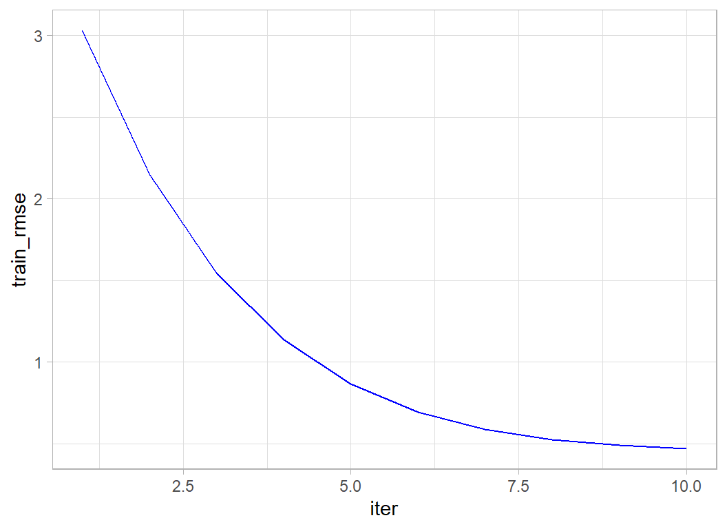
and to calculate the variable importance measures.
xgb.importance(model=xgmod) %>%
  as_tibble() %>%
  print() -> importDF
## # A tibble: 111 x 4
## Feature Gain Cover Frequency
## <chr> <dbl> <dbl> <dbl>
## 1 R1 0.721 0.136 0.0219
## 2 N78 0.0369 0.0663 0.0219
## 3 availability_365 0.0277 0.0703 0.0973
## 4 reviews_per_month 0.0187 0.0410 0.117
## 5 minimum_nights 0.0161 0.0479 0.105
## 6 N61 0.0142 0.0471 0.0170
## 7 X18 0.0113 0.0319 0.0292
## 8 N19 0.0100 0.0438 0.0146
## 9 calculated_host_listings_count 0.00970 0.0146 0.0535
## 10 X4 0.00907 0.0338 0.0122
## # ... with 101 more rowsThe continuous predictors are used a lot in the trees (high frequency), presumably because they can be split in many ways. But R1 (entire house/apartment) gives by far the biggest gain (improvement in RMSE). The N’s are neighbourhoods and the X’s are words from the name field.
Since we have a validation set, we can ask xgboost to tell us the out-of-sample RMSE as well as the in-sample RMSE. To do this, we need to use the xgb.DMatrix function to pack together the predictors and the label (response).
# --- pack the estimation data ----------------------
dtrain <- xgb.DMatrix(data = X, label = Y)

# --- extract the validation data -----------------
validateDF %>%
  select( minimum_nights, reviews_per_month,
          calculated_host_listings_count, availability_365,
          starts_with("N", ignore.case=FALSE),
          starts_with("R", ignore.case=FALSE),
          starts_with("X", ignore.case=FALSE)) %>%
  as.matrix() -> XV

validateDF %>%
  pull(price) -> YV

# --- pack the validation data --------------------------
dtest <- xgb.DMatrix(data = XV, label=YV)
I use the xgb.train() function to fit the model. The function xgboost() that was used before is a wrapper that calls xgb.train() in the background.
# --- fit and monitor estimation and validation RMSE ---------
xgb.train(data=dtrain,
        watchlist=list(train=dtrain, test=dtest),
        objective="reg:squarederror",
        nrounds=10, verbose=2) -> xgmod
## [1] train-rmse:3.027656 test-rmse:3.029342
## [2] train-rmse:2.149653 test-rmse:2.152541
## [3] train-rmse:1.545361 test-rmse:1.549091
## [4] train-rmse:1.135799 test-rmse:1.140541
## [5] train-rmse:0.864560 test-rmse:0.870254
## [6] train-rmse:0.691984 test-rmse:0.699555
## [7] train-rmse:0.586478 test-rmse:0.596175
## [8] train-rmse:0.524449 test-rmse:0.536010
## [9] train-rmse:0.489097 test-rmse:0.502010
## [10] train-rmse:0.468396 test-rmse:0.482440We see evidence of slight overfitting in the training RMSE and this overfitting is getting larger as the iterations progress. The validation RMSE is still improving so it would make sense to run more iterations.
Submission
Although this model was not tuned, let’s get an idea of performance by making a submission.
I refit the model using all of the training data and run 200 iterations to give the model time to minimise the loss.
# --- place predictors is matrix X -------------------------
trainDF %>%
  select( minimum_nights, reviews_per_month,
          calculated_host_listings_count, availability_365,
          starts_with("N", ignore.case=FALSE),
          starts_with("R", ignore.case=FALSE),
          starts_with("X", ignore.case=FALSE)) %>%
  as.matrix() -> X

# --- place response in vector Y ---------------------------
trainDF %>%
  pull(price) -> Y

# --- fit the model ----------------------------------------
xgmod <- xgboost(data=X, label=Y, nrounds=200, verbose=0)

xgmod$evaluation_log %>%
  dplyr::slice(1,10,25,50,100,150,200)
## iter train_rmse
## 1: 1 3.027281
## 2: 10 0.467436
## 3: 25 0.412192
## 4: 50 0.386695
## 5: 100 0.359233
## 6: 150 0.342308
## 7: 200 0.327474The in-sample RMSE looks impressive but we know that this is misleading.
Now I create the test submission
# --- read clean test data ---------------------------------
testDF <- readRDS( file.path(home, "data/rData/processed_test.rds"))

# --- predictors: note change in column numbers (no price) -
testDF %>%
  select( minimum_nights, reviews_per_month,
          calculated_host_listings_count, availability_365,
          starts_with("N", ignore.case=FALSE),
          starts_with("R", ignore.case=FALSE),
          starts_with("X", ignore.case=FALSE)) %>%
  as.matrix() -> XT

# --- make predictions and save ----------------------------
testDF %>%
  mutate( yhat     = predict(xgmod, newdata=XT ) ) %>%
  # --- transform price to dollars ---------------
  mutate( price = exp(yhat) - 1 ) %>%
  select(id, price) %>%
  write.csv( file.path(home, "temp/submission1.csv"),
             row.names=FALSE)
I submitted this file and got RMSE=0.43089, good enough to put us in second place on the leaderboard.
Hyperparameter tuning
XGBoost is a complex algorithm. I have not counted the number of parameters that the user can adjust, but my guess is that there must be between 10 and 20. My impression from watching youTube videos is that a popular approach amongst data scientists is to try everything in a semi-systematic way in the hope of hitting on the magic combination. Not an approach that appeals to me.
Hyperparameter tuning is a critical topic that affects all machine learning algorithms. I’ll use this example to start looking at it, but I expect that I will return to it in future episodes.
Number of Iterations
Let’s look at the number of iterations; without doubt, this is the most critical hyperparameter.
It is in the nature of gradient boosting that we progress towards the minimum loss in a series of small steps. At each step we fit a tree targeted on the observations that are currently poorly predicted. Too few iterations and we will not minimise the loss, too many and we will start to pick up random blips in the training data that will not be seen in the test data, i.e we will overfit.
The optimum will depend on the complexity of the problem that you are analysing, so it cannot be predicted in advance. The only thing that you can do, is to try a large number iterations and look at the loss at each step.
Here is what happens if we run 1000 iterations.
# --- fit 1000 iterations --------------------------
xgb.train(data=dtrain,
        watchlist=list(train=dtrain, test=dtest),
        objective="reg:squarederror",
        nrounds=1000, verbose=0) -> xgmod

# --- progress of the fit -------------------------
xgmod$evaluation_log %>%
  dplyr::slice(1, seq(100, 1000, by=100))
## iter train_rmse test_rmse
## 1: 1 3.027657 3.029342
## 2: 100 0.349448 0.423110
## 3: 200 0.315679 0.422535
## 4: 300 0.285025 0.425237
## 5: 400 0.262911 0.428523
## 6: 500 0.241819 0.432565
## 7: 600 0.225361 0.434975
## 8: 700 0.208922 0.437628
## 9: 800 0.194874 0.440214
## 10: 900 0.182076 0.442238
## 11: 1000 0.170291 0.444098I will wrap my plotting code in a function, so that I can reuse it later.
# --- plot RMSE by iteration ----------------------
xgmod$evaluation_log %>%
ggplot( aes(x=iter, y=train_rmse)) +
geom_line(colour="blue") +
geom_line( aes(y=test_rmse), colour="red") +
scale_y_continuous( limits = c(0, 1), breaks=seq(0, 1, by=0.1)) +
labs(x="Iteration", y="RMSE",
title="In-sample and out-of-sample RMSE")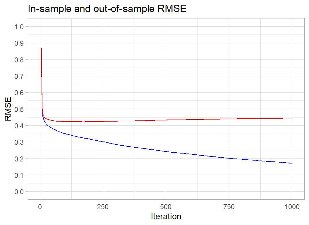 The in-sample RMSE keeps improving. It will eventually plateau at the minimum possible loss for this tree-based model, but the complexity of the trees is such that by the time that that happens we will be picking up every meaningless blip in the data.
For the Airbnb data, the out-of-sample RMSE is minimised at about 200 iterations and after that it increases slowly. The optimum happens to coincide with the choice that I made for my submission. You will just have to believe me when I say that this was a lucky guess. However, the rise in the out-of-sample RMSE is so slow that we lose very little by having a few extra iterations. Generally, a few too many iterations is better than not enough.
For these data, the actual minimum RMSE occurs at iteration 170
# --- iteration with the minumum RMSE -----------------------
xgmod$evaluation_log %>%
  summarise( minIter = which(test_rmse == min(test_rmse))[1] )
## minIter
## 1 170This, of course, is only the result for this particular validation sample. Let’s try some different random estimation/validation splits
# --- optimum performance for different data splits --------
set.seed(4256)
# --- variables for saving the results
minIteration <- minRMSE <- rep(0,5)
for( i in 1:5 ) {
  # --- random split --------------------------
  split <- sample(1:nrow(trainDF), size=10000, replace=FALSE)
  # --- training X and Y matrices -------------
  trainDF[-split, ] %>%
    select( minimum_nights, reviews_per_month,
            calculated_host_listings_count, availability_365,
            starts_with("N", ignore.case=FALSE),
            starts_with("R", ignore.case=FALSE),
            starts_with("X", ignore.case=FALSE)) %>%
    as.matrix() -> Xi
  trainDF[-split, ] %>%
    pull(price) -> Yi
  dtraini <- xgb.DMatrix(data = Xi, label = Yi)
  # --- validation X and Y matrices ----------
  trainDF[ split, ] %>%
    select( minimum_nights, reviews_per_month,
            calculated_host_listings_count, availability_365,
            starts_with("N", ignore.case=FALSE),
            starts_with("R", ignore.case=FALSE),
            starts_with("X", ignore.case=FALSE)) %>%
    as.matrix() -> XVi
  trainDF[ split, ] %>%
    pull(price) -> YVi
  dtesti <- xgb.DMatrix(data = XVi, label=YVi)
  # --- fit the model ------------------------
  xgb.train(data=dtraini,
            watchlist=list(train=dtraini, test=dtesti),
            objective="reg:squarederror",
            nrounds=300, verbose=0) -> xgmod
  # --- find optimum number of iterations ----
  xgmod$evaluation_log %>%
    summarise( minIter = which(test_rmse == min(test_rmse))[1] ) %>%
    pull(minIter) -> minIteration[i]
  # --- RMSE at the optimum ------------------
  minRMSE[i] <- xgmod$evaluation_log$test_rmse[minIteration[i]]
}
print(minIteration)
## [1] 186 168 115 183 215print(minRMSE)## [1] 0.417998 0.431867 0.427539 0.419533 0.426129A single validation sample only gives an approximation to the optimum number of iterations. In this analysis, the validation sample has size 10,000, which it is quite large. Many problems will have a much smaller validation sample and therefore be far less stable.
The random splits suggest that the required number of iterations for this problem is something between 115 and 215.
My submission was based on 200 iterations of the algorithm, but looking at these results I might have chosen 150 iterations instead. If I had, perhaps my model would have topped the leaderboard or come 5th instead of 2nd.
The five random splits give minimum RMSEs between 0.418 and 0.432. This tells us that there is no point in getting excited about selections of hyperparameters that improve a single measure of the RMSE by say, 0.010.
A cross-validated RMSE would be equivalent to averaging over several validation samples so would be more stable, but it would still have an error associated with it.
Learning rate
Let’s return to our original split and look at the learning rate. The idea of boosting is that we create a succession of trees that each fit to the current residuals. That is, at each iteration, the algorithm identifies the observations that are poorly predicted and fits a tree that specifically targets those observations.
By their nature, trees divide the space of predictors into sets of (multi-dimensional) rectangles. Each observation within a rectangle is predicted to have a response equal to the mean response of all observations in the rectangle. These rectangles are the basis functions for constructing the prediction and the means are the coefficients. When we combine trees, we just create a finer array of rectangles and we set the prediction to be a weighted combination of the current prediction and the prediction from the new tree. The question is, what weight should the algorithm use.
The weight given to the latest tree is controlled by a parameter called eta, which is short for the learning rate. It can be any number between 0 and 1. By default xgboost sets eta to 0.3 and usually this value works fine.
Let’s see what happens if we set some extreme values of eta, I try 0.01, 0.3 and 0.99.
minIteration <- minRMSE <- rep(0,3)
# --- fit with eta = 0.01 --------------------
xgb.train(data=dtrain,
        watchlist=list(train=dtrain, test=dtest),
        objective="reg:squarederror",
        nrounds=500, eta=0.01, verbose=0) -> xgmod1

xgmod1$evaluation_log %>%
    summarise( minIter = which(test_rmse == min(test_rmse))[1] ) %>%
    pull(minIter) -> minIteration[1]
minRMSE[1] <- xgmod1$evaluation_log$test_rmse[minIteration[1]]

# --- fit with eta = 0.3 --------------------
xgb.train(data=dtrain,
        watchlist=list(train=dtrain, test=dtest),
        objective="reg:squarederror",
        nrounds=500, eta=0.3, verbose=0) -> xgmod2

xgmod2$evaluation_log %>%
    summarise( minIter = which(test_rmse == min(test_rmse))[1] ) %>%
    pull(minIter) -> minIteration[2]
minRMSE[2] <- xgmod2$evaluation_log$test_rmse[minIteration[2]]

# --- fit with eta = 0.99 --------------------
xgb.train(data=dtrain,
        watchlist=list(train=dtrain, test=dtest),
        objective="reg:squarederror",
        nrounds=500, eta=0.99, verbose=0) -> xgmod3

xgmod3$evaluation_log %>%
    summarise( minIter = which(test_rmse == min(test_rmse))[1] ) %>%
    pull(minIter) -> minIteration[3]
minRMSE[3] <- xgmod3$evaluation_log$test_rmse[minIteration[3]]

# --- best performance -----------------------
print(minIteration)
## [1] 500 170 14print(minRMSE)## [1] 0.450512 0.421795 0.448148# --- plot the out-of-sample RMSE ------------
bind_rows(
xgmod1$evaluation_log,
xgmod2$evaluation_log,
xgmod3$evaluation_log) %>%
mutate( eta = factor(rep(c(0.01,0.3,0.99), each=500))) %>%
ggplot( aes(x=iter, y=test_rmse, colour=eta)) +
geom_line(size=1) +
scale_y_continuous( limits = c(0.4, 0.8),
breaks=seq(0.4, 0.8, by=0.1)) +
labs(x="Iteration", y="RMSE",
title="Out-of-sample RMSE")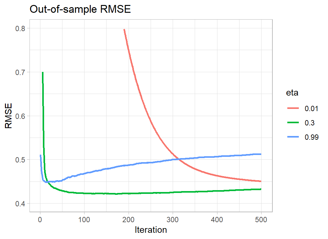
Making eta very small means that the algorithm needs more iterations to minimise the loss; so the downside is computation time. In this example, the out-of-sample RMSE is still on the way down after 500 iterations. Separately, I ran the algorithm for longer and hit a minimum RMSE of 0.417322 after 4986 iterations. This out-performs eta=0.3 by 0.004. Remember though that we previously found that different random validation sets cause the out-of-sample minimum RMSE to vary between 0.418 to 0.432, a difference that is 4 times as large as the gain from using a small eta and running the algorithm for a long time.
Making eta too large causes the algorithm to hit its minimum very quickly, but it never matches the best performance of eta=0.3.
The optimum policy would be to make eta smaller, say 0.1, and to run the algorithm for longer. However, if eta=0.01 only improves the loss by 0.004, changing from 0.3 to 0.1 cannot be expected to make a meaningful difference. eta=0.3 represents a sensible compromise, you will lose next to nothing in performance and xgboost will not take too long to run. If the problem is small, or you have a very fast computer, then play safe and reduce eta but don’t do so with high expectations.
Whatever eta you decide on, fix it and then select the appropriate number of iterations. Jointly optimising over eta and the number of iterations makes no sense.
Other hyperparameters
There are too many hyperparameters to run through them all here and this post is already very long. I’ll look at some other hyperparameters when I next use xgboost.
What this example shows:
XGBoost is a good algorithm, but it has a huge set of hyperparameters, most of which have very little impact on performance. A good strategy seems to be, fix the learning rate, eta, based on computation time and then find the optimum number of iterations. Apart from that, it is wise not to be obsessive about selecting the hyperparameters, you probably will not have the data to distinguish between the default values and any other reasonable choices.
Imagine that in a machine learning competition 20 people each use XGBoost in identical analyses; same data cleaning, same feature selection. The only difference is that when they create their validation sample, they use a different random number seed. They will each choose their own optimum set of hyperparameters based on their particular estimation/validation split and one of those sets of hyperparameters will, by chance, be best for the test data and that model will win the contest. However, the organisers also chose a random number seed when they split the test and training sets and had they chosen a different seed, one of the other models would, by chance, have been best for the test data and won the contest. Use of XGBoost by many competitors leads to overfitting of the test data. XGBoost looks even better than it is and the competition turns into a lottery.
Machine learning game shows are run for fun, so obviously they must not be used to determine our machine learning strategies, but they do highlight some real problems. I like to think in terms of two key quantities related to the loss function; the smallest significant difference and the smallest meaningful difference. By the smallest significant difference, I mean the smallest difference between two values of the loss that could not be accounted for by chance and by the smallest meaningful difference, I mean the smallest difference that would make a material difference when the model is used in practice.
For this episode of Sliced, the leaderboard shows RMSEs on the test set measured to 5 decimal places. Looking down the leaderboard I found that one model scored 0.49006 and finished in 11th place and another scored 0.49007 and finished in 12th place. Do you think that this difference might be due to chance? Are you sure that the order would not have been reversed had the organisers used a slightly different test set? Do you think that this difference is meaningful? If you were a manager looking for a pricing model would this difference in RMSEs influence your choice?
In the context of the game show, I’d like the organisers to state in the rules that, say, evaluation will be by RMSE and models with differences in loss of less that 0.005 will be treated as equivalent. So it might be that the points for best prediction get shared. (Yes, I do realise that you would need a special rule for, model A=0.430, model B=0.434, model C=0.438).
Meanwhile, in the real world, data scientists ought to think about accuracy when they plan an analysis and they should not waste time searching for models that make ridiculously small improvements in performance. In my opinion, hyperparameter tuning should be used to find sensible parameter values, but, after that, there is no reason to continue refining the parameters in pursuit of small (non-significant or meaningless) improvements in loss.
Hyperparameter tuning is the mainstay of many machine learning pipelines. Yet, it is often used inappropriately. I see a lot of videos on YouTube in which many sets of hyperparameters are tried in a frantic attempt to hit upon a combination that magically minimises the loss function. Sadly, this approach is rather encouraged by the competitive nature of Sliced.
I should like to see more emphasis on understanding the roles played by the hyperparameters. The analyst has a lot of knowledge about the nature of the problem and that knowledge ought to be used when selecting hyperparameters values. This approach is ruled out when xgboost is treated as a black box. By all means use xgboost, it is a good algorithm, just use it intelligently. It ain’t what you do, it’s the way that you do it.